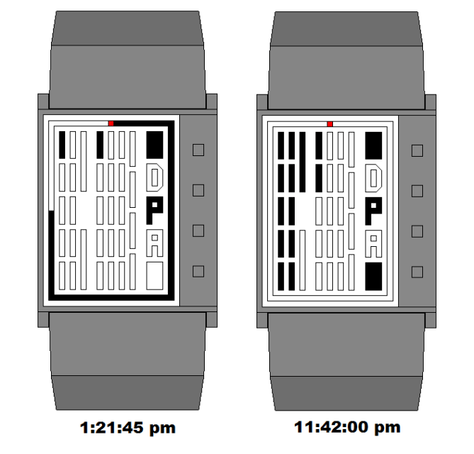
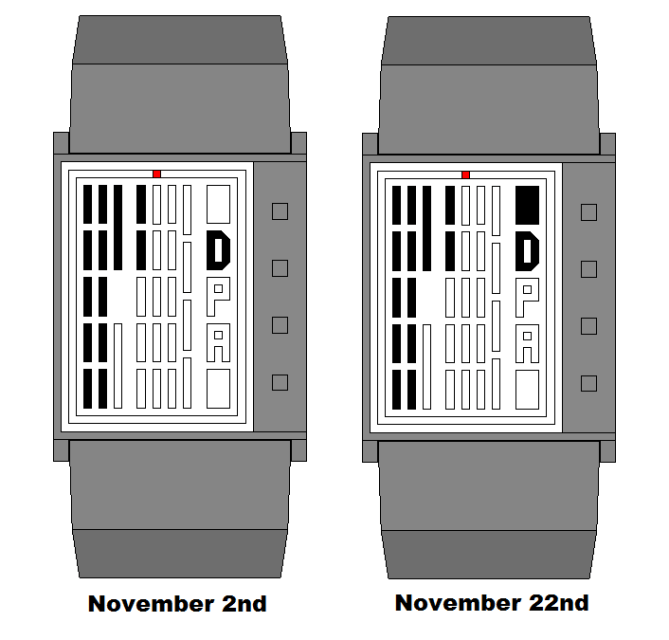
Design submitted by Matt from Canada.
Matt says: By using the Mayan numeral system, for another project, I had the idea to integrate it into something I use daily.

By reading dashes. One dash equal 1 unit. The 12 dashes at the left are the hour/month and the 19 dashes in the middle are the minute/day. The two square at the right equal 20 minutes each. ( + the outers lines of the 19 minutes are on, forming a 0, at 20 & 40 ) The outer line is for the seconds. As each second pass, 1/60 of the line light up. The 4 controls buttons are all covered by a single soft plastic sheet. There is 4 marks on it to show where to press.
Peoples that like/prefer an “out of the box” way of time-telling. Unisex.
The line for the seconds. The button cover and their position. The application of the Mayan numeral system. Note : It would be an always on LCD screen. Variation : The lines could also be horizontal ( 90 degree counter-clockwise )


Nice effort Matosan! Unfortunately I think the display is a bit complicated to me. The design is just OK so there’s not so much to justify the overall watch since the display is not so convincing. BTW I still believe the design got potential, knew it that’s why TF posted it here, so don’t worry, keep it up and good luck!
LikeLike
I have to agree with Fir, the display just looks a little cluttered. If you could group the blocks together maybe in threes or fours, this would improve the speed of time reading and maybe bring a more organised look to the display. Like Fir says its got potential, so good luck!
LikeLike
Do you mean : removing the space between the line ? or re-aranging them ?
LikeLike
ty for your idea. I have 2 new concept. ( the display will be different, but share the same basic idea )
LikeLike
The time telling works, it could be made more comfortable though. The different sized blocks are a bit diversified for the eye, which is ok, but still the display looks a bit too office-like, too serious. Making arrays of blocks look sexy is a tough job. I have to say, the display does not stand out so strong among other concepts. Pete, I think a more organised look might lead to less attraction. If that could be combined with breaking the grid or ignoring the rectangle border, it might be an improvement.
The D, P, A letters look too un-mayan. Maybe there could be some ancient LCD symbols instead. Here again, a less office-like look, a more unconventional look would appeal more.
If I interpret the drawings right, the case has a trapezoid cross section. Totaly adorable for me 🙂 I also like the red light that sends out the secons – that is really a nice part here. 4 buttons on top are nice too.
Good luck from me too!
LikeLike
the letter could be symbol.
LikeLike
“The different sized blocks” are for symmetry purpose. The 11 & 12 hours lines could be positionned differently, verticaly, or of another height. The difference at the last minute line is because there is 4 instead of 5. And the square are the same size of the 3 letters. They could be put on top of the letter/symbol.
LikeLike
ty TF for posting it. The display/button position possibility are 60. This one show a stainless steel wristband, which can be of another material.
LikeLike
the possibility are 78.
LikeLike
it’s really 60. my mistake. Samukun, I forgot to tell that the rectangle border don’t appear when the rectangle are off. ( i’ll do other pics )
LikeLike
The fixed pictures : https://www.facebook.com/media/set/?set=a.377438185645951.87028.316409365082167&type=1&l=6cda244ba2
LikeLike
http://techcracks.com/2012/06/ancient-mayan-numerals-lcd-watch-concept-by-matt/
LikeLike