Design submitted by Leonard from Malaysia.
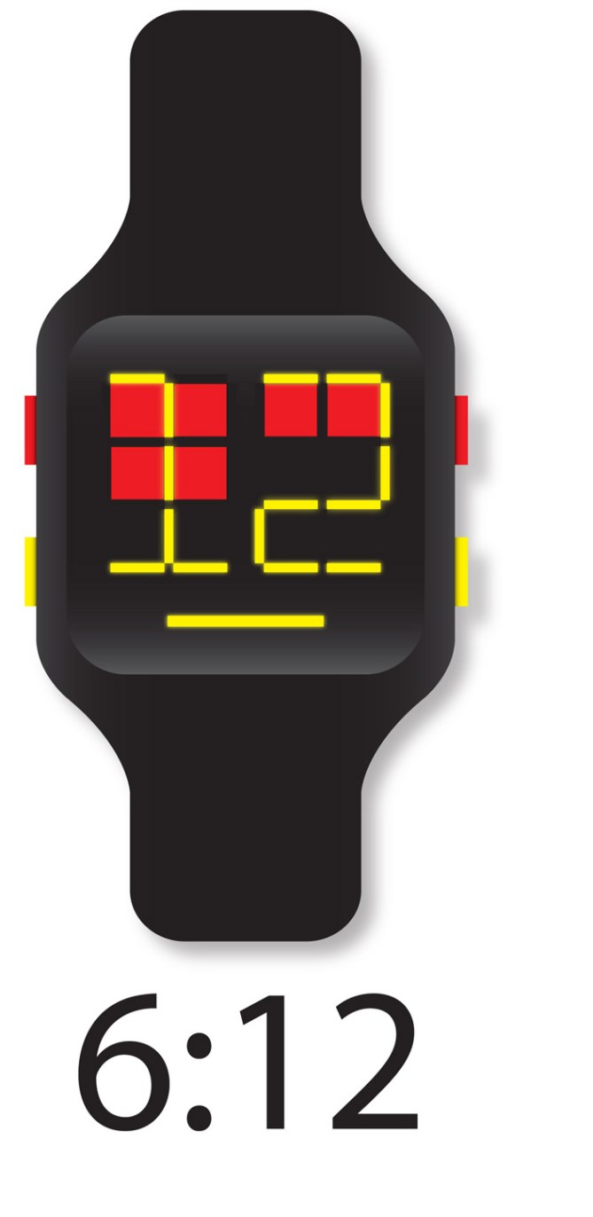
Leonard says: Recently I study about emoticons of digital display. It remains me of tamagotchi, a digital pet in 90’s. When i look at how the tamagotchi’s pet face expression, it give me an idea on designing this watches – Watchme.

There are two colors display.
Red squares is the Hours indicator. There are 12 Red. How many light on is what the hours is. Around the Red squares, is 34 Yellow bar, display the minutes like a digital display–numbering shape. The longest yellow bar at the bottom which every seconds is blinking, is the Seconds indicator.
Appeals to Anyone. Male or female who likes clear, sleek and simple of displaying time.
Cute, Trendy and Futuristic.


Love this design, Leonard! Very straight-forward, quirky interface, and I especially enjoy the elongated numbers. Time for a watch feast! 5*
LikeLike
Cute design, not my cup of tea but will appeal to younger people for sure. Nice simple time telling method.
Welcome to the blog Leonard! 5/Y
LikeLike
Welcome to the blog Leonard!
I like that you combine two different elements to tell the time. This makes the watch look interesting and fun to read. I also like the blinking seconds. I recently made a comment elsewhere saying, that seconds today ar emore a visual thing, than a necessary part of the time telling. An ever blinking light is cool.
This display idea can be translated in many ways – bit potential here. I’m not a big fan of the LEDS colors (one color and white for me plesea), the many colored buttons and the shape could be a tad more edgy for me. But it looks unisex, which is a big plus. My taste does not influence how cool the idea is so…
I support this idea with a 5*/YES. Creative, interesting, space for variations 🙂
LikeLike
Thanks for the comment. You said there are more potential about the display. Can you suggest some? Because about the display, I can only think replacing the Seconds bar with a smile & one feature- displaying date. Thanks for future suggestion.
LikeLike
The basic idea is pretty smart. Try to present the watch in less colorful but more elegant and or futuristic way and this watch is good to go further. Yes I know there are many bold and colorful watch designs but I believe the colorful and bold colors are not for this concept. Leo-chin, Good luck and keep it up! Malaysia boleh! 😉
LikeLike
Hello.
Thanks for the suggestion.
I use too many bright colors yet too strong contrast colors! Too Bold!
How can I improve this design?
LikeLike
Hello there.
How you can you improve? Read the comment and and think about it. Good luck!
LikeLike
Thanks for those who comments it.
But, I need more comments to develop further!
LikeLike
Yeah, I like everything except the buttons – just a bit overboard. For me, keep as is but light-grey buttons.
LikeLike
nice idea. I would prefer if the buttons where 1 color. I would suggest to remove the bar for the second or put more bars ( 4-5 ). I would prefer another colors combo. I don’t like that the digits are not vertically symetrical, but I understand that they are limited because of the 4 x 3 hours blocks. ( you would have to put 1 line of blocks over or under the digits, which might be bad )
LikeLike
Thanks for the suggestion, Makkovik! Your suggestion will be taken consider. Thanks!
LikeLike
Thanks for those who support this design and your critics. I really appreciate your guys help. All of your comment will taken consider in further development. The new “Watchme” will be soon ready for sending to TF within this months. Hopefully, more support and critic for the new one! Thanks
LikeLike