Design submitted by Heather from the USA.
Heather says : I was looking at a digital clock whose traditional 7-segment digits were mostly trapezoidal, with a visible gap between the segments. I thought, “Why do the segments need to be trapezoids?” I sketched some digit layouts using various arrangements of seven polygon segments with pronounced spaces between them, until I came up with the CRAX digits.
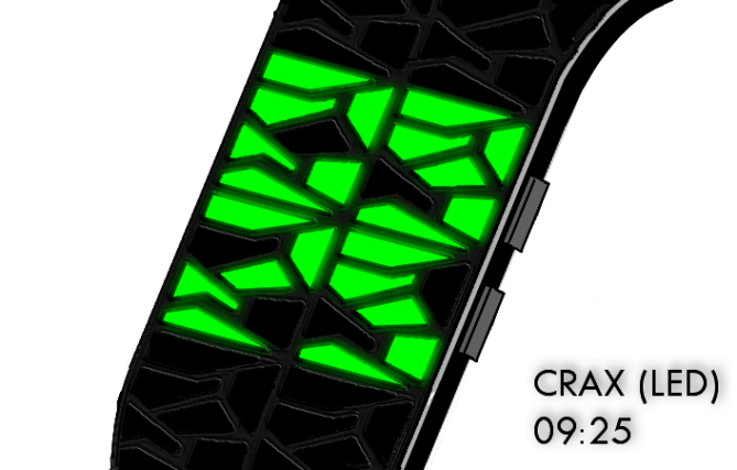
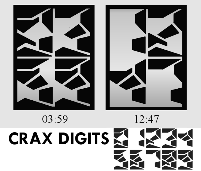
It occurred to me that these digits could work well with either LCD or LED, so I sketched an example of each. In both versions of CRAX, the four digits of time are arranged in a rectangle – top two for hours, and bottom two for minutes.
In the LCD version, a rectangular border is drawn around the four digit display, bringing them together and making them appear to be rock formations protruding from the walls around them. The reader’s eye, then, is drawn to the cracks between the rock pieces, making the time appear quite cryptic indeed. In truth, the seven rock pieces (LCD segments) for each digit can easily be read to tell the time (see animation of how the digits were formed).

In the LED version, I envision a slim bracelet style watch, where the cracks between the digits are actually cracks built into the watch itself. The LEDs (7 for each digit) are therefore slightly elevated in comparison. The time can be read from the illuminated LEDs at a button press.
People who like cryptic looking, yet easy to read at a glance watch displays would appreciate the CRAX watch.
This design stands out because it has cryptic digits that can be easily applied to either an LCD or an LED display.


Nice Idea! This watch is very artistic, seems like a mosaic work of art. If each number was in a different color, it would make it more fun. I totally like the idea of the cracks being built into the watch if its an LED one.
LikeLike
Hi, Matt! That’s a great idea, having the different colors! Your support is appreciated! 🙂
LikeLike
As always, great watch design idea Heather! I like how the digits look close enough to regular digits so it’s not very difficult to tell each number. It’s also pretty creative I would say.. I give it a 4.5/5!
LikeLike
Thanks for the compliment, Jeremy! And for your vote!
LikeLike
This is like more classical approach to Broke design in Waku element, but with cryptic theme. I think this design is okay, even not 100% of my taste, but I can see the potential and uniqueness. Good luck!
LikeLike
Firdaus, thanks for your honest review, and for appreciating the potential in my design. 🙂 I did have some inspiration from Broke when I planned the final digit layout – cool that you can see it!
LikeLike
I love the digits! The fragmentations is generally cool but each digits itself looks nice too. You know I had the Stencil-effect when I first saw the display before any explanation. That was nice 🙂 Now I can’t unsee the numbers. If TF ever want to go breaky again, this would be the first concept to check up I think. Hitting the 5* without doubts and YES! Doog ckul!
LikeLike
Thanks for the support and vote, Sam! I hope TF agrees with you! 🙂 Glad you got to experience the Stencil-effect! 🙂
LikeLike
Heather does crax!…
…creatively
😉
LikeLike
hehehehehe….thanks!! yeah…and this watch design stuff is quite addictive!
LikeLike
Nice design, Heather – like the creative element. I’m a little turned off by the colours, as they remind me of khaki…
If colours could be used that are more like cobblestones, or something, then I might be more hooked.
Cheers,
DZ
LikeLike
thanks, DZ. Yeah, the colors are just a sample…my graphics skills aren’t the best, so I just stuck with one example of LED and one of LCD. I actually prefer the LCD myself…black on mirror…but no one seems to be commenting on that one…TF could of course choose whatever colors they thought would be most popular…if they chose to make this…
LikeLike
The is nice! Simple! I like the LCD version! Much more eye catching to my eyes! 5 stars for it !
LikeLike
Thank you, Leonard!! The feedback of which display is preferred is very helpful. Thanks for taking the time comment, and thanks for your vote! 😀
LikeLike
Is this is Heather’s style?
I don’t think so!
LikeLike
Hi, Will I Am. You don’t think the LCD version reflects my signature cryptic digital look?
LikeLike
The LCD look better than the LED.
LikeLike