Design submitted by Dietrich from Australia.
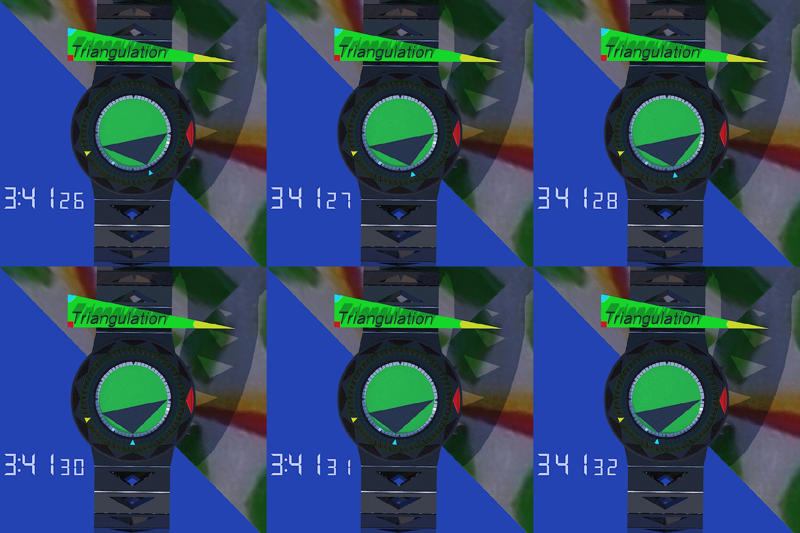
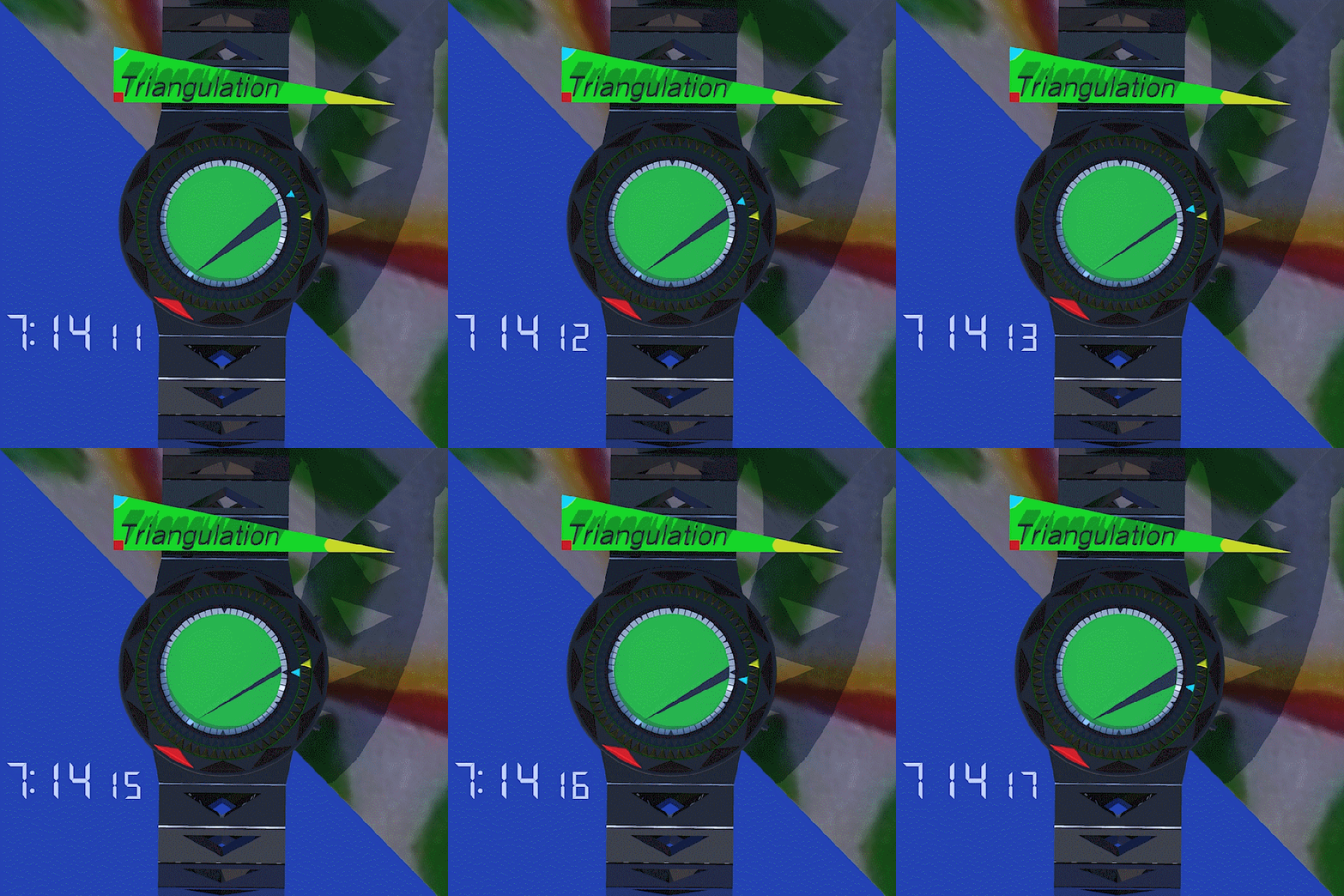
Dietrich says : This idea was inspired by my inaccurate memory of a 1980s video game called Qix, and also by sun-dials. I originally had two watch ideas – one for the outer triangles and for an inner triangle, so I merged the two.
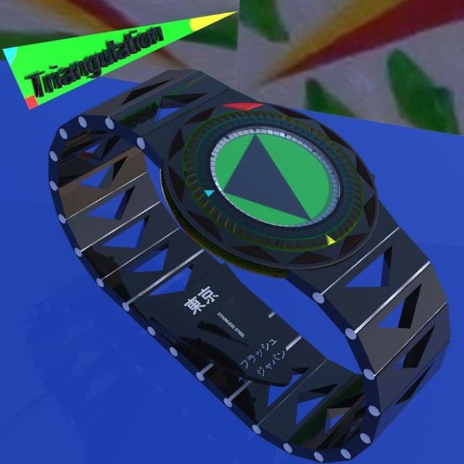
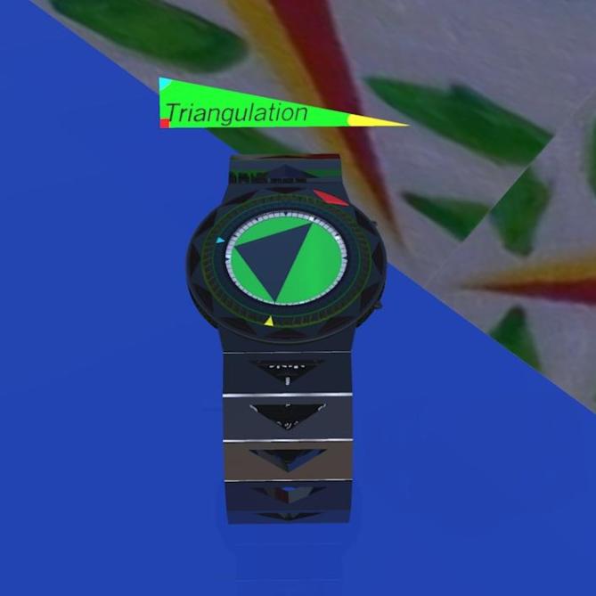
To tell the time, simply imagine an analog watch. The red wedge = hours, the yellow wedge = minutes, the light blue wedge = seconds. The shadowy triangle helps orient to where the wedges are, and is incredibly funky. The animated gifs will make it obvious.

Anybody that wants to be noticed will love this watch. The triangular animation in the centre will definitely draw attention, especially during the hourly animation (which occurs when all coloured wedges line up.
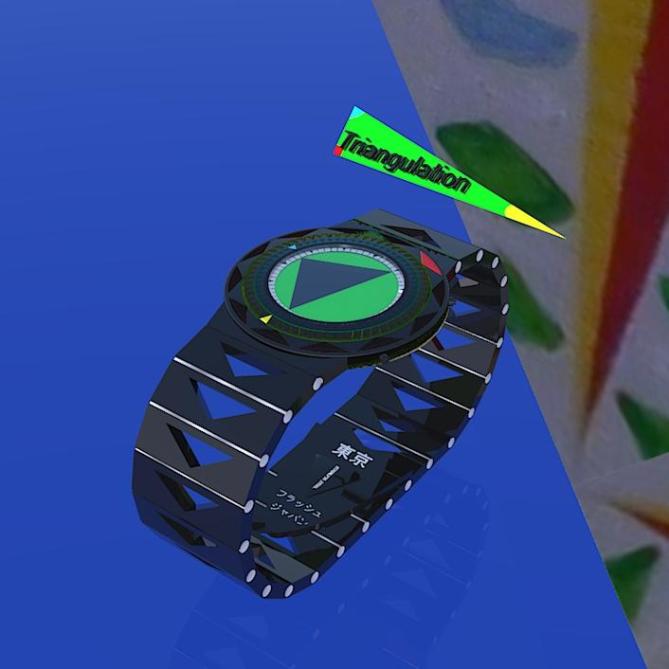
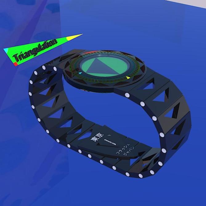
What is particular about this theme is the design carries through to all facets of the watch. Triangles, triangles and more triangles – even on the watch band! And it’s easy to tell the time. The triangular shadow is an eye-catcher, because it throws the notion of analog “hands” out the water.



Nice design Dietrich and welcome to the blog! 🙂
LikeLike
Thanks Mushy! (Is that Lloyd?)
Cheers.
LikeLike
Yeah. Now I know who you are too. 🙂 Keep sending in the ideas.
LikeLike
Sorry Dietrich, I like this concept better:
http://www.tokyoflash.com/blog/2010/10/vector-watch-concept/
Much more aesthetic!
But welcome and good luck!
LikeLike
Thanks for showing me that one, Timo. I have to admit, the Vector is a pretty sleek design!
Cheers,
Dietrich aka DZ
LikeLike
I like the idea behind this watch. I can see the similarity to vector as Timo highlighted but I think they are different enough. I prefer the time reading on your version as it is much clearer due to the tips of the triangle meeting the edge of the display. I had a similar idea a while back but the “Triangle” would have been lines that can overlap each other so it looked like the old polygon style screen saver, maybe with echoes for a more animated look. Either way its a nice concept. The styling isn’t my cup of tea but this is something TF could tweak if they developed it. So 5/Y for the concept, best of luck and welcome to the blog! 😀
LikeLike
Thanks for your great feedback, Pete!
Cheers,
DZ
LikeLike
I didn’t realize it was you DZ, congrats on getting a design posted on the blog! You have waited long enough! Solid first entry! Hopefully the first of many! 😀
LikeLike
Hi Pete,
Thanks. I’ve made a couple more submissions…that’ll probably be it for a while! I don’t know how you guys whip up such awesome ideas so quickly.
Cheers,
DZ
LikeLike
crikey! actually I’ve quite similar idea long time ago, but I couldn’t fine how it would works well on analog design but never thought to apply it on LCD design (then I created Tako aka Art in A Watch). Yay I think your design is okay already, only critic about the strap, triangle hole shouldn’t be there please. Of course I would buy if it is ever be produced! 5*
some observation: what is the painting at the background and why you use that image? motif? I couldn’t let my brain to stop thinking why you put that particular image 😉
LikeLike
Thanks for your feedback, Firdy. Yeah, perhaps the triangle holes are a bit much. How about a triangle imprint instead of a hole?
That’s one of my paintings in the background. It’s a large triangle! Maybe I’m going over the top with the triangles…but I wanted to make a statement, haha.
Cheers,
DZ
LikeLike
OK. The background image give the overall artwork some tropical feel ^_^
LikeLike
HAHA – Tropical triangles! 🙂
LikeLike
I agree with Firdaus about the triangle holes in the wristband and I was going to suggest imprint, maybe in another color than the band. I don’t like the white dots on the side, between the links, either. Other than that, an amazing design.
LikeLike
Hi Makkovik,
Thanks – I agree with the white dots…I couldn’t quite get the metallic effect I was after. Holes are a bit too much…imprints in another colour might work.
Cheers,
Dietrich
LikeLike
It’s cool that you can express your idea and share it with us DZ!
Honestly the watch around the display is not my taste. But somehow (subtly) implementing triangles in the straps is a cool idea. The many triangles on the bezel are a bit too much for me too. Some small rectangle indicators (like 0.5 x 2mm) would look less busy. But thats my personal taste and I see potential here.
The display is a very cool. I thought about a similar display and I would suggest e-paper at the moment because e-paper can show many different things without seams. LCD would have to get cut into fragments. If you run through all possible display layouts, the segmentation would look like a furball. There would be segments that are microscopically small. I think e-paper could do it. If e-books can show grayscale images, then triangles should be no problem. I gave up the idea because e-paper can’t change each second, and if it could, it would eat up too much energy. THat was too much negative info for me 😉 But if such a display is somehow possible…
…and if TF would find a bit more stylish look, then it’s a 5*/YES. I give you this because the design around the watch isn’t essential for the actual concept so my taste is just a temporary issue. Plus, technology (or my limited knowledge about it) should not be a too big criterion right now. To make a long story short, GOOD LUCK DZ
LikeLike
Thanks, Samukun. I was thinking four concentric LCD bands – that way it could be permanently lit. Alternatively, main display is LCD and outer wedges are LED. Then you could have the main display always lit and the wedges wouldn’t be visible all the time, except for when you press a button. (I’m not so sure if this arrangement is practical). With the main display on its own it would still be feasible to tell the time – although a bit of deductive reasoning would be required when hours, minutes and seconds are close.
Arigatou,
Ditorikukun
LikeLike
Really cool watch… hopefully they will make it… so I can buy it :P… Thanks Dietrich for submitting such a cool design
LikeLike
Thanks, Chintu. I would also like to buy it!!
LikeLike