Design submitted by Lloyd from Australia.
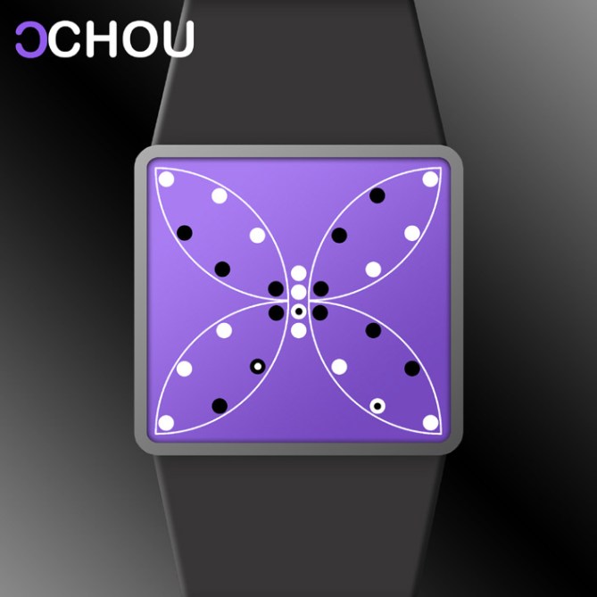
Lloyd says: This concept LCD watch design uses the shape of a butterfly to display the time and date, hence it’s name “Chou”, which is Japanese for ‘butterfly’.

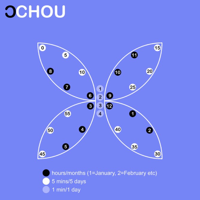
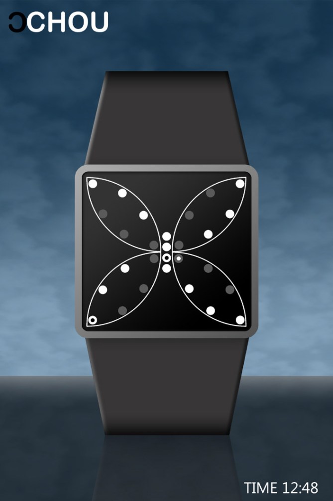
Figuring out the time or date on this watch is surprisingly easy. Basically, each group of 3 spots forming an arc on the butterfly’s wings mimics the positions of 3 of the hour/5 minute markers on a circular analogue watch. In the “time” mode the white ones indicate the hour and the black/grey ones indicate how many 5-minute increments have elapsed. The 4 large white spots forming the butterfly’s body indicate additional increments of 1 to 4 minutes. In the “date” mode the white ones indicate the month and the black/grey ones indicate how many 5-day increments have elapsed. The 4 large white spots forming the butterfly’s body indicate additional increments of 1 to 4 days. The time and date are indicated on the larger spots by smaller black and white ones. Please take a look at the images below for a better understanding of how to tell the time on this watch.

This watch is USB rechargeable via a computer and the strap is made from an animal friendly material. The display is available in a variety of colours and is “always on”. The watch’s buttons end flush with the side of the case so they don’t protrude.
I feel this design would appeal to anyone who likes nature, art, quirky things and creativity.
This design stands out because of its unique, eye-catching butterfly display which is also modern-looking and relatively simple to read.


wow, lloyd, that is a very impressive and creative way of telling time… i’ve worked on some similar ideas that involve looking at just one of four arcs at a time (i think logan had an idea like that at one time as well), but this is different because it shows all at once in a way that is very pleasing to the eye. it makes me think of the beauty and symmetry of nature. my favorite is actually the greyscale one in the last image, but they are all quite nice to look at.
the time-reading is a little difficult to get used to (because i stink at reading analog time to begin with), but very logical. i find myself more tempted to read the white as hours and the black as minutes, but that would just take practice, i guess. i think, though, that it might be a good idea to scrap the date idea — i find it just too difficult to bother, because it’s not intuitive to translate analog time reading to date-reading.
5* for a superb creation – very outside the box, yet can easily be understood from its close connection to analog time-reading. YES from me.
LikeLike
Thanx a lot for all your feedback Heather. 🙂 Pity about the voting.
LikeLike
Very good. I think it would look amazing with some artistic swirls & engravings of the butterfly on the face.
LikeLike
Thanx Uminohi. 🙂
LikeLike
Your butterfly watch is elegantly sleek. I would wear this in a heartbeat or a clock tick!!!
LikeLike
Hehe thanx Lynn! 🙂
LikeLike
Another brilliant design, very unique and artistic. Who would guess this is a watch face at first glance! This is a real show stopper. The Black one especially looks very sophisticated.
Diane.
LikeLike
Hi Dane
Have to agree with you. But my only argument is the time telling arrangement is a bit complicated with this shape. The overall design is no doubt an eye catcher especially for women and girls. Good job on the artistic work too!
LikeLike
Thanx Firdy! 🙂
LikeLike
Thanx Diane! 🙂
LikeLike
Without a doubt, this is my favorite watch so far. I’m biased in that I love butterflies, but it’s such an attractive face, that I can see myself wearing it, not only as a fashion statement but as a karmic one too! I suck at telling time and usually wore kids’ cheap digital watches, but this one is worth taking the time to learn.
I’m still trying to figure out AM from PM. Also, what animal friendly band do you see on it?
I’d want the purple or the pink. And wouldn’t it be cool if you could make it with a knob on the side to change the color (to go with my outfits of course)!
I’m sure lots of guys will like this but I promise all females of all ages will die for this beauty. Not sure you know this but one of the favorite brooch pins females purchase happens to be in the shape of a butterfly.
LikeLike
Thanx Diane for your helpful feedback! 🙂
LikeLike
What a cool way to split up the analog watch display into a interesting digital form ❗ Time reading requires some orientation. Once the reading rule is understood, it’s fun. Uminohi’s idea about some artistic engravings is nice for an even more girly version of the watch. I like it as blank as possible. The grey one (maybe metallic?) is mine 😀 5*/flap flap
LikeLike
Thanx Sam! 🙂
LikeLike
The time reading takes a litle getting used to (for me anyway lol) but nothing a little practice wouldn’t sort. Very creative design with mass appeal! congrats 5/Y best of luck! 😀
LikeLike
Thanx Pete 🙂
LikeLike
Nice one, Lloyd!
5*
LikeLike
Thanx a lot dziggy! 🙂
LikeLike
It is a poetic watch.
5 * / Yes.
LikeLike
Thanx Patrick! That’s a lovely thing to say. Hope you’re doing ok. 🙂
LikeLike
I click “Yes” every time, no problem Mushy!
LikeLike
You’re nice Patrick. 🙂
LikeLike
Another great product of metamorphosis from Lloyd! Very interesting…I think my 8-year-old daughter would wear this one!
LikeLike
Thanx Mr Brainboggler. 🙂
LikeLike
Hi Lloyd,
Thank you designing a great watch. I am glad that this design is more for ladies, because all other watches seem dedicated to man most of the time. I like this watch because of its great design (butterflies are my favorite) and it is challenging enough to read the time too!!! I hope its size will be suitable for ladies wrists, to fit us just nicely. I cant wait to find it available so i can buy it!
LikeLike
Thanx ramona! 🙂 We’ll just have to keep our fingers crossed.
LikeLike