Design submitted by Sam from Germany.
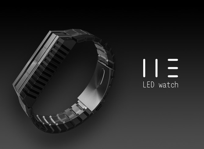
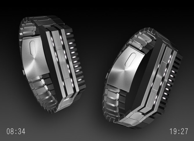
Sam Says: I was sketching for a simple way to deform the classic seven-segment-LED-digits and came up with the idea to just let the horizontal segments take a step aside. The result is a confusing bunch of lines. To celebrate this confusion, I wanted to emphasise the horizontal and vertical lines with according geometry, pretending, the segments are meant to be there. I own a 12-5-9 L and it’s my favourite Tokyoflash watch. The geometry of the IIE is inspired by that watch.
This is a watch for people who like edges and segments, angles and gaps and a confusing but cool looking display that isn’t too hard to be learned.


Sam, this design is like a lunatic on acid!
5*
LikeLike
Lol xD Thanks DZ!
LikeLike
Wow saturday posting! Thanks Toky for psosting my “blunt instrument” 😉
LikeLike
Yay a saturaday posting, a very pleasant supprise! I hope this will be a common occurance!
This design takes a little “getting your head around” as people will know from my poor attemps on Sam’s fb page lol. I struggled when I first saw it but now Im used to it, it works well. Looks striking too!
5/Y Best of look Sam! 😀
LikeLike
Hehe it was fun back then 🙂 I’m glad it works now – that’s how it should be.
Thank you Pete!!
LikeLike
Wow, a Saturday design like the old time 😉 and it makes me surrounded by Sam 😉
I love entirely exterior of this design, feels like robotic, kamen rider and samurai in one. But my brain couldn’t decode the time so easily, seems harder than counting binary time. Classy watch though! 5*
LikeLike
The cryptic digits aren’t a new idea, Sam, but I like the way you’ve incorporated them in the design. It looks very cool! 😉 5*Y and best of luck with it.
LikeLike
@ Fir: Mwahaha indeed! Feels good to hug a watch like yours 😉 Thanks for the honest view Fir. I must admit, while I made this watch, it wasn’t super easy to read the time either. But I stood convinced that this is so simple actually and practice is the key ^^
@ Lloyd: Oh really Q.Q I haven’t seen something like this before. But I had imagined, that such simple transformation just couldn’t be discovered till 2011. But if this is the first watch concept that uses it, I’m still in the race 😀 Cool, you like the appearance! It’s less neutral this time. Thanks for the insight Lloyd!
LikeLike
Hi Sam. Don’t worry. I doubt it’s been used on a watch before. 🙂 I first saw a number series with the horizontal segments missing in the mid 1980s. I don’t know who originally came up with the idea or when.
LikeLike
The cool thing is, when taking away horizontal or vertical segments, the numbers can be confused because some look alike then. The combination is the key ^^
LikeLike
Yeah that IS cool. 😉
LikeLike
I like the method of telling the time. I suggest reversing the animation, though, to better show how it works.
As for the case, what’s not to love? Reminds me of the old Tokyoflash style that I prefer.
LikeLike
Hey, Sam! I love the concept here, and as you know, I have no trouble reading it 😉
The styling seems to be better suited to a male demographic, so I would probably not buy this for myself.
I can imagine a more feminine version in stainless steel where some of the hard edges are more like a smooth curve – could make a very nice looking bracelet that tells time in a cryptic fashion. The white LEDs are a good choice!
5*
LikeLike
Logaaan! Oh, cool idea about the animation. I’m showing the creation, but the decryption would’ve been wiser 🙂 Cool you like the look. Thanks for coming by!
Heatheeer! Thanks for the comment! Yep, guys favored here 😉 The display idea can be translated into geometry in different ways. I took the chance to revive the 12-5-9-L-look. As I’m writing, I have a more unisex version in mind. Hm, maybe as reloaded version someday.
LikeLike
Could it be used as a start-up animation on the watch?
LikeLike
Hm, since the segments are separated hardware-wisely (that’s a term now) they can’t be together for an animation. But if the case face would be transparent, then the segment movement could be watched. Hm, as much I like the idea of such a case, the untransformed time would give too much of a hint (if not telling everything already) and so the crypticness, that makes people talk, would be lost. Hm, as an optional feature this would be interesting – clear time at the press of a button for people in a hurry. I think, that could be the second thing for a reloaded version.
LikeLike
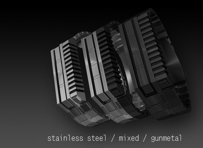
I absolutely love the case – especially the mix of gun metal and steel. Its a nice chunk of metal that would sit happily on my wrist! The time telling is just a wee bit too tricky for me though, which is a real shame as i really do like the overal look. 😦
LikeLike
Awww what a dilemma!
Scott, thanks for the insight. Maybe you would give it a chance, if the watch would look back at you from the shop, baiting you with its chunkiness 😉
LikeLike
it’s been a while since my last comment on any design. mostly, i have to admit, because i wasn’t very impressed with what i saw here. but, damn me, sam did it once more.
this is a piece of industrial design, that i could love to pieces!
ok, admittedly the time telling function is not very clever, but it isn’t bad or badly implemented either.
instead it all seems to go together very well and the overall design just blows me away!
this definitely goes on my “would buy” list!
very well done! bravo!
LikeLike
Woof, I remember you! Welcome back, hopefully not for short. You seem to have a very special taste!
I’m glad that this expressive look find its fans. Sometimes I have my moments, hehe. The time teling seems to polarize between too simple and too complicated. It’s ok that way as long as you buy it 8) Thanks alot for review wolf!
LikeLike
Stop Sam, stop!
You’re a robber! I haven’t enough money for your watches!
🙂
LikeLike
Hi Sam, only just realised how very easy to read this watch it is! Looks very cool, kinda star warsy for me; a long time ago in a galaxy far far away.. So yeah I hope this gets made, if not just wait for a space time capsule to hit earth and i’m sure u will one of these inside lol. Muito bem!
LikeLike
Laszlo, that made me giggle 😀
Hei Keiron! Thats nice how you see this watch! Thanks so much for the cool comment and saying it’s very easy. It’s all there 🙂 Apropos Star Wars, a black/white acetate version would be interesting ^^
LikeLike
OOOOOOOOOOOOOOOOOOGHHH HOOHOHOHHH !!!
when i saw the little lines in the animations, i thought..oh..okay…then when it turned into a design and went into the watch, that was the coolest thing i ever saw, I have always wanted tokyoflash to make another led watch with lots of lights ns tuff like they used to, this is badass…you have bought classic watch back to life! I want it!!
LikeLike
Hehe thanks for the very nice comment! This is actually how the design came to being – I developped it from the number segment layout ^^ My architecture prof once said “Don’t make a diagram into a house” but here this method worked pretty nice it seems 😀
LikeLike
Amazing design! Love the industrial look of it! I visit this blog a lot but never really commented. When I saw your watch I had to. Hope this one turn into reality someday, I would buy it immediatly!
BRAVO!
LikeLike
Wow that’s nice! Thank you for stopping by and commenting Ricard! Crossing my fingers too 🙂
LikeLike
Looks like a transformer! 😀 I really like the idea but the design is a little bit too… ‘serious’ or ‘robust’ if you see what I mean. I would make it a little bit more ‘aerodynamic’ with less hard edges :p still nice watch though! (y)
LikeLike
Yeah I see what you mean. Thanks for the honest perspective! I’m glad it’s still nice for you. Maybe I’ll do another version, I would have enough material for an alternative 😉
LikeLike
I love the design but i’m not sure about the time-telling. A 12-5-9 where the line would be like that would be nice.
LikeLike
Thank you for your opinion! Design and time telling are molten together though. But the tendency here shows, an optional easy mode would be useful.
LikeLike
Thanks everybody for your views! I can see, the look was liked by the majority and the time telling method polarized. Very interesting. Cool, that the result if pretty good. I’d like to see this irl… this blunt instrument hehehe.
Stay creative, stay critical, stay tuned!
Sam
LikeLike
Best of luck Sam, this was cool! 😀
LikeLike
Thanks for your words Pete!
LikeLike