Design submitted by Logan from USA.
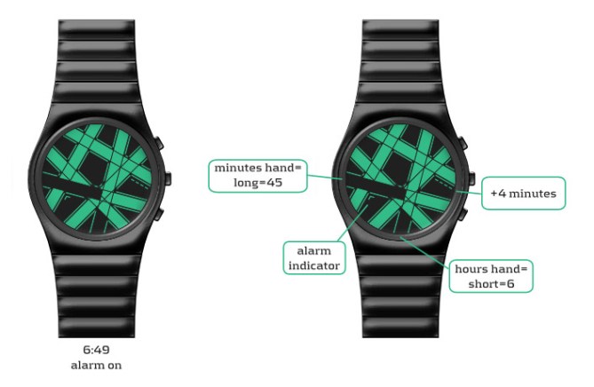
Logan says: Permutation connects random pairs of clock positions with thick LCD lines. The intersections of the six lines break them into smaller LCD pieces, which are inverted to display the time.
The “hours hand” is a small inverted segment starting from the normal clock position, and the “(groups of 5) minutes hand” is a long inverted segment. Four additional small segments near 3 o’clock count extra minutes. An arrow-shaped additional segment near 9 o’clock appears when the alarm is set and blinks when the watch is in date mode.

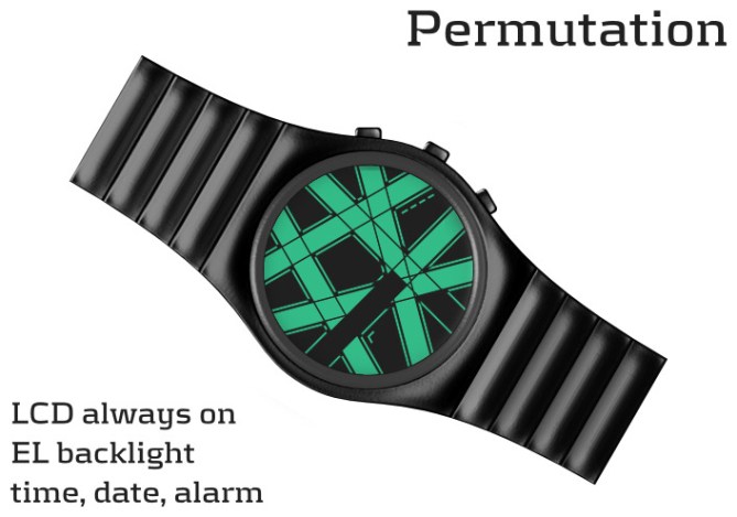
The watch has an EL backlight. The illustrations show four color variations: “Rogue” coloring (IP Black + green/black LCD), IP Black + mirror/black LCD, stainless steel + mirror/red LCD, stainless steel + mirror/blue LCD.
If you walk the line between order and chaos, Permutation is your watch. The familiar clock emerges from random connections. And so it is with life.
Like any Tokyoflash watch, Permutation looks completely new. But reading the time with this one is easy. The design scrambles the visual depiction of a clock, but preserves the simplicity of the time-telling mechanism.


This is an incredibly interesting. Outstanding and completely different than any other LCD designs suggested here! I LOVE the entire designs. PLEASE I NEED THIS!
Geeky, stylish, unique, not mainstream but works!
yohooo YES YES YES YES YES
LikeLike
Thank you for your enthusiasm, Firdaus! Very glad you like this design and appreciate its unique qualities.
LikeLike
Really like your egyptian mummy (bandages) watch Logan! Great design! 5* and yes!
LikeLike
How about a mummy eyes appearing between the bandages for additional minutes? :oO The ‘stitches’ are great tho. ;o)
LikeLike
Aha! I never thought of that, but now that you mention it…
Thanks, Lloyd!
LikeLike
5*/YES! This is a watch I first wanted to have and then learn how to read it! It is such a fresh idea with a striking look. I like the overlapping illusion and after finally checking it, the time telling. That one works fantastic! Interesting how you segmented the display, adding contours to each stripe – very appealing. A leather strap that subtly continues the bandage pattern would be nice, then the art is not limited to the display. A metal strap could be sliced accordingly too… mhhhhhhhhhh 😀 I thought about the usage of four long thin lines in the background as additional minutes, but the small indicators break up the display in a good way, adding some diversion. Well, this is one of my Logan’s favorites, one of my blog’s favorites now too. Good luck!!
LikeLike
Thank you, Sam! I’m glad you noticed the contours, they are really essential.
A leather strap might work well, good idea. I tried at first to continue the design on the metal strap, but it looked too “busy.” Maybe it can be done, but I didn’t find a solution I liked myself.
And I also tried using four long thin lines for the extra minutes, as you said, but it became too crowded. One of the challenges of this idea was finding a permutation where there is a pleasing distribution of negative space. Many permutations result in one large region of negative space and many tiny regions, so, although I said in the description that the clock positions were paired randomly, what I really did was to select the best permutation from among several random ones.
Other visual considerations for selecting the permutation were to avoid parallel lines, avoid pairings going straight across the watch, and avoid obvious symmetries. There are still symmetries in this permutation, and it’s an interesting mathematical problem to characterize the types of symmetries that arise from all designs like this.
Anyway, thanks very much for your support!
LikeLike
This is an idea that crossed my mind, and Logan did it!
5 * / Yes.
LikeLike
Ah, Patrick 😦 I hate it when that happens, so I sympathize. But thank you for the support.
LikeLike
Takes a little time to get used to but works well and looks very interesting! 5/Y Best of luck!
LikeLike
Thanks, Pete!
LikeLike
XXXXX / Yes
LikeLike
Thanks, Laszlo. Glad you like it!
LikeLike
very, very nice, Logan!! 5*/yes from me – great job! 😀
LikeLike
Thank you, Heather. See my reply to Sam, above, about symmetries in this type of design 🙂
LikeLike
I broke my fusion dt1 watch recently, this would be a worthy replacement.
LikeLike
Thanks, Martin! (Sorry to hear about the dt1.)
LikeLike
Hi Logan,
I love the originality of this, so 5*! It looks like a chaotic intersection…
LikeLike
Glad you like it! Thanks for the feedback.
LikeLike