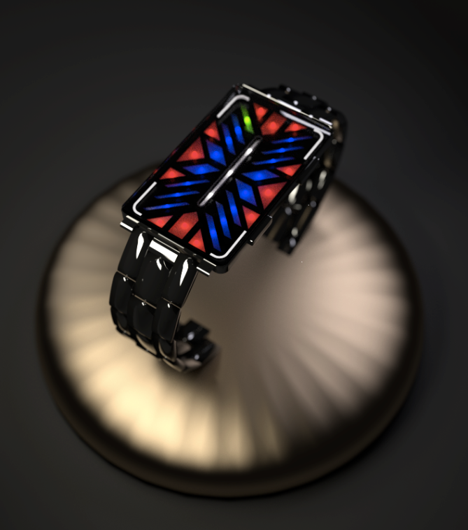
Design submitted by Sascha from Germany.
Sascha says: “The idea for this watch design arose from my intention to buy a new futuristic watch. I started thinking about the attributes that I personally set value on, and after some thoughts I began working a timepiece I would love to wear myself, whereat I focused on light and not being minimalistic.
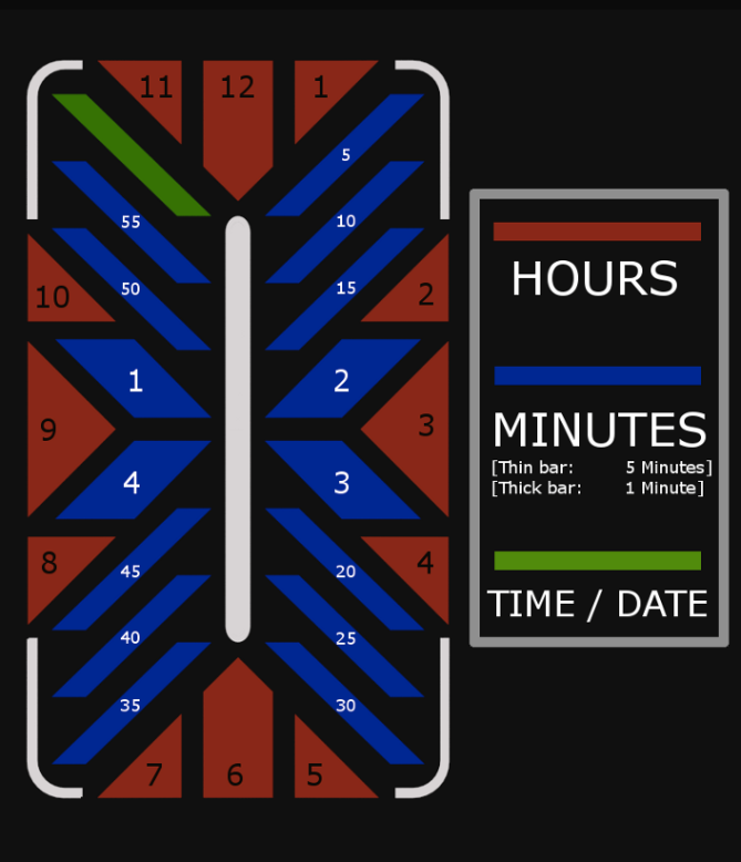
The design I chose is basically an enhanced, restructured and conciliated form of the “standard” variant of sci-fi-themed watches. Depending on the certain LED that is activated (minutes) or not activated (hours), the user is able to read the time and date without much effort.
I think the design mostly goes with people who like a modern and futuristic style while appreciating a balanced relation of playfulness and seriousness.
As mentioned before, I tried to achieve a “feel of substance” (which means that the watch is not restricted to only a few LEDs, but uses the whole space given) and to combine that with a certain kind of heraldic layout, which results in a “closed” piece of art.”


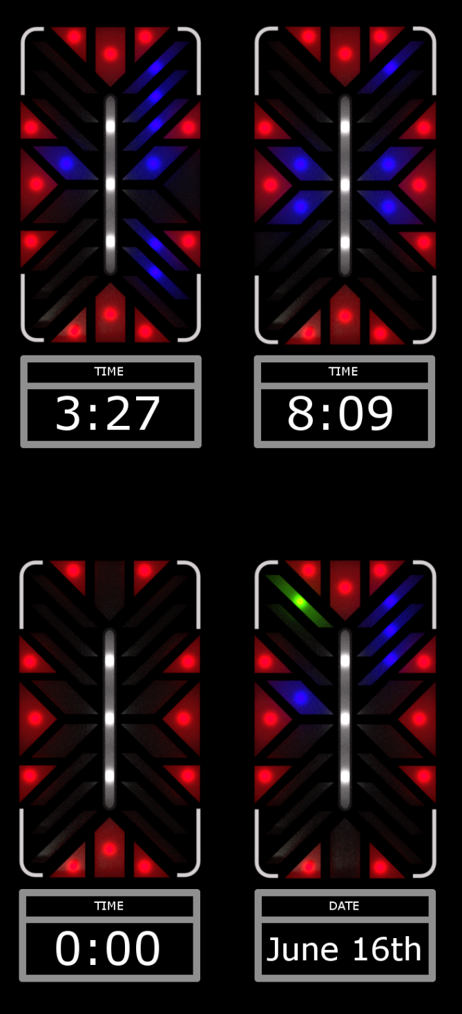
The design and concept are well thought out for this time piece. I especially appreciate the added ability to check the date. However, from the photos above, I feel there isn’t enough distinction between the lights that are supposed to the visible/not visible. In particular, the red hour lights look as though they are always visible It could just be a discrepancy with the pictures, but if not, it’s an aspect of the design worth looking into.
Overall this watch is asthetically pleasing and has a much more slimmer design.
LikeLike
Hey, Mandara,
at first, thanks a lot for your feedback 🙂 Now to your critique: It was actually my intention to make all the red lights for hours be activated except for the one that indicates the current hour. I thought the “red frame” that is created by those lights might be a good base, together with the white light in the centre. So you have only slight changes in that outer frame over time, whereas the blue elements really “count” the minutes, so there is a lot of dynamic change in the more centered parts of the watch.
But all in all I am very pleased that you like the aesthetic style 🙂
greetings, Sascha
LikeLike
Sacha,
I see where I’ve misunderstood! In light of that, it makes for all the more a better watch!
Cheers,
Mandara
LikeLike
Hey Sascha … Welcome to TOKYOFLASH designer’s family … It’s really a nice presentation of time … vivid n’ symmetrical watch … nice start of imagination n’ creativity … Best of Luck for your future designs …
LikeLike
Thanks a lot 🙂 It is nice to hear that you consider the watch to be vivid, that was one of the main aspects I tried to implement while creating that design.
LikeLike
This is one of the most beautiful watches I have seen on the blog in a long time. It reminds me of the windows designed by the architect Frank Lloyd Wright.
LikeLike
Hey, thank you for your comment, I am really kind of moved by those words. Hopefully we will be able to see that design in reality one day 🙂
LikeLike
Hi Sascha, wilkommen im Blog!
This watch looks really tokyoflashy and follows their tradition: cool display pattern, several LED colors, an interesting theme that justifies the look. Honestly, I think it’s maybe too traditionally tokyoflashy, not really brand new. But I have to say, I would prefer this watch to a Broke, a Wasted or a Galaxy (all seen in the watch museum), so YES, I would buy it.
Time reading works good and the time examples look space-ish 😀 First the display felt like there’s too much going on for me, but it’s actually nice. I can see it activating with an animation and then impress the buddies, when you show the watch to them. The display reminds me of some 90’s Star Trek consoles, woohoo!
Sasha, good luck with this concept!
LikeLike
Again thanks a lot for that detailed comment! 🙂 You mentioned that the watch follows the basic traditions of Tokyoflash, and I am glad I was able to achieve feel. I need to say that I LOVE the design roots of this company and think that it is “not the worst decision” to rely on those roots from time to time 🙂
On top of that, it is nice to hear that the readability is actually given, which was one of my personal concerns when I was finished with the first version of that conceptual design.
As you mentioned that the layout felt kind of “too much” at first, are there any aspects that you would like to be changed, or was it really only some impressions at first glance that turned out to be different later on?
Greetings, Sascha 🙂
LikeLike
I think it’s the first glance. One has to give a concept more that just the first glance. Tokyoflash watches often need some moments 🙂 Actually, the watch would be off the most of the time, the more impressive looks the display at the press of the button. I like Pete’s analogy of the stained glass window. A more tame look (only one color, using rectangles and generally less angles) wouldn’t be that striking.
LikeLike
Yeah, you are right 🙂 I think that one has to look at a concept for more than just a minute to see its real intention and beauty.
With regard to the stained-glass-window-style: It is quite interesting that a lot of people who looked at this design thought about church at first, although it was not my main intention to achieve this impression. I think it was a subconscious process while designing that watch, as I always liked that kind of windows and its outstanding style 🙂
LikeLike
This is an interesting concept, reminds me of a stained glass window. I personalluy find it a little difficult to read the time even tho its a relatively conventionally time telling method. The display is a little too busy for me. If it was a little simpler it would be clearer to read the time. I could imagine a range of these wastches based on one LED layout with several different “lenses” with different colours and designs. This has potential so I support it 5/Yes. Welcome to the blog and best of luck! 😀
LikeLike
Thanks for your feedback! 🙂 As you criticised the readability of the watch: Do you have any specific changes in mind that you think should be done for making it easier to read the time? Maybe shortening the bars so there is a bit more free space within (which I actually tried to avoid as mentioned in the description) or maybe making only the certain red light for the current hour to be lit?
By the way I think it could be a good idea to extend that concept to some sort of series with different “secondary designs”.
Greetings, Sascha 🙂
LikeLike
Its tricky to get the balance between the aesthetic and readability. If it was my design Id be tempted to make the layout more like a conventional analogue face. With a ring of minutes (5 min blocks) around the outside and hours inside of them where you would expect to see them on an analogue face. This would be more intuative. The risk of course is then it might loose the striking look you currently have.
I think it would be easy to have a positive and negative time telling method option, so the wearer can choose between easy and more visually dynamic. These are only my opinions of course. Eitherway its an interesting concept which I support! 😀
LikeLike
I personally thought about those different methods of time telling, too. It would be a great decision regarding battery life and individual liking. The implementation would also be really easy, for example by just holding the button which is used to activate the lights. As Jan posted, this idea could then be extended to a third mode, namely an artistic switching between the lights for impressing the people surrounding 🙂
LikeLike
Welcome Sasha-chin!
If the display is less colourful would look more futuristic.
I like the colour to be maintained like this though, you can use came case and strap of Kisai Traffic.
This would use same type of LED and technology like Traffic, Broke and Round Trip.
LikeLike
Hey, thanks for your comment. I think you are right with your opinion towards the case and strap of the Kisai Traffic, it would fit the design, although I think that a black color of those components would increase the contrast to the – as you called them – colourful lights of the display itself.
Greetings, Sascha 🙂
LikeLike
Hej, this watch is a nice futuristic mix of an actuall watch and a bracelet. The display design is well elaborated, though it took me time to understand it. The LED-colours look like old windows in cathedrals and give it a really fancy touch.
I wonder if it could be possible to add any extra features like a stopwatch or a “disco-mode” (It would be very unique to have a bracelete that blinks and glows to the beat of music).
So far well done sir!
Cheers, JJ
LikeLike
Hey Jan, thanks for the feedback! I think that both the stopwatch functionality and a kind of “disco-mode” are potentially possible, and they would surely be a real eye candy. The only concern is then about battery life, but as one normally neither uses that demonstration mode nor a stopwatch for hours, it could be a great addition.
Greetings, Sascha 🙂
LikeLike
Hi,
I like the watch because of its design.
It’s a great idead to combine Arts with Techniques.
By the way, I am in an Arts & Music Class in my school, so I have to honor the watch anyway. 😉
Design is cool and innovative.
My problem is unfortunetely the reading of the time on this watch.
But I could be eased to it.
Sorry for my bad Englisch, my English teacher would beat me certainly.
PS: I will advise the watch.
Regards
Richard
LikeLike
Nice to hear you like the combination of art and technique, it is something I personally set value on, too.
And I have to admit that it is actually not that easy to read the display at first, but one gets used to it in no time, I think 🙂
Greetings, Sascha
LikeLike
Hiho Sascha,
I really like the disign of your watch, it’s an eye-catcher, for sure, wheater you’re into futuristic design or not – makes me wonder if you’re some kind of professional designer 😉
Though, the reading of the time isn’t very intuitive, as mentioned before by other comments.
I guess, it requires some time with the manual to get used to it, but anyway, it’s not an obstacle that would keep me from buying this watch =) Great work!
Greetings, Söhnke
LikeLike
Thanks for your comment! I didn’t think that this design could be appealing to some who is not into futuristic design when I first created it, but it is great to be told that it could actually be that way 🙂 It is a nice thought that there are people with different likings who feel satisfied with that watch!
Greetings, Sascha
LikeLike
Nice design Sascha. Nicely arranged and easy to tell the time/date on. I hope TF would make it in other colours too. Good luck with it. 😉
LikeLike
Thanks for feedback 🙂 If Tokyoflash is interested in this design at some point of time, it would be a great idea to use different colours for differents tastes. Maybe some variation in the colours of LEDs, bracelet or case.
And by the way, was it easy to read that watch from the very beginning or did you need some time for “practise”?
Greetings, Sascha
LikeLike
I was a bit thrown at first because of the 4 minute markers in the middle. But when I looked at your diagrams it was easy enough. 😉 I don’t think it’ll be a problem for most people.
LikeLike
It is good to hear that 🙂 I personally think that after understanding the concept once, it is only a matter of more or less experience for every person (The same – in my opinion – applies to other styles like binary watches, which seem to be overwhelming at first, but one stops to think about the meaning of every light at some point of time and starts to see one’s “own pattern”)
LikeLike
Hey Sascha! Nice work! I like it a lot! Even though I am not that much of a future watch person, I really like design and idea behind it!
LikeLike
Hey, thanks for being that positively stunned by the design although not being into futuristic style…I feel kind of moved by hearing that 🙂
LikeLike
i realy like the design of this watch. it took a short time to understand the arrangement of the leds but it is build-on logical und quiet well to understand. i like the idea. maybe you could do something for the option of an indicator to show the difference between a.m. and p.m. but it is not realy necessary, i think. only a think i have noticed while looking at it. all in all a very nice idea and a great layout and i would buy one of this 😉
LikeLike
really*
LikeLike
thanks for your opinion! If it is really considered to be necessary to have a light that indicates a.m. and p.m., the white light in the middle could be used for that (although I think it would have a slightly negative effect on the design when that light is turned off).
And yeah, hopefully you can get the chance to buy one of these one day 🙂
Greetings, Sascha
LikeLike
the idea is brilliant!.. no words to explain!.. excellent piece of work!! .. goood job mate!! 🙂 🙂
LikeLike
Great to hear you like the design 🙂
LikeLike
Wow! I can’t believe this concept design just reached a 4.0+ rating. Many thanks to everyone who supports this piece of work!
You are all still appealed to comment and express what you like, dislike and what you would like to be changed and maintained 🙂
LikeLike
the design is awesome! this is what i call a masterpiece. keep up the good work buddy 😀
LikeLike
A truly futuristic design, which combines aesthetics and a logical thought.
LikeLike
wow!
LikeLike
Hi,
Love the watch.
I actually had to spend a little time on the diagram to understand how to read it but it was done quickly.
As someone already mentioned it reminds of stained glass in cathedrals and jewelry work in medieval/renaissance works.
I love that it’s a watch combining both futuristic and antique sensibilities. And yes I would buy it.
Keep on designing!
LikeLike
This concept is both unique and easy to grasp, but I don’t feel that the desired futuristic effect comes through. Nor does it seem to be unisex in nature.
However, I do feel this design captures something extremely elusive to LED watches; feminine elegance. The retro stained-glass effect is superb and personally, I would focus every variation of this design squarely at a female audience. As such, I think a gold colored band would be a fantastic addition.
Great job and good luck!
LikeLike
A graphite or tempest acetate band like that found on the RPM, would probably go really well too.
LikeLike
wow, great piece of work!
As some others before I had to think about the stained glass in churches and I immediaty wondered what these pattern might mean to people in the future 😉 because as you intended, the futuristic look of watch is very clear too. I also really like the combination of the colorful lights and the black bracelet it gives the whole watch a very elegant and luxury appearance.
I would buy the watch with this bracelet but I think another black one made of stiff leather for guys who aren´t as would fit too 😉 but it looses a great part of its futuristic charm then. And please no gold-bracelet as it was posted in the comment before, to my opinion that wouldn`t match with the colours in the displays.
Keep on doing this! i would like to see some more designs made by you 🙂
LikeLike
*guys who aren`t as courageous (that one missed ;))
LikeLike