Design submitted by Sam from Germany.
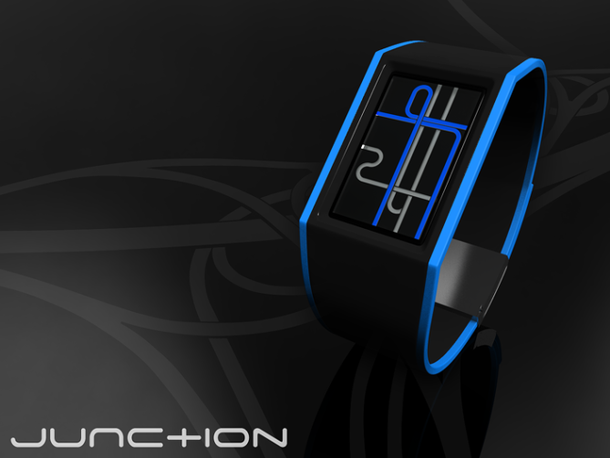
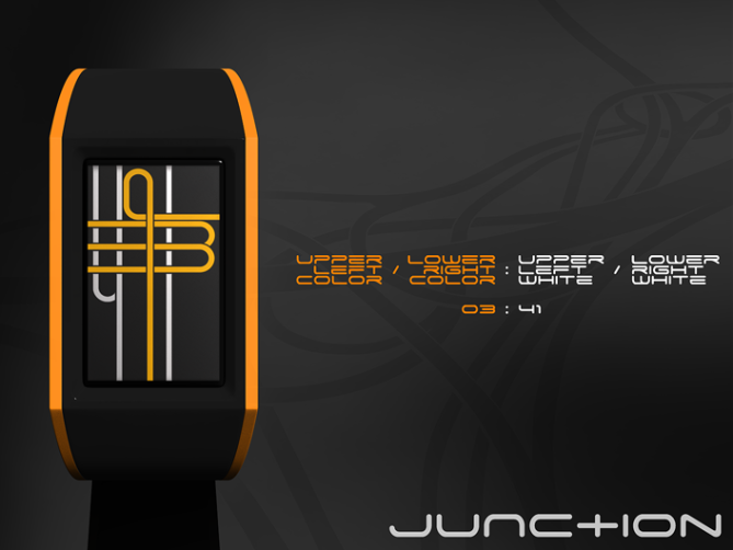
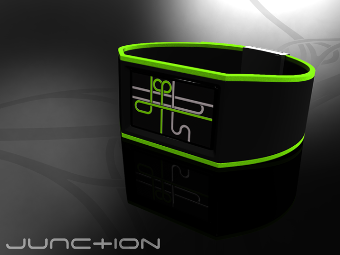
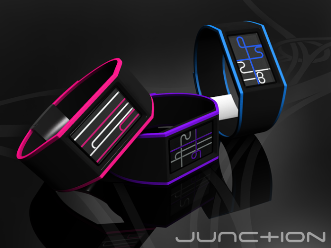
This watch concept is inspired by the interlocking fluent mandala-like shapes of motorway junctions. The time is told by four digital numbers which are like four motorways that meet in the display section. Each motorway comes from outside, goes through one or more curves, forming a number and then leaves the display again.Two motorways are colored – those tell the hours. The two colorless ones tell the minutes. The display works with a traditional LCD layer and a colored one to achieve a diversified and readable image. Although the display is inspired by motorway junctions, it leaves enough space for interpretation. The technical as well as artistic expression might appeal to quite some people.
The watch is creative, relatively easy to read and has a high recognition value. There is a link to my YouTube version of the presentation here.


Sam … Your Junction Watch … is really nice futuristic watch … nice use of color … curves used in your watch are really fascinating … out of box … wizard stereo type watch … great work Sam … 🙂
LikeLike
Looks wise a 5! Wish There was the time next to each watch so I could confirm if I am correct. The bottom pic in pink is that ….sorry can’t read it. 00:06?? Help me…hahaha
LikeLike
Its a liitle tricky at times to read, something Im sure we would get used to quickly (a few more times next to the images like Tim said would have been beneficial)
Looks great, loving the bright colours. Great work! 5/Y
P.S Tokyoflash cannot be help responsible for people getting lost on the tube system after looking at these images! lol
LikeLike
Funky! Took a few minutes, but I think I can actually read the time…but got a bit dizzy doing it.
LikeLike
Superb presentation, as usual.
5 * / Yes!
LikeLike
Thank you Tokyoflash for adding this to the blog!
And, heyhey thank you everybody for commenting!
Tim, it’s 00:00. On the green one you see how a 6 looks. It’s not super easy at first, but the numbers can’t be confused.
Hmhm, practice is the key. Always remember color-color : white-white. Yeah, maybe some explaining times next to the images would’ve been wise Pete. Here we go:
Blue#1: 07:24
Orange#1: 03:41
Green#1: 08:54
Green#2: 12:01, Orange#2: 01:42, Pink#1: 08:35
Pink#2: 14:14, Purple#1: 16:24, Blue#2: 05:28
Pink#3: 00:00, Purple#2: 07:14, Blue#3: 10:01, Cyan#1: 15:38, Green#3: 02:46, Orange#3: 00:29
Hi dzign, maybe you should slowly drive the timeways with your finger so you don’t get travelsick 😉
Merci bien monsieur!
LikeLike
That’s the way… I like it…
5*/Y
LikeLike
Looks very stylish Sam! 5* and Yes.
LikeLike
Spaghetti Junction. 🙂
LikeLike
in general, i’m not a huge fan of non-SS watches…….however this is just awesome!
my only wish/hope is if this watch was made, it would be like an ipblack or black acetate.
plz don’t go plastic.
5/Y as long as it’s not plastic 🙂
LikeLike
rly good design! should be handy if you set all the numbers at a row, and set more time next to it.
gj and good luck!
LikeLike
Now I hear the song in my head, Laszlo 😀
Thank you Lloyd. You are right about the junction!
Mhhh diclonius, acetate would be very nice too.
Hi befrey! I made a number overview that could help (will show up here soon)
For more pics, info and also a number overview, check my facebook album
Thank you for your comments!!
LikeLike
Very artistic digits, and a stylish design too. It looks very modern, but also reminds me of my brother’s ‘Hotwheels’ tracks winding all around the loungeroom floor when I was a kid.
Of course I am partial to the pink one, because I love black, pinks and purples, and the pink looks great with the black.
Nice job!
Diane.
LikeLike
Hehe, that’s nice. I’m glad you found a favorite. Thank you Diane 🙂
LikeLike
Great work!!!!! I’ll by it first!!! Hi from Russia
LikeLike
Hi to Russia! Thanks for the comment!!
LikeLike
Looks great. Could the four not be just a mirrored seven to try to stick with the one line in and out for as many numbers as possible?
LikeLike
Thank you thinking this through Jan, and for commenting!
Good idea. What you mean, is finding a style, that can be argued for easily in terms of “how the numbers were made”. And “they are made of a single lane” is indeed a simple phrase.
There are two points, that could stand against a simple creating rule: the readability of the resulting numbers and the actual inspiration which offers a wider designing vocabulary. As for the readability, I first have to say, sometimes my numbers are easy to read, sometimes bam, eye crossing time 🙂 Here, I tried to transform the known digital numbers into curvy ones. A 4 requires two lines. I found a way to merge these two lines, keeping them looking like belonging together. As for the designing vocabulary. You can see in the backgrounds of the images (it’s the so called spaghetti junction ) there are different types of how the lane goes along: alone, making a loop, splitting up, merging with another one / splitting in two, running below another one… So I can at least say, I’m sticking to the original.
LikeLike
Well, it is a great design. If it makes it to production i will buy one. Good Luck
LikeLike
Great design. This should be made
LikeLike
Thanks Jan 🙂 Thank you too Agent13!!
LikeLike
love it, just love it.
LikeLike
Sknaht tola 😀
LikeLike
Love this design. Want want want
LikeLike
Thanks thanks thanks Dee!
LikeLike
the lines looks like an old windows screensaver. Look very nice. 5*
LikeLike
Thank you Mak! I remember that pipe screensaver 😀
Wow, I didn’t know we can still comment!
Then I have the chance to say thanks to everybody for the support. Thanks everybody for the support!! IT’s always nice to read positive comments as well as productive critique.
Lalalala,
Sam from Germany
LikeLike