Design submitted by Laszlo from Hungary.
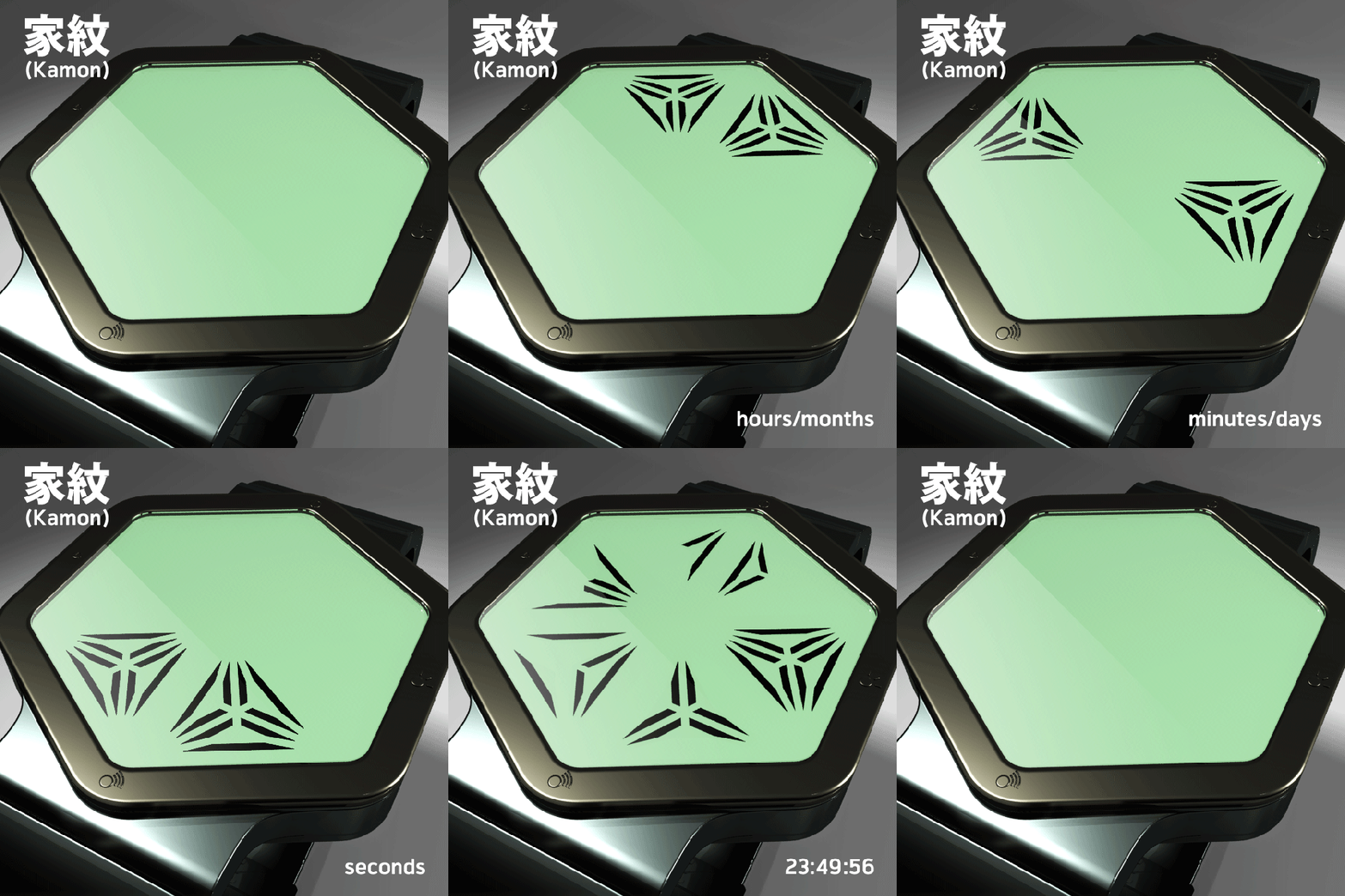
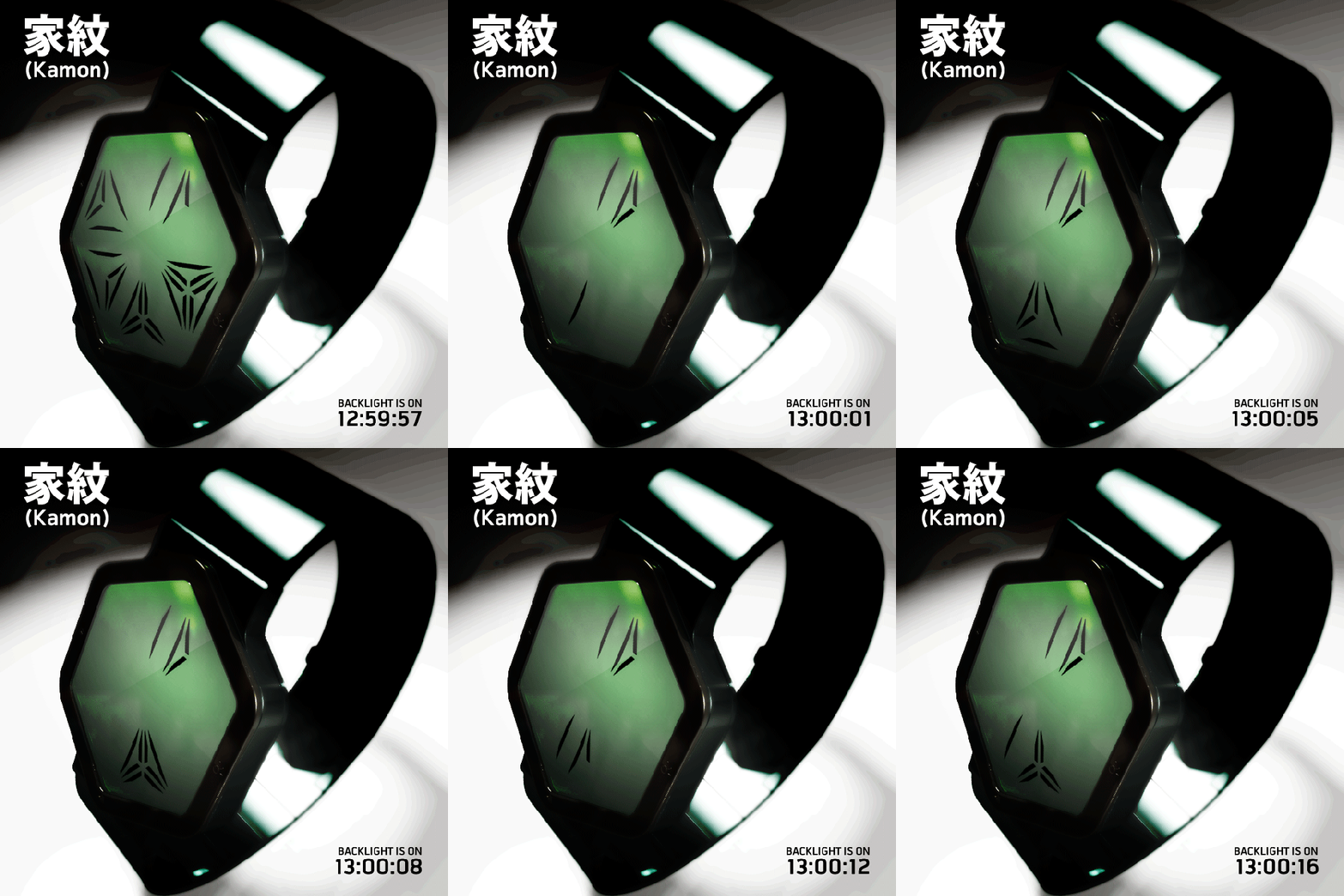
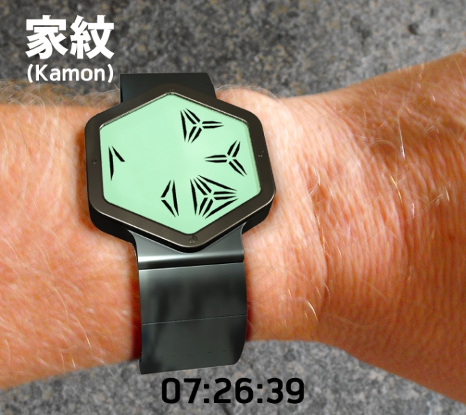
This watch design has an always on touchscreen LCD display and features time and date, plus alarm mode. The time is indicated by three column (hours, minutes and seconds). Easy to read, just count the sticks!
The idea for this design came from Mon (紋?), also monshō (紋章?), mondokoro (紋所?), and kamon (家紋?), which are Japanese emblems used to decorate and identify an individual or family. While mon is an encompassing term that may refer to any such device, kamon and mondokoro refer specifically to emblems used to identify a family.
The devices are similar to the badges and coats of arms in European heraldic tradition, which likewise are used to identify individuals and families. Mon are often referred to as crests in Western literature; another European heraldic device similar to the mon in function.
Mon may have originated as fabric patterns to be used on clothes in order to distinguish individuals or signify membership in a specific clan or organization. By the twelfth century, sources give a clear indication that heraldry had been implemented as a distinguishing feature, especially for use in battle. It is seen on flags, tents, and equipment.
Like European heraldry, mon were initially held only by aristocratic families, and were gradually adapted by commoners. On the battlefield, mon served as army standards, even though this usage was not universal and uniquely designed army standards were just as common as mon-based standards. (cf. sashimono, uma-jirushi) Mon were also adapted by various organizations, such as merchant and artisan guilds, temples and shrines, theater troupes and even criminal gangs. In an illiterate society, they served as useful symbols for recognition.
Japanese traditional formal attire generally displays the mon of the wearer. Commoners without mon often used those of their patron or the organization they belonged to. In cases when none of those were available, they sometimes used one of the few mon which were seen as “vulgar”, or invented or adapted whatever mon they wished, passing it on to their descendants. It was not uncommon for shops, and therefore shop-owners, to develop mon to identify themselves.
Rules regulating the choice and use of mon were somewhat limited, though the selection of mon was generally determined by social customs. It was considered improper to use a mon that was known to be held by someone else, and offensive to use a mon that was held by someone of a high rank. When mon came into conflict, the lower-ranked person sometimes changed their mon to avoid offending their superior. The mon held by the ruling clans of Japan, such as Tokugawa’s hollyhock mon and the Emperor’s chrysanthemum mon, were legally protected from unauthorized usage.
Occasionally, patron clans granted the use of their mon to their retainers as a reward. Similar to the granting of the patron’s surnames, this was considered a very high honor. Alternatively, the patron clan may have added elements of its mon to that of its retainer, or choose a completely different mon for them.


Very interesting. Reminds me of Predator a lot.
LikeLike
yep. needs red LED.
LikeLike
Colour mutations: http://www.facebook.com/photo.php?fbid=354985217872002&set=a.322003427836848.67739.313229228714268&type=1&theater
LikeLike
I like it cos it reminds me of a kiwifruit. 🙂
LikeLike
You make me smile.
LikeLike
The time telling method takes a little getting used to, remembering which group of lines/block tells what incrument, the seconds being the most obvious. Maybe these could be marked somehow to save you having to think about it. All that aside its a great looking design which is totally makeable. 5/Y Best of luck! 😀
LikeLike
Thank you very much Pete!
LikeLike
Very interesting, that these symbols have an own iconographic power (they look partially like numbers, partially like kanji) , but are “just” countable segments. So the display looks more complicated than it is and so very appealing to me! I also like the hexagonal display and the basic gemoetry, reduced to the necessary. The geometry does not provide distractring details so the numbers are the protagonists. 5*/YES give me 😀
LikeLike
I’m glad you like it, thank you for your detailed comment.
LikeLike
Tim says:
Very interesting. Reminds me of Predator a lot. -> AGREE
XXXXXXXXXXXXXXXXXXXXXXXXXXXXXXXXXXXXXXXXXXXXX
Fresh concept, not just unique font, they are not obvious numbers! I like version with inverted colors. The display is very cryptic indeed. This is the watch for someone who wana be total predator die hard fans! Prepare to memorize the symbols!
LikeLike
Thank you for your feedback Firdaus!
LikeLike
.:love the patterns, a little difficult but that’s what will make it fun. Yes, given colour option, I’d buy it, & yes, reminds me of Preditor too:.
LikeLike
its very interesting!
you need to get used to it, to actually use it fast
or i’m just dumb 😛
LikeLike
Hi befrey.
You’re not dumb! Don’t complicate the reading, just count the sticks!
😉
LikeLike
Very interesting display, first I think it’s difficult to read, but not. Easy to read, nice display. 5 starts.
LikeLike
Thank you very much akicam!
LikeLike
Thank you Tim!
LikeLike
The hexagonal display is nice. The position of the sticks would sometime make the minute look odd. ( like the 2 on the 7:29:36 picture ) As of the symbol meaning, it would be fast to learn, without having to count the sticks each time.
I have 1 question : what are the 4 symbols on the case ? ( at the 3, 6, 9 & 12 position )
LikeLike
Hi Makkovik!
The symbols is similar like: http://www.tokyoflash.com/en/watches/kisai/rogue_touch/
LikeLike