Design submitted by Jeffrey from the Netherlands.
Jeffrey says: “I bought my girlfriend a square watch, and on my desk was a Wacom tablet with lights which you can only see when they come on… and an idea popped into my head! It was not perfect at first but it all came together in the end.
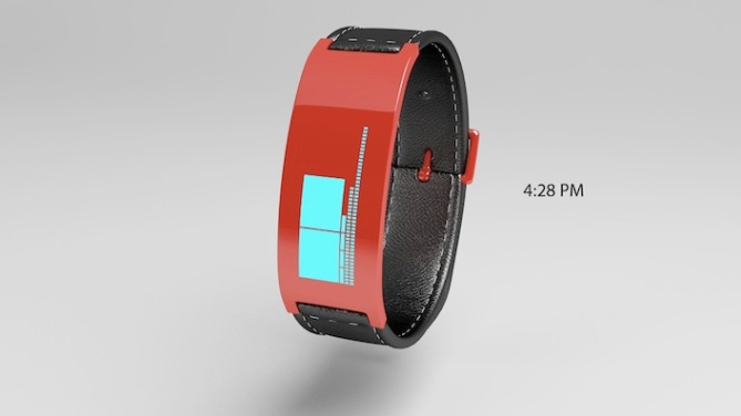
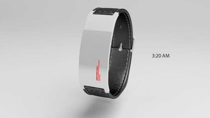
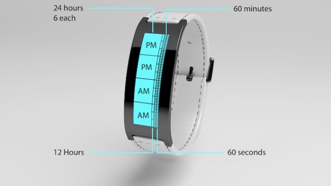
The design itself is very simple, but it works and feels good. The time is displayed by simply counting the blocks for hours and minutes. To make reading the time easier, I created 4 large blocks which each represent 6 hours of time – to show AM and PM, up to 24 hours. Next to those blocks are hours, a total of 12, the 4 bigger blocks divide those in four groups of 3 hours. Next to that is minutes and seconds, a total of 60 blocks each. Every hour divides min in 5, so 5 groups of 12 minutes.
When the watch is on or off it doesn’t look sci-fi. The watch is not to hard to read, you don’t need to be a genius. The design is very neutral, so i don’t see older people wearing it, more in the range of 16-26 – trendy people, which is very common nowadays.
Most watch designs like this are very complex in telling time and design, which is fun, but i want the strange time telling with a very simple design, especially not to sci-fi,big or complex, which myself will not wear very fast. I think this time telling just hits the spot of medium but still fun. It may need changes, to the curve of the watch, for variation of wrist size.
An interesting design! Jeffrey has tried to simplify the time telling by adding markers in the form of four large blocks. What do you think about this? Do you find the time telling easy, difficult or spot on? Let us know your thoughts in the comments section below.


It’s a cool idea and it would make a killer watch but figuring out the minuets is going to be too much of a hassle in my opinion. Maybe if say the bar at every 5 mins would be a bit different so we could see the general time.
LikeLike
if i set the bar of seconds in evry 5 seconds?
+ have you not seen the last picture the big blocks are for measurement.
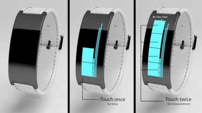
Each big block devides 3h-15min-15seconds, should be easy to tell the general time.
ty for your comment 😀
LikeLike
Are you new to the blog Jeffrey? If so welcome!
Looks cool for sure, I think that the size of the blocks could be better proportioned, the 6 hour blocks look a little large in comparison to the others. Also if the minutes and seconds were divided into blocks of ten or something would speed you the reading process. These are only minor details. Black white and blue for me! 5/Y Best of luck!
LikeLike
i can try making min and hours wider.
indeed it are minor details can be still changed easily.
ty!
LikeLike
if the hours, minutes, seconds mark where wider, I would consider buying it.
LikeLike
thanks! i have remade it , and its wider now! + i have now 2 rows of 12 hours which merge in 6 hours each.
and the min merge in 5 min group. then 3x 5 min merge n 15 min group.
seconds stayed the same.
so its wider easily more readable, and fast reading without having to calculate.
i have also redesigned the outside, to be wider, and lost the leather.
LikeLike
Hello Jeffrey, welcome to the blog!
I really like the took of the watch: slim, minimalistic, vertical display, cool material combination, interesting looking display and pleasing colors.
It has to be “Every hour divides min in 5, so 12 groups of 5 minutes.” in your text, right?
I have to agree with Layfon about the figuring out the minutes. You are right, it’s all about counting, and you divided everything cleverly. As much as the big blocks help, I would need something like that for the minutes.
How about you add another column of blocks like the 12 hour blocks which light up, depending on how far the minutes go. Maybe 4 big blocks, 12h blocks, gap, 12 helping blocks, 60 minute blocks, gap, 60 second blocks.
Or how about letting each 5th minute be a wide block, that reaches out to the right border of the display. This might disturb each 5th second but hey, they change every second so there won’t be much trouble. Extending each 5th minute once it shows up would easy up reading so much.
I don’t understand why the upper two blocks say PM. After 6AM it’s still AM. Maybe you had a 24h display earlier?
What about the time on the last image. Isn’t it about 4:50:55?
As I wrote, I like the look and that’s why I would buy it if it were more comfortable to read without losing the blocky look.
LikeLike
Again look the last pictures the big block divide 3 hours 15 min and 15 seconds.
the 24 hour display is correct right? otherwise i have to change it.
and seconds can easily be divided in 5seconds or 10. and should make it even easier to read.
whit out telling the secret ^^
TY!
LikeLike
Ah, now I understood the last image 🙂 YW and TY for making clear again.
Oh, so when it’s 7:30 am, what big blocks are on then? No blocks, like in the 3:20 AM picture? Why are the upper two big blocks PM, when the two lower blocks are on in the 4:28 PM image?
LikeLike
24 hours divided by 4 is 6 hours.
every block will stand for 6 hours.
if its 7:30 AM 1 block will light up standing for 6 hours.
also 7 blocks of hours light up..
as soon as it turned PM like 1:00 PM
2 blocks will light up for 12 hours.
and 1 block of the hour.
LikeLike
I would be happy to change this design! 😀
maybe if every 5 complete min light up as 1
and every further min is divided.
and plz guys look at the big blocks in the last picture they divide 3 hours 15 min and 15 seconds.
i think if these changes happen it would be correct.
LikeLike
Nice graphics Jeffrey but, as others have said, the time telling method needs to be simplified to make it more user-friendly. Also, this sort of thing has been done a lot on here. It’s a great first submission though. 🙂 Good luck with it.
LikeLike
i have already way simplified it and made it easy to read, i will post a re design somewhere in the future 🙂
and i looked on this forum and this has actually not been done yet. not in this way at least.
Well for a first submission its very fun!
i needed feed back to make it better, and i will! 🙂
thank you
also the look, will you change it? i was thinking of making it wider.
And every 5 min merge into 1 block now, 3x 5 min also merge into 1 block, like the big block.
seconds does this 2.
also i was thinking of removing the big blocks and do 2x 12 hours on it.
every 3 hours also merge into 1 block.
LikeLike
It looks nice Jeffrey. 😉 When you post your updated design, I’ll try and give you some more feedback. One thing I was wondering though was why the hours don’t just go in the 4 big blocks. That would give you more room, especially if you make those narrower like Pete suggested. Good luck with your changes and I hope I haven’t made things worse for you.
LikeLike
Just ignore my feedback Jeffrey. You just do what YOU think. 😉
LikeLike
i will think about it ty!
and i already get so high rating whit so many flaws 🙂
LikeLike
Yeah that’s really good Jeffery. 😉 Keep it up!
LikeLike
Ok, I think it is safer for me to just saying this is a good design. I don’t dare to suggest this and that otherwise it would be my design.
Goodluck Jeff, and get along well with us, especially Pete… Ehem… Oh welcome to the blog!
Peace 😉
LikeLike
my ears are burning! lol
LikeLike
well feedback is no problem for me 🙂 i just try what you say, if it doesn’t work, i will tell you 😛
anyway if this watch will ever be made, its you guys that wear it.. doesn’t matter if its my design.. you wouldn’t buy it if it doesn’t work probably, or is frustrating to look at.
LikeLike
Yeah that’s the danger Firdy and everything will end up being the same.
LikeLike
i dont think so ,multiple minds are more creative then 1 , doesn’t matter who it is.
LikeLike
Don’t worry, I often talk rubbish. :o) You might find this link interesting:
http://www.creativitypost.com/psychology/does_solitude_enhance_creativity
LikeLike
You can be the next President 😉
LikeLike
😛
LikeLike
Would rather it being entirely plastic rather than the leather.
LikeLike
maybe some more ppl can show their opinion about this 🙂
i will try to see how it looks!
But i think the leather also is a step back from letting it look to futuristic.
LikeLike
I think this design would look nice as a continous bracelet, like a metallic bangle. If the strap was a black chrome to match the display would look very funky. You can link new images to the comments or submitt them via the submission form and hope TF add them to the post.
LikeLike
my design has changed allot 🙂 and improved, so i will re submit it 🙂 since it now works different 2.
yeah and i will definitively try the black chrome bracelet! i think it will be awesome, but for that i have to make the design look more manly, that’s why i made it wider. and now i , even want to have this watch wait till you see it 😛
LikeLike
Yes please.
LikeLike
yes plz black chrome continous bracelet?
i think it will look cool. if you say yes plz to this design then wait for the improved version 😉
LikeLike
Sounds good, look forward to seeing it! The original is still scoring well! 😀
LikeLike
What happened here? the last time I commented this was on 4.0 (if my memory serves)
LikeLike
No one can reach anything spending no efforts. But, it doesn’t mean that you should make lots of efforts for writing. We suggest you to order coursework online and spend no time.
LikeLike
I want this watch where do I go to but it? The answer to all my long nights looking for a watch bracelet a d here it is! Make this and watch how many will sell, I know it will…..
LikeLike
how can it drop 0.6 in 1 day o__O? with no comments?
LikeLike
It did? That’s a shame 😐 But rating and commenting are not connected – not technically and too often not contextually. Don’t worry, Tokyoflash know how the rating is influenced and they judge a watch by way more criteria 🙂
LikeLike
somebody must hate me 😛 haha nah
welll i hope i dont know how tokyo flash works and wat they think. 🙂
LikeLike
I wouldnt take negative ratings too personally, they often dont reflect the general consensus or TF’s opinions. The comments and external blog activity usually give a better impression of how a design is recieved.
LikeLike