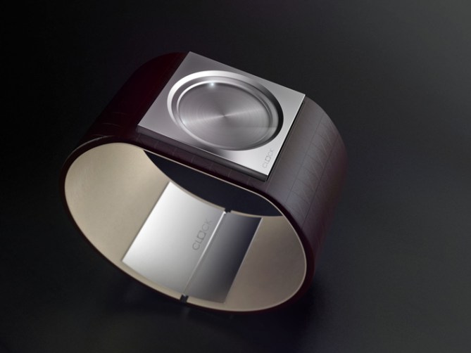
Design submitted by Felix from Germany.
Felix says: I’ve always wanted to make a jewel-like clock, which is minimalist and timeless.
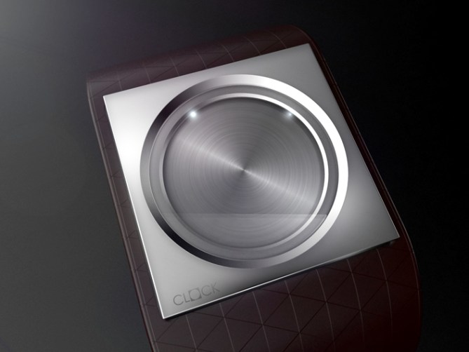
The design elements should be square and circular. No decoration except for the strap. Timeless.
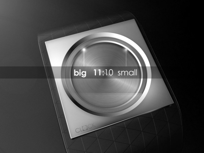
There is a large and a small point of light. One reads the time like an analog clock.
There is no specific target group, because the design is more neutral. However, the draft intended more masculine.
Less is more with premium character.


I like it! Very elegant and simple. I also like that it’s thin. Thats probably why it would look good on women also. I would wear it 🙂
LikeLike
It’s beautiful and I know a lot of people I can imagine buying it. However, as a fan of Tokyoflash, I’d personally prefer a more unusual method of displaying the time. In other words, it doesn’t feel like a Tokyoflash watch to me, but I can easily see it in other watch catalogs. ++ for the choice of strap color.
LikeLike
Instant love. I’d buy this for my girl. Great job Felix-chin!
LikeLike
Very classy, Sign me up for one when it is ready
LikeLike
Reminds me of my neighbour’s house; right up my street…=)
Being drawn to the minimalistic end of the scale, I think this looks very nice. Provided that the difference between the lights is clear enough to avoid confusion and that they’re strong enough to be readable in sunlight, this should work pretty well. Nice work!
LikeLike
Very elegant and quite cool! But how do the led gonna fits in? I think pointer would be better!
LED watch should be something more vividly!
LikeLike
Sehr schick how we say in Germany, hehe. There is nothing I don’t like on this watch, nothing to add or to remove. I share a thought with Logan about it being not so tokyoflashy. But we look at the past, the Kisai 7 was the most minimalistic one. Before that, the RPM took a step into getting less screaming. If we think about the future, Tokyoflash try to go new ways, so anything is possible. I would buy this watch, whoever makes it. 5*/YES
LikeLike
Love this! Super minimal. Very modern. I understand why some people don’t think its very Tokyoflash, but i think this would add something different to their range.
5*/ and a HELL YES! 😛
LikeLike
I have to say this is a very classy design, clearly this is a german design trait! 😀
I like the minimal look and the materials chosen. My only concern is as with all led watches is that in bright light reading the time will be difficult, but this is a minor detail. 5 stars and yes Sir!
I assume this is your first submission to the blog? if so welcome and best of luck! 😀
LikeLike
The apparent brightness/size of the 2 LEDs would be difficult to distinguish depending on the surrounding light level.
However this could be overcome in several ways
– Tasteful colour change; White & Yellow LED
– By having 1 of the LEDs blink
– Hours light is wide (like RPM) or twin LED, minutes is single point.
LikeLike
The single led for minutes and twin for hours would look nice and would be much easier to read. 😀
LikeLike
Many Thanks for your comments.
First I have to add something:
– it seems like to be thin (housing extends into the strap)
– the battery takes place among the polished circle
– the LEDs are located under the rim, so it is a sunlight shielded area
– the LEDs are arranged downwards to the slope of the central panel,
so that they reflected, while the dark area next to it creates a good contrast
I think the best technical solution for the hours/minutes is the twin/single idea.
Colour changing not pursued the minimalist design as good.
LEDs should only blink for a short time.
@Pete: yes it is my first submission
I look forward to more comments and
I’m curious as it goes further here…
LikeLike
Felix has good taste, at least the same one as me.
Really beautiful, sehr schön !
5 * / Yes.
LikeLike
Welcome to the blog! The basic idea is similar to http://www.tokyoflash.com/blog/2010/11/led-reflection-watch-design/ good luck Felix!
5 stars and YES.
LikeLike
I think this is very tokyoflash! Most tokyoflash watches tell the time using methods never before seen.
Who else has seen a watch like this?
5* and a yes. Also, the 2:1 dot idea is great. But when the dots are close together, won’t they be hard to tell apart?
What if you used two lines instead? Just a suggestion.
Good Luck!
LikeLike
I rate this 5 stars and would buy it as soon as it is available.
I agree the twin/single is best for hour/minute indication. Shouldn’t be a problem telling time when they overlap. The time would be obvious: 1:05, 2:10, 3:15, 4:20, 5:25, 6:30, 7:35, 8:40, 9:45, 10:50, 11:55, 12:00.
LikeLike
I rate it 5 stars and would buy it as soon as it is available.
The twin/single idea is best for the hour/minute indication. The time would be obvious when they overlap. 12:00, 1:05, 2:10, 3:15, 4:20, 5:25, 6:30, 7:35, 8:40, 9:45, 10:50, 11:55, no problem.
LikeLike
There are shots where someone as the blogger will get something bad in your posts for example comments about essay papers.
LikeLike
This is an amazing concept, great design. we would love to promote it.
Wish you all the very best Felix
Regards
Murtaza
http://www.dzinetrip.com
LikeLike
I havent checked back by here in a few days. This design is really scoring very well, congrats! especially for a first attempt on the blog! I hope you submit more designs of this quality! it makes us all want to raise our game! 😀
LikeLike
I guess that you should get know about this topic and essay writing. At the term paper writing services that is really easy to purchase already written essays and custom writing reffering to this good post.
LikeLike