Design submitted by Ignacio from Spain.
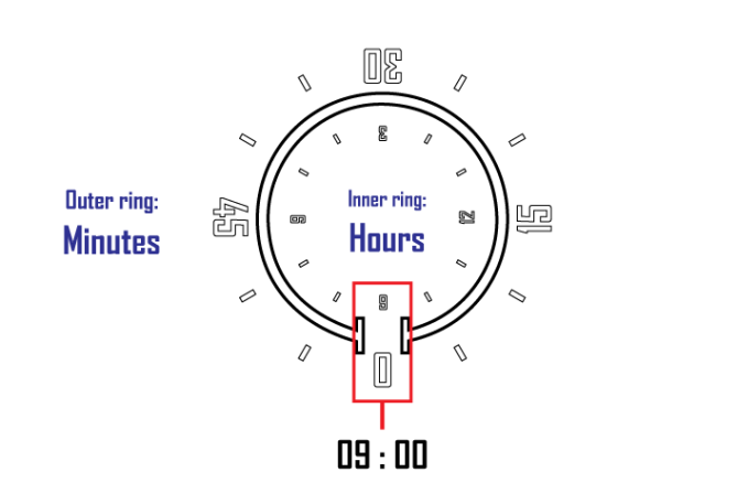
Ignacio says: This design is a variation of another one that I am developing. The original idea is a watch with just one handle, and this design is a version of the same idea but with a more futuristic style. The time is displayed in two separate rings on the outside shows the minutes, and within the hour.
In my opinion, I think make it look more minimalist, not add features or buttons, so it has a built-in touch screen.
To read the time, simply tap in the center of the broken ring to turn it on.
The brand, the white broken ring, indicates the part where you read the time, in the lower part.
And I think with this design I left to see the watch style I love, minimalist, “opaque when switched off but shining when switched on”.
For everyone who loves minimalist and strange watches.
My watch design style.
The idea may seem similar to another design I made (Ronu), even I think of it, but the idea that I set is different, and their designs as well.
I personally find it an original idea, I don’t remember seeing one like it right now, and I hope you like.


A refreshing design which is even able to tell you the time without a university degree.
LikeLike
😀 Whenever I teach my watch “Fire” (right now, in Tokyoflash watch museum)to friends, family… they say something like that. But I tell them it’s only a matter of relearning the system, as we learned the numbers and read the time on a clock when we were young.
Thanks for your comment! 🙂
LikeLike
I really like the simplicity of it. It reminded me of an egg timer at first though…
Butt still, I would buy the white one 🙂
LikeLike
Glad to see you like it 🙂
An egg timer? Great! 😀
To tell you the truth, I have a problem with these watches. Tokyoflash watches I see them as something futuristic, and my problem is that I see as futuristic and minimalist black and white, with shiny and reflective materials, and stylized. Like this design. So I always make my designs with those two colors. The others do not seem very futuristic.
And thanks for your comment 🙂
LikeLike
But* Sorry about that 😀
LikeLike
very cool
LikeLike
Thank you very much 🙂
LikeLike
Hrmmm… I think it’s an interesting design. The design also works with many color variation as suggested. Most importantly, relatively easy to tell time and considered in a unique design range. I can see you become regular on this blog. Ignacio-san, a name to remember along with Peter, Anders, etc….
LikeLike
And I also hope to be regular here, and improve the quality of my renders. It would be an honor for me 😀
Thanks for your comment 🙂
LikeLike
I like the minimalistic approach and you have a nice selcection of colour examples.
The time telling is simple and easy to understand.
The time telling method deosn’t however feel very unique, it works in the same way as an analogue disc watch only in this case using an electronic display. If you can somehow make the display more unique then Im behind it 100%. Nice work Ignatius 5/Yes
LikeLike
Pete comment: Boost moral!! 😀
About the display… I design it according to my tastes, so it’s probable I can not be able to see a better display. And one of the objectives of this site is that people can give their opinion. According to you, how it would have a better display? How it would be more unique? I really want this kind of criticism.
Thank you very much, Pete. 😉
LikeLike
Maybe its not an issue, most people might not see any simularity anyway.
To be honest Im not sure how to best change the display to make it more unique but keep the ease of reading. If I think of anything I will let you know! 😀
LikeLike
Certainly, thank you very much TokyoFlash for add this design to your blog 🙂 It’s an honor to be part of all this.
LikeLike
Very slick, Ignacio! I like pretty much everything about it. It could go touch screen, or traditional analogue with a crown on the side for setting. Very slick!
LikeLike
Very thank you, Pete! yap, initially my idea was that it had a touch screen, like one touch to turn it on and two in one of the rings to set it. About the crown… in my opinion it could break the idea of minimalism. Don’t you?
I’m glad to see you like it 🙂 and thank you very much for the comment.
LikeLike