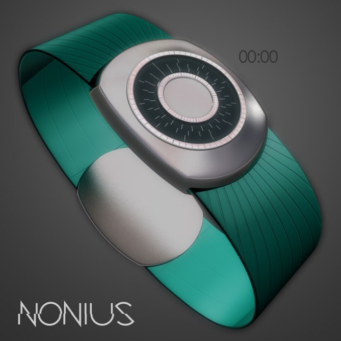
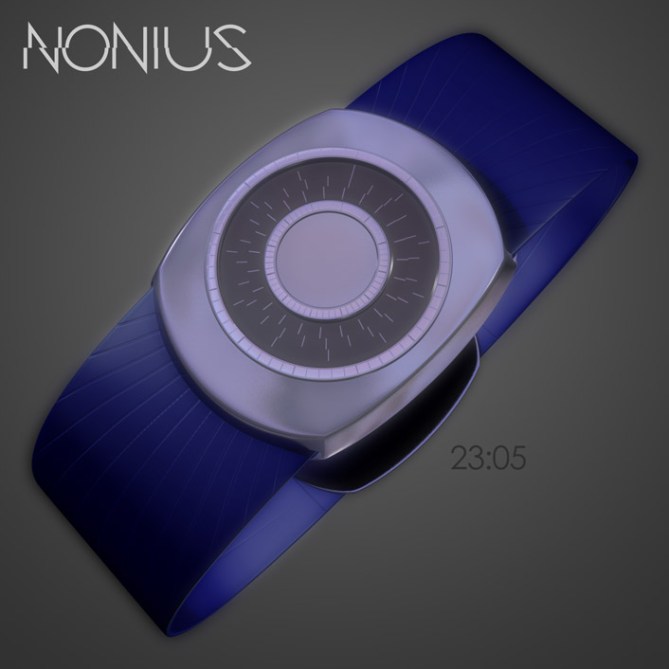
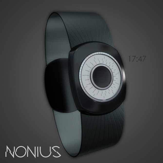
Design submitted by Anders from Sweden.
Anders says: This concept is something of a reworking of Vernier, an old submission of mine. The peculiarities of the vernier or nonius scale caught my attention once again. I wanted to (for once) design a watch as simple as possible around the display, and this is the result.
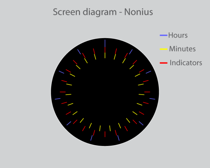
The display is in principle analog, with an array of 24 indicators between 11 outer hour markers and 23 inner minute markers. The hours snap 0,5 degrees clockwise per minute, the minutes 6 degrees and, in order to match up with the minutes, the indicators move 9 degrees counter-clockwise.
One minute line will always match up with an indicator line, thus marking the current minute. The hour markers won’t however, so one of them is slightly longer than the others, to mark the hour. The markers are chrome on thin roundels, to make the time readable in any light.
The styling is very understated, both for reasons of style and ease of manufacture. The strap is easily changed, and can be produced in many colours, as can the body finish and backlight. This widens the appeal, and could conceivably be bought by almost anyone who enjoys simple style.


Using an established mathematical scale to tell the time in an understandable way, is a wonderful thing when it works – and this does.
I’d like to see a slightly more ‘exciting’ display – maybe if the markers were stylised a bit more – but otherwise this is a win for all mathematicians, engineers & physicists.
LikeLike
Thanks to TF for publishing this one! I didn’t think it was going to make it to be honest, but I’m glad it did.
I agree that it might be taking the ‘understated’ thing a bit too far, so I might try to work a similar theme into a ‘flashier’ package, and to try to achieve a better solution for showing the hours.
LikeLike
Very clever! Tried to make my calliper to a watch but was too brainy hehehe. This display works similar and I like that very much. It’s a bit tricky at first but like any other TF watch, with some practice it’s fun. The visual apperance is just wonderful – very stylish and minimalistic. 5’/YES!!!!
LikeLike
Thanks Sam, I’m glad you like it!
I purposefully didn’t make it very complicated, since I felt it might overshadow the display. I was afraid that I’d made it too plain, but so far people seem to like it…
LikeLike
I thought about a more hardware-ish look. Like a calliper has or (better example coming) your Scaled Watch Design Concept from back then. It looked great. Combining the look of that with the reading method if this one – perfect!
LikeLike
Howdy Anders of the grey warden, quite an attractive display, made me want to know more about how this mysterious cornea look dials tell the time. But I couldn’t figure it out very easily…. my mistake, lacking understanding skill perhaps…. Design wise the display is my type, the overall look of the watch is cool. Maker yes, and I need to learn more 😉
LikeLike
I like the look but find reading the time quickly difficult, make it clearer for quick reading and its a winner. I would describe this as “tokyoflashy” 4* and Yes
LikeLike
Thanks for the vote Pete!
I might be tempted to make a second version of this, time and energy allowing, to refine it a bit, and to improve the reading…
LikeLike
3.1? very very ouch! This concept is worth more than that!
LikeLike
I didn’t use the essay writing service for essays papers composing. But, I’m busy for writing and must buy custom essays.
LikeLike
When you have no thoughts how to start your gcse essay, you are welcome to ask: ” write my essays “.
LikeLike