Design submitted by Firdaus from Malaysia.
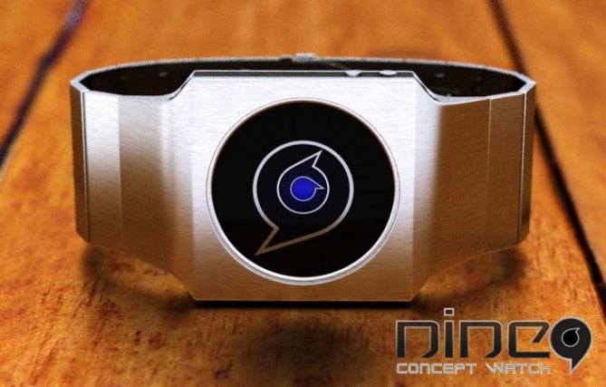
Firdaus says : This analog watch design is inspired by number “9”.
The mechanism of this watch design is almost the same as my previous “Art in A Watch” except the time reading order is read from bigger to smaller discs (hour-second-minute).
This design is suitable for people who loves cryptic looking analog movement watch that is easy to read.
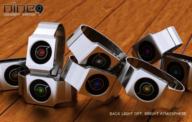
Uniquely different but mainstream enough for easy to read analog watch design, this watch demonstrates contrast identity when the back-lighting is on and off in bright and dark environment.


Wow sexy!!! Another hit my master Fir, I would say Interesting ! Looks very nice. Interesting, with how less details you achieve such a cool result. Simplicity is the key. 9*/YES 😉
LikeLike
Very cool, I like it! Very simple but absolutely brilliant idea 🙂 Nothing to complain about. I would buy!
LikeLike
The last image reminds me of my Rogue SR2, and this is not a bad thing! Love it. Simplicity rocks.
Case is a little too square for me, but that’s mostly just personal taste (I likes me the curvy)
LikeLike
Thank you Tokyoflash for posting this design.
Thank you for the comments Samu-chin, Sandra-chin, and Cory-chin!
LikeLike
This is a bit like your other design Firdy, but I like this one more. I don’t know if it would be feasible, but maybe you could have interchangeable hands of different shapes so that people could change them according to their interests, mood etc. Anyway, just a thought. 🙂
LikeLike
hey, nice watch, but it looks a bit like the sign of vodafon, take a look: http://www.google.de/search?hl=de&safe=off&q=vodafon&psj=1&gs_sm=e&gs_upl=1164l2562l0l2796l7l7l0l3l3l0l86l323l4l4l0&bav=on.2,or.r_gc.r_pw.,cf.osb&biw=1600&bih=758&um=1&ie=UTF-8&tbm=isch&source=og&sa=N&tab=wi&ei=o0gqT-6dEozVsgbvltz6DA
LikeLike
Hi Firdaus, the “9” looks like a sympathetic character who tells the time with his pointed nose (I must be the one to see this character?)
Firdaus is one of my favorites on this blog, because its design is often subtle and seductive.
5 * and Yes, no problem!
LikeLike
Thank you for the comments mushy-chin, burter-chin and Patrick-chin!
9 is very inspiring and cryptic isn’t it?
http://www.mangafox.com/manga/naruto/v59/c572/12.html
LikeLike
Yes!
LikeLike
Very pretty design Firfir, the case is simple and elegent, the display is clear and stylish, whats not to like?
Inspired by the number 5 thats how many stars I award and Yes! 😀
LikeLike
:O I had a similar idea some time ago that I would like to submit to Tokyoflash, but I wonder if having seen this one they think that mine would be a copy…
Anyway, love it. 🙂 I love the concept and the design. In my opinion a round case will look better.
5* and YES (And if I had more money, aside to help pay for my studies, I’d buy two, a green one and one white)
Good luck Fir 😉
LikeLike
Thank you for the support Pitukun. Thank you for the comment Ignatius, don’t worry about your idea because great minds think alike (but my IQ is low). Arigatou mina!
LikeLike
I like this one… although I see sixes and not nines 😀
LikeLike
Maybe call it the 69er watch . 😉 Nice concept.
LikeLike
thank you guys. 9 sounds more commercial 😉
LikeLike
This is a lovely design, and the case looks classy. Unfortunately it does remind me of a phone logo.
It does look quite elegant though and is a good concept.
Diane.
LikeLike
How about a Face in 3 parts? Lines up at 12:00 Or Sexy Female/Male “shape” lines up at 12:00 or Billaiard Table w numbered balls?(Would be stunning!)
LikeLike
Thanks guys for the feedback. I’m not ashamed to tell its inspired by very common number 9 shape, and can be similar to anything. Round shape, why not say it reminds us to moon or blah blah blah… Sillyworm-chin, sounds like gay, could be fun, you can put any shapes, might work.
LikeLike