Design submitted by Albert from the USA.
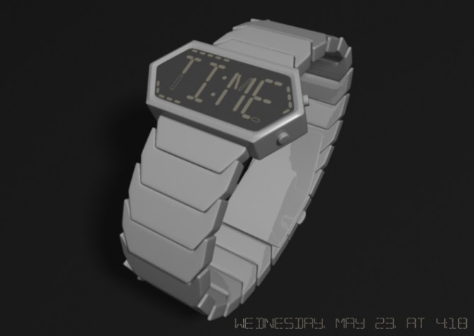
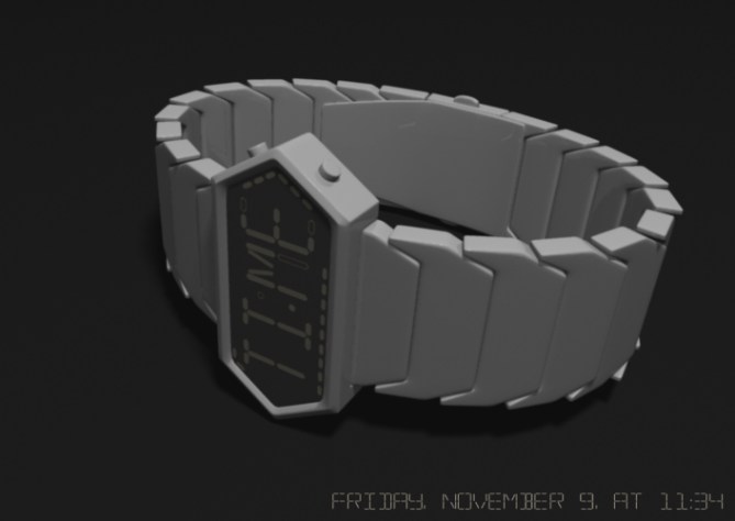
Albert says: I wanted to design a watch that would tell a visual joke, or at the very least, be amusing to the reader. Working from there, I decided to use the word “TIME” to tell the time.
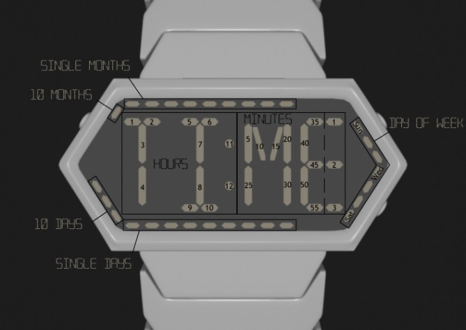
The watch is an always on LCD so the time can easily be read at a glance. Each segment in the first half of “TI:ME”, including the colon, indicates the hour. The segments in “ME” show the minutes. Information about the date is displayed around the edge of the face.
This watch is for anyone who enjoys word jokes or jokes in general.
This design is unique because of its new use of the word “TIME” in place of traditional number.


Hello Al, very geeky watch. It reminds me of my first submission that use the word “day”. It seems this design is extended version of night vision for the smart brain! Love puzzle? What time is it? Arhhh… ….. YES 😉 keep it up!
LikeLike
Thanks for the encouragement! You are right, this does have some similarities to Night Vision. I didn’t really notice before.
LikeLike
Oh yeah, second watch from Albert!
Interesting approach. It’s TIME 🙂
I like the idea you had with the geometry. The time telling method is definitely creative. The indicators should flicker or flash, you know, like a neon tube that’s not properly working. The border segments could be arranged more symmetrically… or more planned. On one hand you have a strict rule (the letters, that you play with by letting some segments stand out) – on the other hand you have these arbitrarily arranged segments… Hm, what about you fill the whole border with segments, and where you have gaps, the segments flash. Then you would have again the impression of something meant to be complete, but not properly working, like the TIME – instead of something that’s broken from the start.
Ok, that’s my impression. Other people have other preferences. The base idea is clear. I think with some tweaking, it could have a future in real life 🙂
LikeLike
Wow. I did not even consider the indicating segments as broken or discontinuous. I agree the border segments seem arbitrary in comparison with TI:ME, but I kind of like the contrast.
LikeLike
Recently, papers writing firms pay special attention at privacy policy! Thence, that becomes safer to buy pre-written essay.
LikeLike
This is a nice idea, seems a liitle complicated to read and a little busy having the date information on there too. I would have been tempted to have a “date” mode using the word “DATE” instead of time using the same priciple.
If you can make it quicker and easier to read somehow it would be worth 5*. Untill then I will save my vote.
LikeLike
Oh yeah, an additional solution vor DATE would be cool!
LikeLike
Hmm. Using DATE as well would be a nice touch. I may have to work something out for that. Thanks for the food for thought.
LikeLike
roll the points that stick up on the links and i think you will have a nice bracelet
LikeLike
That is a good point. I wanted to keep everything either flat or pointed, but on the bracelet, it is just asking to catch on something.
LikeLike
Really like this as a concept.. personally feel it would be slightly better with a more traditional overall look.. maybe like a basic casio, i do like the original strap, just think it detracts from the simplicity of the design. Good point peter made too about seperate date mode. This watch has huge potential 5*
LikeLike
Thanks Keiron! 😀
LikeLike
I see what you mean, and if DATE was also used, a rectangular case would still enclose the words very nicely.
LikeLike
@ Keiron
LikeLike
As you clearly embrace the feedback and comments I just voted, 5* and Yes!
Best of Luck! 😀
LikeLike
Thanks for the feedback everyone! I look forward to hearing more from you about future watches.
LikeLike
goodluck to your next design! this one is already good, but keep improving.
LikeLike
Hey Albert, very nice effort indeed; I can see you put a lot of thought into this idea.
I wonder if there’s a way that you could retain the word “TIME” on the display but also have digital numbers incorporated somehow, so it looks like “TIME” but also has the digital time within. Maybe simply touch the button to switch from the word “TIME” to the actual time in digits?
For me, it’s a bit too complicated to read at the moment but I like the idea of someone taking a glance at your watch to see the “TIME”!
LikeLike
Hi Albert. I wasn’t going to say anything, but I created a watch design months ago using “TIME” and “DATE”, but never sent it in. I thought people would think it was daft or something. I just divided each letter up into the appropriate number of identical shapes so that each letter could represent a digit. For example, the letter “T” in “TIME” was divided up into 2 shapes so that it could represent 1 or 2 and, if no shapes were illuminated, it would represent zero. I hope this helps a bit. 🙂
LikeLike
I hope I didn’t upset you Albert by saying this. Keep the designs coming. 😉
LikeLike