Design submitted by Cory from the USA.
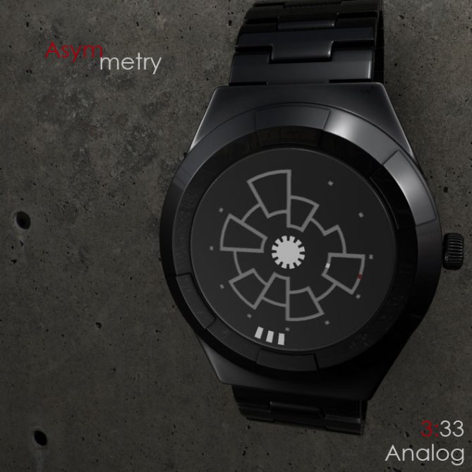
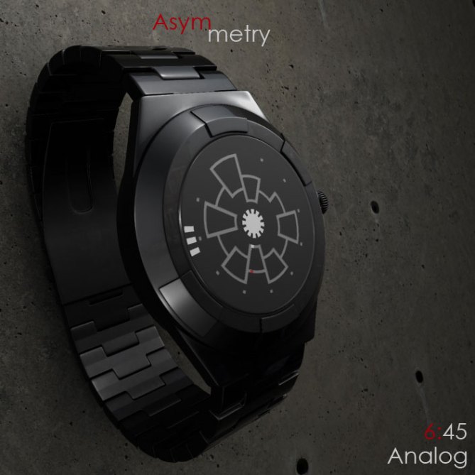
Cory says: Hull plating on fictional space stations always has such interesting patterns. I thought it would be fun to do an analog watch with an asymmetrical pattern that resembles hull plating.
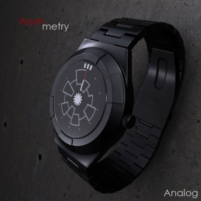
The lines that radiate out from the center correspond to the hours of a clock face, simply find the place where the line changes to check the hour. The three dashes at the edge of the watch face denote minutes, specifically the center dash.
Tokyoflash fans who enjoy analog designs that are complex-but-simple to read may enjoy this design. As would anyone living in a deep space vessel who needs to keep track of time.
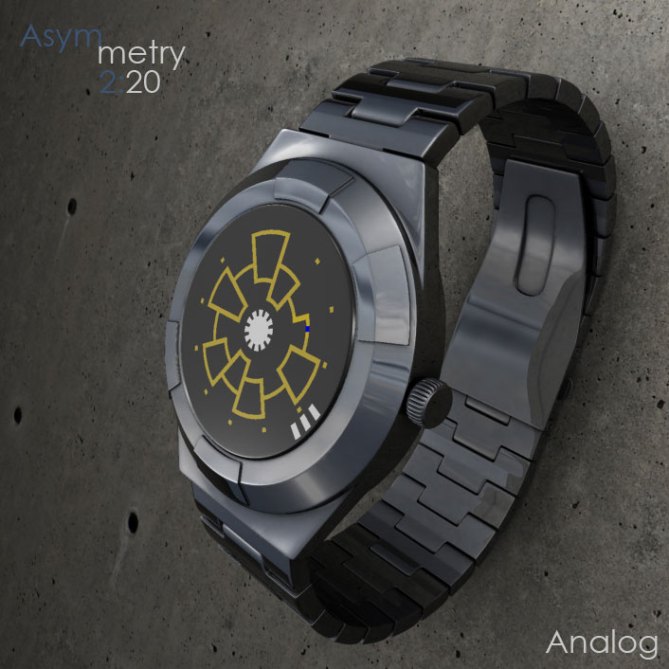
The asymmetrical shape of the hour ‘hand’ and the three dashes at the edge, along with a semi-symmetrical watch case creates an interesting look in both IPblack and Stainless Steel.

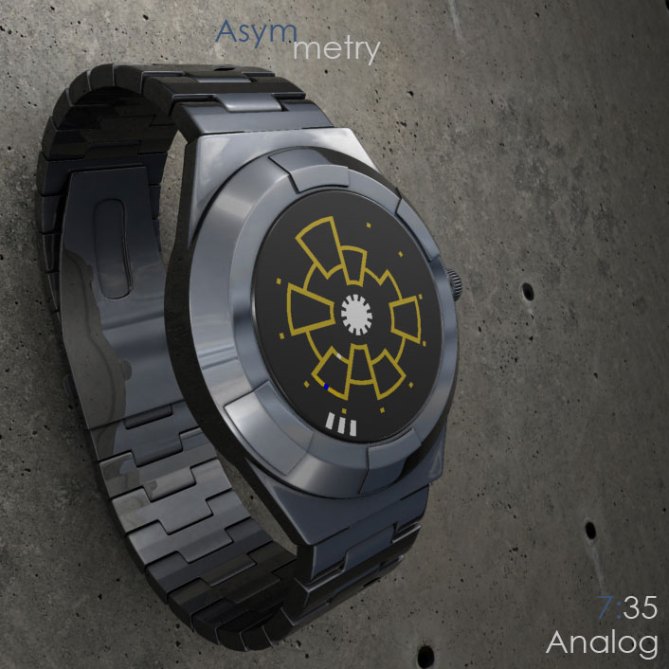


I like it very much. First of all case and material are very appealing – nice first impression. The display looks fantastic, draws attention if one sees the watch just shortly. The analog time telling is just fine. It looks effective with just little effort (normal analog watch mechanism can be used!). If it were in the shop, I would wanna get it. I like the red/white/black most, blue/white/black would work fine for me too. 5*/YES
LikeLike
Color variations could be endless with this design, I think. Me, I like the SS with blue/yellow then the red white black version, but many more could be envisioned. Thanks, Sam!
LikeLike
Personally I like this a lot.
Very easy to make, very easy to understand, looks normal if your wearing it at work – yet the face design is very sci-fi.
The minute hand is great, bold & easy to see. The hour hand might need some extra thought; its likely to be difficult to see because not much daylight can get in though the thin lines. So perhaps making the red zone wider or having triple red lines like the minute would make it more obvious.
LikeLike
I thought of the difficulty with the hour hand myself when I saw the video after YouTube compression. Perhaps a thicker slot in the disk, or three slots with the center one being thickest so that it coincides with the minute hand’s dimensions.
Thanks for posting the design and the feedback!
Arigatou gozaimasu, Tokyoflash!
LikeLike
It also occurs to me that you could print tiny minute numbers on the back dial which would only be visible where the minute markers are transparent. So you might see 46, 47, 48 in those 3 markers.
Not sure if that would disrupt the overall feel, but just a thought.
LikeLike
I contemplated also having the hour hand revealing the background behind the hour tic marks that go around the edge if the design… Would be particularly interesting on the 11-12 line. It would give those dots a bit more of an active role in the display. Hmmm…
LikeLike
One of the best looking analog watches here, a veeeeeaary good start for the new year. I’d definitely, don’t feel like wana rock this in fallout, let it be in real life, thus, 5 stars and yeah.
LikeLike
Thanks, Mr. Public! cheers!
LikeLike
great work Cory. I like it, and it has a tokyoflashy look. Actually at the beginning I thought that the design is presented by TF. 🙂 congrats, 5 stars.
LikeLike
Wow, thanks GBB! Glad you like!
LikeLike
I’ve always been a fan of Cory’s designs and this one is no exception, The presentation and renderings as ever are fantastic. I love anything to do with sci-fi so this works for me! The time telling is criptic but easy enough to understand when you know what your looking for. My on critism is that the hour hand could be clearer. I like the idea of another slot concentric with the original (another row of hull plating) the hour hand would then be visible on both rows and more obvious, whether this would spoil the look I dont know. Either way this is definately worth a “warp 5” and a “make it so”! Best of luck Cory! 😀
LikeLike
I have fans! If I count this guy among them, I’m a lucky fellow! Thanks, Pete
LikeLike
2nd this. If there’s no design from Cory in certain week / month I feel like this blog is lacking something.
LikeLike
“WINNER WINNER” and the renderings are spot on. Good work Cory 5*
LikeLike
“winner winner chicken nutrition cubes!”
LikeLike
I got the chicken dinner! BOO YA! Gordon, much appreciated
LikeLike
An interesting watch, a little wise, for my personal taste.
But it is a beautiful work that deserves 5 * / Yes!
LikeLike
Thanks, Pat! Perhaps one of my next few will be more to your liking, thanks for the five-ness anyway 🙂
LikeLike
Have a great academic life.
LikeLike
Spam, Y U NO GO AWAY!?
seriously, this spam crap needs to end. 😦
LikeLike
I think this means: WHAT A COOL DESIGN and I must say, it’s not exaggerated.
LikeLike
Google translate magic tells me he wants us to buy metal roofing in Kiev. I’ll pass.
LikeLike
Thanks ZaharovValerii-Baka for your time to comment here, kisama….
LikeLike
The global shape is rather classic, but is the strength of this design. You can wear it in almost every situation, while keeping a “subtle wow effect” 🙂 The display is inventive & looks futuristic. Good one !
LikeLike
Thank you for your ‘Wow effect’ comment, Nico!
LikeLike
I agree with TokyoFlash opinion, the red mark seems so small, it would be really hard to spot at a glance.
LikeLike
Cory, can we feature your work on our website?
LikeLike
Absolutely! Thank you for the interest, Industrial Design 🙂
LikeLike
this is definitely one of the most creative and sci-fi watches I’ve seen on here. A super cool, abstract way to read the time, and a watch I would be proud to wear. Bravo!
LikeLike
Thank you fellow ninja 🙂
LikeLike
Tuvie design blog has posted this design 🙂
Thanks Tuvie!
LikeLike
http://igyaan.in/2012/01/20359/concept-asymmetry-analog-watch-colin-farris My name is now Colin XP
LikeLike
ugly looks like you ripped off my design.
LikeLike
I’m sorry you feel this way, but quite frankly, I have done no such thing. People would also be more inclined to discuss things if politeness was present. Most on this blog are quite pleasant and amicable. Can we keep it that way?
LikeLike
http://www.trendhunter.com/trends/asymmetry-watch Trendhunter 🙂
LikeLike
http://www.newgadgetec.com/asymmetry-design-analog-watch-by-cory-farris/ New Gadget Tech! 😀
LikeLike
http://techcracks.com/2012/01/asymmetry-analog-watch-concept-tokyoflash/ Tech Cracks!
LikeLike
http://www.techchee.com/2012/01/16/tokyoflash-asymmetry-analog-watch-resembles-hull-plating-of-a-space-station/ Tech cheeeeeeeeeeeeeeeeee E_E
LikeLike
Good luck Cory! Analog watches rock!
LikeLike