Design submitted by Ignacio from Spain.
Ignacio says: The original idea came from my brother Jose. He showed me a sketch with 4 crosses and I helped to develop it and made the renders.
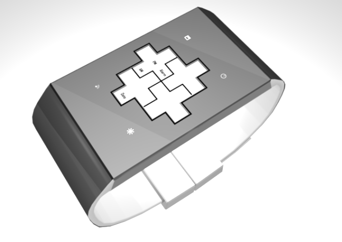
We thought at the moment it had to be a touchscreen. We also think that the screen is made of black mineral crystal lens (just like your watch Oberon), which can’t see anything until it is turned on.
The touch screen has 6 pressure points, 4 in the corners for the 4 buttons (backlight, time, date and alarm) and 2 in the middle so when we want to change the time/date/alarm, select what to change.
In the middle are the 4 crosses. The two above are the hours/months and in the bottom two minutes/day.
Each cross shows the numbers 0 to 9 with only 5 squares.
For everyone who loves minimalist yet complex watches.
Its simplicity, complexity, and futuristic style.
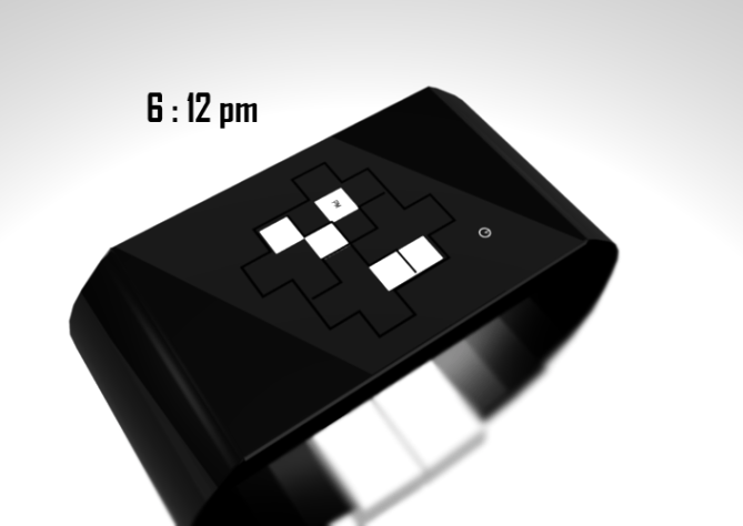
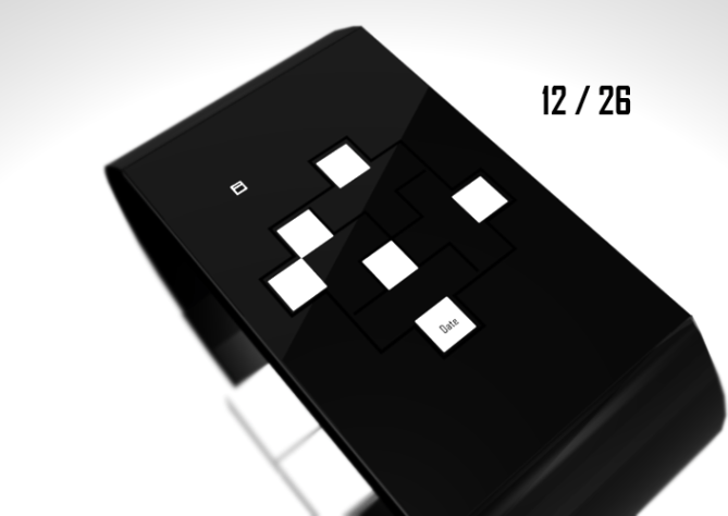
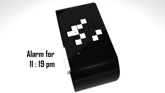

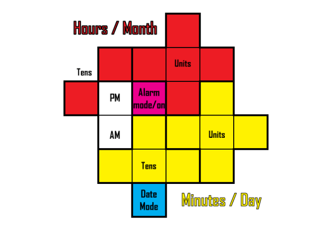
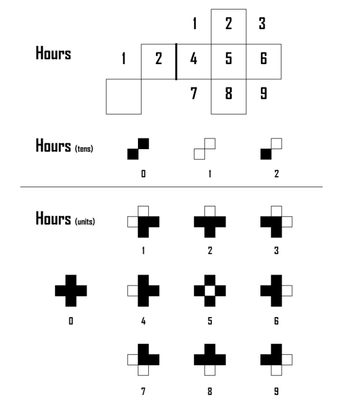
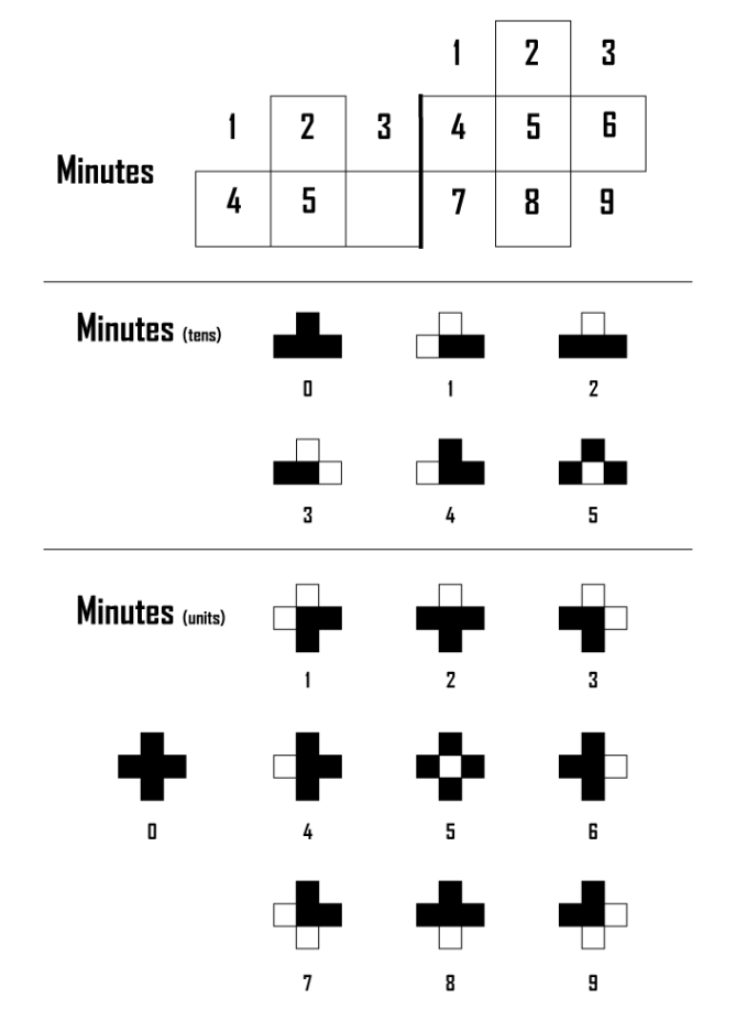
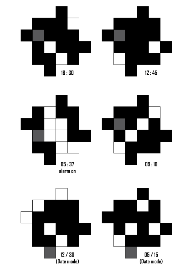

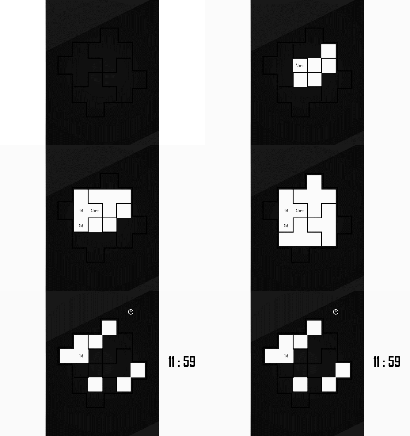


complex is an understatement. this took quite a while for me to figure out how to read. if i’m reading it right, then the one that says 05:37 actually says 07:37.
the time reading is very creative, and with an always on display and lots of practice, i could see it being feasible. but if it is only displayed briefly, it would take me too long to discern the time.
also, why do you have a tens digit for hours of a 2, implying 24 hour mode, but also have AM/PM settings? i.e. for the 18:30 example, you could have actually shown 18:30, but you show 06:30 PM. and you show 00:45 PM for 12:45?
LikeLike
Visually I like this very much, very minimal looking.
The time reading is very difficult to get the hang of!
I would suggest a training mode showing the numbers untill the user is used to the time reading system.
With a training mode 5 stars and Yes! 😀
LikeLike
That was my intention: I always try to transmit the idea (although there’re some errors in the images).
Surely someone (even TokyoFlash) suggest a change that will improve the idea.
It is always difficult to read the time at the beginning, is only a matter of learning the new code (not thinking only of numbers) and get used to it.
And thank you very much for your vote 😀
LikeLike
Just to get this sam-wise:
06:30 pm, 18:30 in 24h mode
00:45 pm, I think 12 am/pm would suffice. Or 00h and 12h without am/pm, but 00 and am pm don’t belong together. If the watch has 12h mode and 24h mode, it’s perfect.
07:37, not 67:37 hehehe. I think the alarm on/of indicator could be the alarm button itself… but you know what, I came this far, I can learn that too.
09:10 easy; 12/30 easy; 05/15 easy 🙂
The time examples are a bit too hard to read. They could have used these very comfortable cross-separations that are in the watch renderings. I think the explanations confuse more than you wanted. Ignacio, it would be cool if you add some separating lines to the time explanations and send it to Tokyoflash. Something like this.
I like the cross theme, the overall minimalism in the style, the time reading needs some practice but it’s working fine and looks good. I hope this gets to the next round. 5+/YES
LikeLike
Sincerely, thanks for this comment.
The truth is that we wanted to cover all aspects and we are made a mess, especially with the hours, am, pm… This aspect (now that I look it carefully) can be improve a lot.
You’re right about the example, that is much better.
And thank you very much for your vote 😀
LikeLike
I like the look of it but like everyone says it would take a little time to learn how to read it.
LikeLike
A very good try Ignatius Reillius…. I can see you submit more designs in the future… for starter, well, it’s quite difficult for my brain but really appreciate the effort you introducing unique, geeky watch concept… See you in your next design 😉
goodluck and keep it up!
LikeLike
And I also hope to continue sending designs and they are published 🙂
Thank you so much for your comment! 😀
LikeLike
Amazing, as always! Congratulations.
LikeLike