Design submitted by Logan from the USA.
Logan says: I designed “Sequence” to balance simplicity and complexity. The appearance is always complex, but Mode 0 is easy and simple to read. Mode 3, on the other hand, is logically simple to read, but difficult enough to provide mental exercise for those who want it.
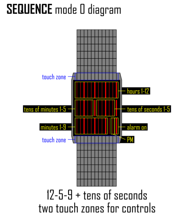
“Sequence” has an always-on LCD display consisting of three rows of 12 segments each. Every third segment is wide, to aid reading. There are no buttons, but instead there are two touch zones, one at the top and one at the bottom of the watch face.
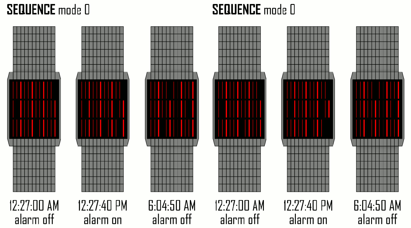
In Mode 0, the hours are displayed at the top, the tens of minutes in the middle, and the single minutes at the bottom — just observe which segment is turned off to read each part of the time. For example, if the second wide segment is turned off at the top, then read 6 hours. If the narrow segment after the second wide segment is turned off, then read 7 hours. The tens of seconds, AM/PM, and alarm indicator are also shown using segments not used for the 12-5-9 (see diagram).

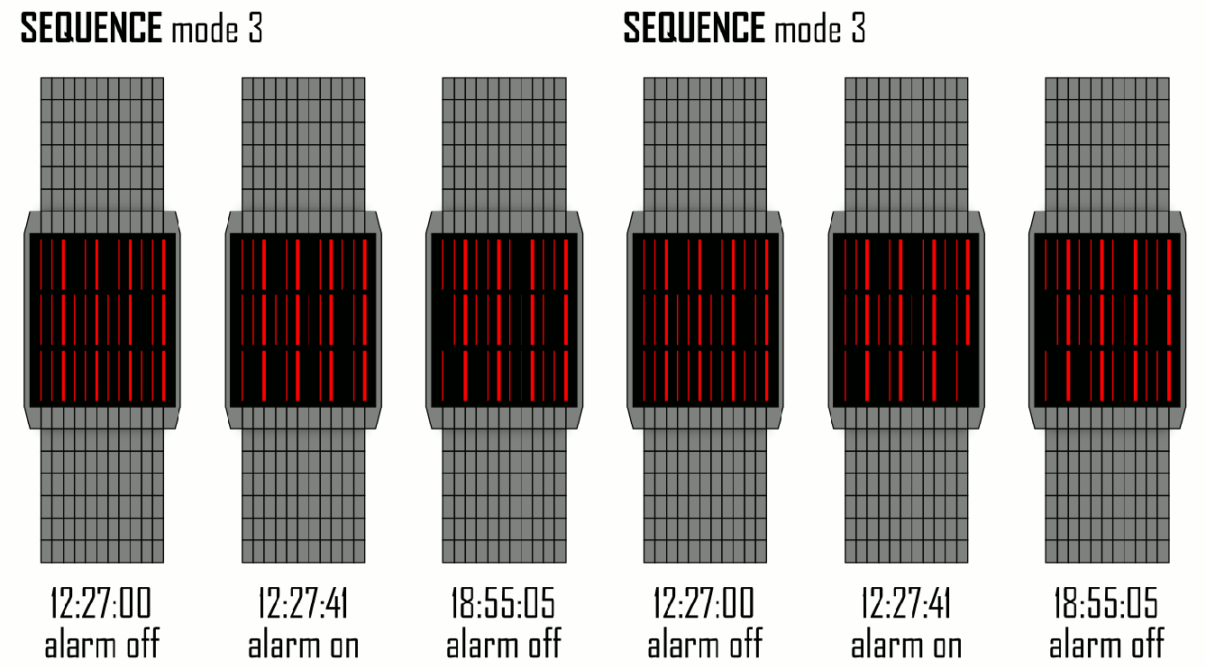
In Mode 3, the hours, minutes, and seconds are displayed in trinary (base-3). The wide segments are never turned off (except for the blinking alarm indicator in the bottom right), but instead serve as visual markers for powers of three: 3, 9, 27 (the right-most wide segments are not used, again except for the alarm indicator). Since there are two narrow segments after each wide one, the layout is perfect for trinary — if the first narrow segment is off, it means multiply by 1, while if the second narrow segment is off, it means multiply by 2. So, if the second narrow segment is off after the 9 wide marker, read 9×2=18 (see diagram). This is straightforward trinary — simple, but not as easy as Mode 0.


“Sequence” is great for two types of Tokyoflash fans: 1) those who like watches that look difficult, but are actually easy to read (Mode 0), and 2) those who want a mental challenge (Mode 3). Choose the mode that suits you best.
“Sequence” balances simplicity and complexity in both its visual appearance and time encoding.


Hi Logan,
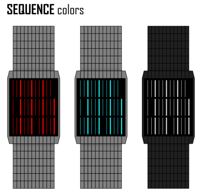
Im afraid this isn’t my cup of tea, I dont think I am geeky enough to fully apreciate this. For me its a little difficult to read quickly. Id be tempted to make the dividing lines a different colour (ideally the same colour as the case) to make reading easier and break the face up a bit, make it more grid like. Best of luck! 🙂
LikeLike
Oops, thats tough. When I saw the little preview, I thought, the watch is read like this. Readble at a glance…
Ok, first I thought, even the 12-5-9 mode is confusing, because the important lines are embedded within the not important ones. But the the important ones are just off. 1st row 12 – left from the left; 2nd row 5 – read from left, no matter what’s coming affter these 5 lines, 3rd row 9 – also read from left, no matter what comes after these 9 lines. Once got used to this, the seconds and the pm and alarm lines can be involved in the thinking – these are just filling up the space left on the right side. Easy.
The 3-based time is definitely too much for me… at first. Maybe the 12-5-9 is too boring after a while, so one can use this mode 🙂 It’s cool, you like to please two types of brain users (the lalala faction and the 1.41421356 faction) I did similar with my hexagons watch. It keeps the watch interesting for a longer time.
An always on LCD barcode like display is cool. It’s a contemporary style. This concept about being willing to learn, after you accepted the style. I can see why this watch is scaring. I like Peters suggestion to break up the display or work with colors. I think there is quite something possible within the barcode theme.
Logan, welcome back to the blog!
LikeLike
A bit too much going on for me, Logan, but then I’m a bit simple minded. I’m sure it’s got potential otherwise it wouldn’t have made the blog. Good luck with your design.
LikeLike
Just wanted to add that I really like the look of the design, Logan. 🙂
LikeLike
i really like it. reminds me of a barcode.
i will say that i DO think that mode 3 is a little too confusing, however mode 0 is great!
this watch is a great example of something that looks hard to understand, but it actually easy. (at least mode 0 anyways 🙂 )
i’m gonna say 5/y i love it!
LikeLike
Wow! Some guys are very harsh with your design and star allocation! Well… I think you deserve more! Congrats and don’t get discouraged!
LikeLike
Yeah the voting can be very harsh around here. This design deserves a much higher score. 🙂
LikeLike
come on, 1.8? have you looked at the explanations? have you red the text? I really like the look of the display. I must revise my opinion about rectangles. ok, here we have very slim ones, actually lines. but still i thought, the time is over for such displays. it’s not! i like minimalistic arts and I can see, it works nice for a wrist watch. i prefer the easy mode, because if I want to know the time, I want to know it now. the difficult mode is a cool alternative tho. as I told on other watches, I like when I can choose. *****/YES is one drop in the ocean 😥
LikeLike
That rating can only be explained by some self-serving voting. Disappointing!
LikeLike
That’s probably right. But that person just wants to execute psychological warfare since the rating is already known to be not the most important thing here. I just hope, it’s not a designer from here, because that behaviour would be disrespecting towards his own work – shame.
LikeLike
Thank you everyone who commented, whether you liked the design or not. I guess that the trinary mode is not for everyone 🙂 But I couldn’t resist, because it fits very logically into this LCD layout. Well, some day I will convince you to join my way of thinking, and where else could I even try but Tokyoflash.
LikeLike
Concrete point you got here, you get my support. However, I can’t deny that this design is kinda hard, considering current Tokyoflash trend… Hope you can take the critic positively. Voted 5.
LikeLike
Аренда автобусов,Киев,Пассажирские перевозки,Аренда микроавтобусов.
LikeLike
I think this watch would appeal to people into maths, and science with the ‘graphy’ look. It is very stylish. It is a good ‘geek’ watch too!
Diane.
LikeLike
The computer tells me that this entry ends soon, its not my cup of tea this one but I can imagine it appealing to the geek chic. Best of luck Logan! 😀
LikeLike