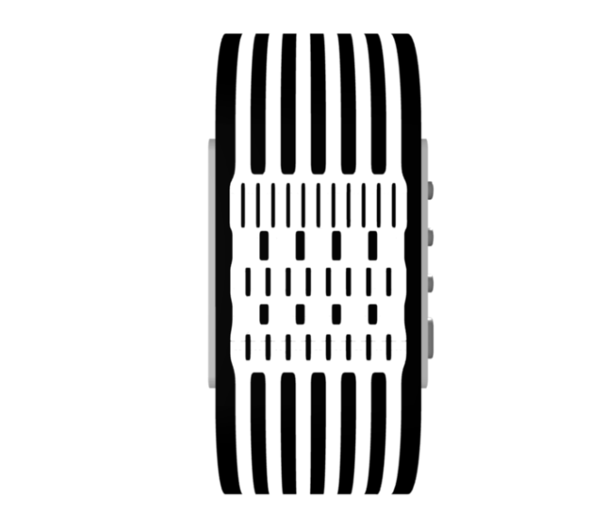
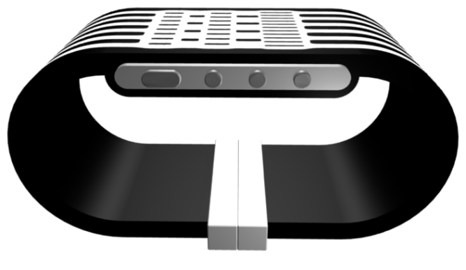
Design submitted by Ignacio from Spain.
Ignacio says: Curiously, I had a pencil which projected three shadows. That inspired me for a design that, after modification, resulted in this design (which is quite different, the original design consisting of circles).
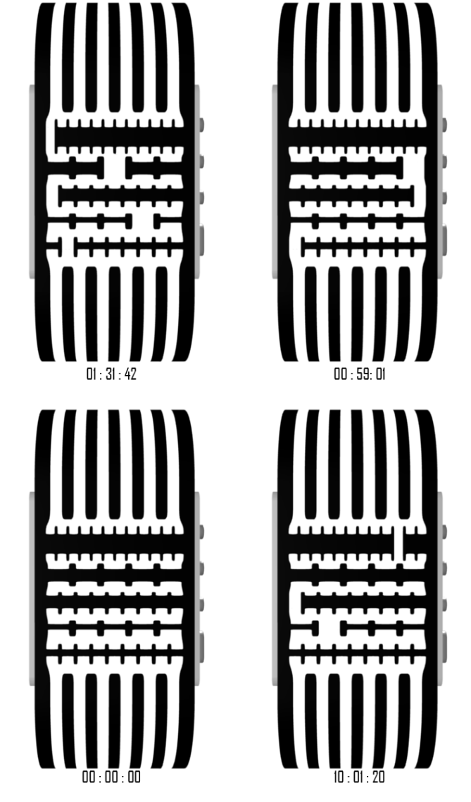
I made simple images but I hope they can convey the idea.
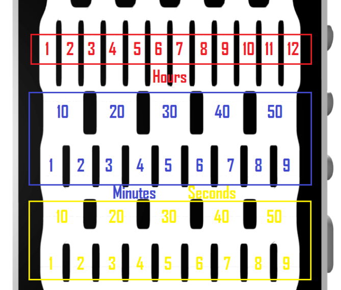
To read the time on this design, we need to look in the 5 areas where lines connect:
* The 1st shows the hours from 1 to 12.
* The 2nd and 3rd shows the minutes, 2nd for the tens (10 to 50) and 3rd for single minutes (1 to 9).
* The 4th and 5th shows the seconds just as the minutes, 4th for the tens and the 5th for simple minutes.
It has 4 buttons:
* One to turn the greatest light.
* Three normal, after hold for two seconds, you can change the hours, minutes or seconds.
It will appeal to everyone who likes the stylish, simple yet complicated.


Nice job Ignacio!
It occurs to us that there are several possibilities for this display to show the time in different ways. There could be a number in the gap, or there could be 3 gaps to mean 3 o’clock.
It could also work with various technologies. LED, LCD, e-paper. Also lots of room to experiment with colours.
It’s good to have all these options possible.
LikeLike
I think a number in the gap would detract from the mystery – if you’re showing the numbers, what do you need the rest of the display for??
LikeLike
Hi TF, its nice to see a comment from you.
You have been quite quiet recently (we know you are very busy), your comments have been missed!
Keep up the good work! 🙂
LikeLike
First, thank you very much to post my design (my name is Ignacio but my nickname is this). I was beginning to think you don’t like my ideas. And it’s very encouraging to see that someone likes your ideas, and even more if is yours the comment! 😀
I would like to say that the first design was circular, http://www.imgjoe.com/x/initial.png but I think this design is more readable. Maybe you think this one is better, I don’t know, it’s just a curiosity (as a contribution).
About the technology, I had in mind a simpler idea. I was thinking with a white stripe tapes, and revolve. I don’t know if I’m explaining well, but the idea (the mechanism) is the same as in this video: http://www.youtube.com/watch?v=Az1SqX3Bqdc&list=FL8FkYLy_oumJpfRAowdzP5Q&index=54&feature=plpp_video
But it’s you who make it true, so as you better believe, I leave that decision in your hands. 🙂
Thanks again for considering the design and please forgive my english. :S
LikeLike
I like it. Very creative…it’s 12-5-9-5-9 with a negative twist (spaces, not lines)…interesting. I like how precise it is, the ever-changing seconds will be neat to see. Super-easy to read with little counting. It should definitely be always on, so I’d go with LCD. I’m not sure if e-paper can refresh every second??
It’s not a very feminine look, but then again, not all watches have to be appropriate for everyone. 5* for the time-reading method.
LikeLike
Actually, it’s 11-5-9-5-9, you never will see 12 hours. Design failure. 😦
Tokyoflash, can I send you a renders edited to change these by these other?
And thanks fot your comment!
LikeLike
I think the low rating is due to the aesthetics of the given display, but this can be easily adjusted. I think it’s more important to vote/comment on the time-telling method. Although this is not my design, I made an example of what I think may be a more aestetically pleasing look for the same time-telling idea: http://www.proudnerd.com/connected_black_red.jpg
Good luck, Ignacio!
LikeLike
Thanks.
About your idea, I think your design make it lose the aesthetics of seem to be connected, hence its name. Personally, ok? Just I like more my display that yours. 😉
I submitted a design that proposes an idea, it seems that TF liked, and I think if they believe a need to improve their appearance, do so.
LikeLike
Hi Ignacio, I have not seen your name on the blog before, is this your first entry?
I like the idea behind this watch and agree with TF that there is many possibilities. The time reading method is simple and quick to understand, I don’t think it needs numbers.
My main issue with the current examples is that it looks a bit busy, could the lines that make up the time be thinner or paler so they are less bold? Also I like the ideas of the markers being circles, would look a bit like the London underground map, which would fit nicely with a couple of existing TF watches. 5 stars and yes for the principle.
best of luck! 🙂
LikeLike
Thanks for your comment Pete!
I was who design the concept watch “Ronu”, so it’s not my first entry nor my first design.
http://www.tokyoflash.com/blog/2011/03/ronu-classic-watch-and-futuristic-clock-combine/
About your idea, do you wanna say something like this?

Actually looks less overwhelming(?), less busy. It looks better now isn’t? And I like too the circles (but as I told Heater, like this it loses some of its essence of connectivity).
Thanks for the suggestion! 😀
LikeLike
недорогая реклама на транспорте только тут
LikeLike
Hi Ignatius, great design! I looked it up very very misterious until I read your examples. Once I understood, it was easy to read the time. It seems like razor blades!. Now in spanish: Pasha Ignacio? Me ha gustado, parecen hojas de afeitar. Por cierto, ¿la zona de los segundos estará cambiando mientras se ilumina o se muestran fijos? Saludos, y ¡mucha suerte!.
LikeLike
Como siempre, hasta que no se sabe el código es indescifrable, pero es mu sencillo.
Me ha alegrado mucho verte comentar aquí directamente 😀
Sobre la visualización, estaría mu bien que estuviera siempre encendido, aunque eso ya se lo dejo a TokyoFlash, que son los que saben. Muchas gracias!
As always, if you don’t know the code is unreadable, but this it’s very simple.
I was glad to see you comment here directly: D
About the display would be very well that was always on, though that I leave that to TokyoFlash, who are those who know. Thank you very much!
LikeLike
Very original. Love the idea. However, I like to see this concept design with other colour variations.
—————————————–
Tokyoflash Ni multicolour LED
Sensai Black
Twelve 5-9 Q version black
Shinshoku / Corrosion
Kisai RPM Acetate granite
Kisai Kaidoku black+blue LCD
Kisai Seven white LED
LikeLike
Thanks for your comment, Firdaus! 😀
I should make them and send them to TK in the next days, although I think the most important thing is the idea.
Thanks again! 🙂
LikeLike
Graphically great! Clever, simple and good looking time reading system! Can come in e-paper or LCD so you have enough options. I also like the bracelet-style. Good luck for this one Ignacio!
LikeLike
I’m glad to see you like my design 🙂 I also hope there’s better luck.
Thanks you Sam!
LikeLike
it’s too much zebra for me. I can’t wear it, sorry. the time reading is clever and simple tho ***/:'(
LikeLike