Design submitted by Peter from the UK & Sam from Germany.
Peter & Sam say: The initial idea for this LED watch came from the so called Penrose Stairs. These imaginary stairs let you walk up eternally by stepping on the same steps again and again each cycle. From a certain perspective, real life models can look like the often seen images. From another perspective you can see, it wouldn’t work. This perspective dependency guided us to the display and the time reading.
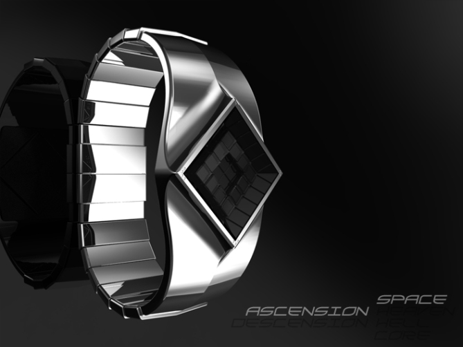
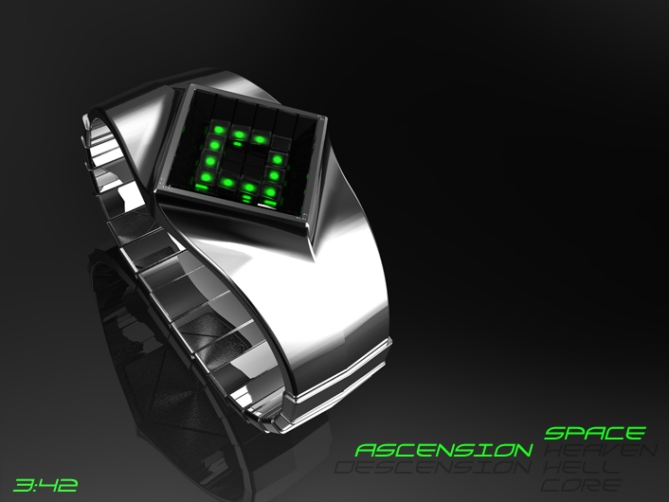
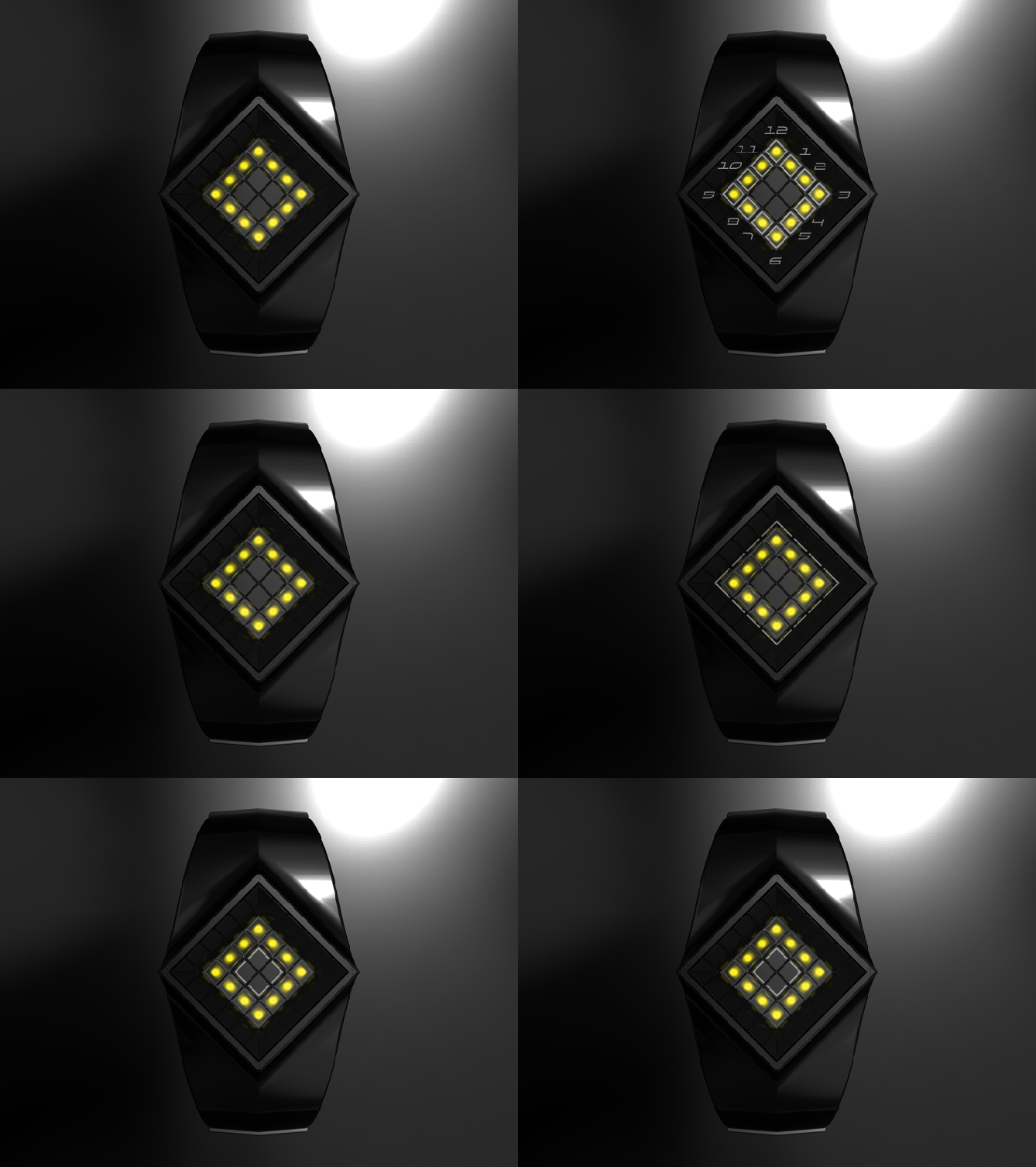
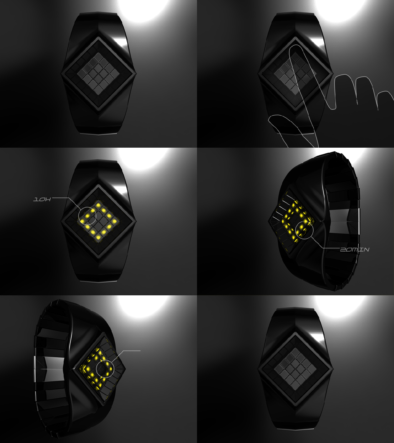
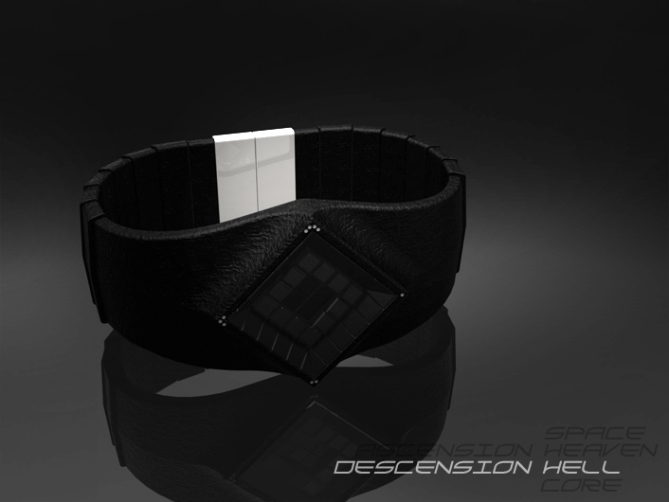
The diamond shaped display contains a 12 step replica of Penrose Stairs – a mere hint of the original of course. The top faces represent the 12 hours. The outer faces show the 12 five minute steps. The inner faces indicate the additional 4 minutes. The display is mounted on four microswitches and each corner activates a different mode: time, date, settings, animation. When you press the upper corner of the display, all LEDs light up, except the ones marking the current time. The hours are quickly visible. In order to tell the time precisely you have to change your perspective of the display and find the current five minute step and the additional minutes.
One half of the watch is made of a hard shell carrying the display and let it flow into the segmented straps, which are the second half of the watch. They are shaped in reference to the inspiring stairs. We are suggesting some material and light variants, playing with the ascension / descension topic.
This is a watch for geometry fans who like to wear a less geeky, more fashionable timepiece.
The perspective dependency is an essential part of this watch. It creates some confusion but is easy to understand.





Thanks TF for adding this collaboration design to the blog! 🙂
LikeLike
Yes!
LikeLike
I really like this. It’s special. It looks kind of EVIL – muh, ha, ha, harrr!
I can imagine a fashion conscious Necromancer would be all over this. LOL
Have to say 5 & yes.
My only reservation is I am not a fan of the time telling where the missing light is the indicator.
I much prefer: 9 lights = 9 o’clock.
Thats because a) it indicates the same position, b) You can count it as well as check the position & c) it gives more variation in the pattern of lights you see though the day.
Saying that, I would just include both modes, then you can choose your preference.
LikeLike
That is a very useful comment, I agree it would be sensible to have a couple of display modes to suit more people. We decided on this method so that the majority of the stairs were being used to show off the stair inspiration in full. Thank you for your feedback! 🙂
LikeLike
Onisan, that’s definitely a good alternative you’re suggesting! Actually adding alternatives shouldn’t be a big problem. More fun for everybody. Thank you for your comment and rating!
LikeLike
funkadelic!! me like
LikeLike
Thanks for the comment Gordon! 🙂
LikeLike
Nice collaboration, Sam and Pete!
+I love the geometry of the display. (It makes me think of M. C. Escher.) I rarely find a watch that I like the look of when off. In my opinion, these stairs actually look even better when off, rather than on. It looks like jewelry.
+Ascension Space is my favorite.
+The time-reading is interesting – I like the idea of lighting up different surfaces.
– Hours are easy, but reading the minutes with 5 minute blocks seems a bit harder to me, partially because you have to turn your wrist around to find the missing LED…also, I just personally prefer 12-5-9 because there is less to calculate. (personal preference)
– Personally, it seems like it would probably be too large for me to wear comfortably.
5* for huge potential.. 😀
LikeLike
Hi Heather,
Yeah the intention was to have it look like jewel when he lights are off, which will be how the display is seen the majority of the time. The changing of the persepctive to see the various elements of the time is a big part of the concept, maybe they need to be clearer somehow to make reading easier.
The intention was that this would be a unisex watch, I think the images make it look larger than it is. If TF chose to develop it I’m sure they could tweak the proportions to suite the majority of wrist sizes.
Cheers for the feedback! 🙂
LikeLike
Nice how you sound like us, when you pick out the good points 😀
Yes, the change of perspective the the carrying principle behind the concept. If that’s not convincing, we hope the look does. That’s actually the way many Tokyoflash watches work – good looking but tricky to read. You mentioned “calculate”. Additions should work 😉 Don’t mind the conceptual wrist size too much. Let’s imagine, if it would be indeed produced, TF finds a size for all of us.
Heather, thanks for the detailed personal view and the rating!!
LikeLike
Can’t go with you here, guys. I like the look of the watch right enough, but the idea of moving my wrist around to catch all the angles before the LEDs turn off seems like it would A) make me look like a crazy person and B) it would be frustrating when I wanted the time quick-fast. If there were a way to bevel the display so that all is visible from top down, I’m in.
LikeLike
Hi Cory,
I see your perspective, perhaps the sides of the display could have a draft angle on the to aid quick time reading. Im glad you like the look ! Thanks for the feedback! 🙂
LikeLike
A) You have to see me, when I read my denshoku or my early days of my twelve-5-9-L, placing my finger at the case and making a calculating face 🙂 It’s part of the deal, having a cool looking watch and loose some comfort for it. B) speed is proportional to habituation. But it’s nice, you imagine this watch on your wrist. Thank you Cory!
Oh Pete! If the 45° sides would be mirrors… *wink wink*
LikeLike
Yeah I did think about that, would help with the time reading without affecting the look! 🙂
LikeLike
Thinking about it, I believe the secondary lights should be viewed from bottom angle – not left/right.
This would be a more natural rotation of your wrist.
LikeLike
Im not sure how that would be achieved, at the moment the 5 min lights are where you would expect to find then on an analogue watch. Something to think about. Thanks for the feedback Onisan! 🙂
LikeLike
Oni, don’t try to reach the light with wrist rotation only, please turn your forearm around an axis, collinear to your upper arm 🙂
A just bottom view would cut off 50% of the LEDs, because upper view isn’t possible. That means a whole new concept. As Pete says, the analog display is the hidden layout idea and would in the end be harder to read (we accept this flaw cause it’s well integrated and not a fall-out) but easier to understand… I think 🙂
LikeLike
Hi Sam and Pete, the system of reading, I like very well, for against the harmonization of the dial with bracelet, graphically I like less, but this is just personal opinion.
5 * / Yes, especially for the system of reading of time.
LikeLike
Hi Patrick, Im glad you like the time reading if not the styling. It won’t appeal to everyone of course.
Thanks for the feedback and the all important vote! 🙂
LikeLike
i agree about the display and the bracelet…they don’t seem to fit right together…very angular with a very smooth curve…i felt like something was off there, but i’m not sure i can give a suggestion on how to fix that…
LikeLike
This is a subjective matter, I quite like the mix or curve and angles. Perhaps the the diamond shape just need softening a little, curved faces rather than flat?
LikeLike
Thank you Patrick!! It’s always good to read from you 🙂
LikeLike
Wow, now this is stunning to look at! I love the different versions, the core one is my favorite. I quite like the fact you have to tilt the watch to see the minutes, makes it different to the rest. 5 stars and yes!
LikeLike
I thank you for your wow, comment and your vote! 🙂
LikeLike
Exactly what Pete and I wanted to achieve. Thanks C!!
LikeLike
Wooow! This is funky! Kinda evil looking in the black and red. I like this a lot! 5stars (what else) and Yes Sir!
LikeLike
Woooooow (mine is longer) for your comment! Red and Black it is for you sir.
Thanks for the positive comment! 🙂
LikeLike
Wow-length competition hm? Anyway 🙂 DW, cool you found a favorite version! Thank you for your comment and rating!
LikeLike
Im not usually a fan of LED watches but there is something about this that really appeals to me.
It looks very Alien! I love it.
Oh and nice collaboration Guys! 5* and Yes!
LikeLike
Im glad you like it. Yeah the collaboration was fun to do, and we both liked the result which is always a bonus! Thanks for the comment! 🙂
LikeLike
Such “normally I don’t, but now I do”-comments are very nice. It shows, we are breaking new ground here. Thank you GC!!!
LikeLike
You guys are on fire! This is an incredibly beautiful design. I like the look very much and although I wouldn’t wear it myself, I appreciate the design. I find the reading of the minutes a little bit too much for comfort and speed. I love the dark, mysterious look and I like the attention that has been paid to the case back, very cool and adds quality to the watch.
LikeLike
Im glad you like the look of the watch if not the time telling method. Thanks for the compliment and the feedback! 🙂
LikeLike
Yep, comfort and speed are tough when you’re confronted with it for the first time. Ava, look at it for a while and then the watch HAS YOU BWAHAHA! No, honestly, it’s comprehensible. It’s nice how you share your impression with us. Thanks alot!
LikeLike
One of the most truely unique watch designs I have seen in a very long time. I LUV IT!
5 and yes! Please
I would buy this the first day it is available! Soon I hope
LikeLike
Hey Pingy,
Thanks for the great comment! I hope you get the chance to buy it in the not too distant future! 🙂
LikeLike
Just like Pete says 😀
LikeLike
Terminator should have the same, directly from the future, this watch VERY NICE, pure, elegant and What IDEA, a watch like that the CLASS “WOW” 🙂
LikeLike
Thank you very much for the comment Alain! 😀
LikeLike
Merci bien Alain! Nice comment!
LikeLike
Im glad you like the look of the watch, the having to tilt the watch to see the minutes seems to be the biggest issue for the majority so far. It maybe something to look into. Thanks for the comment! 🙂
LikeLike
Darth Vader called , he wants his watch back
LikeLike
dun dun dun da da dun dun dun (star wars music) “Luke I am your father! and its my birthday soon, so get ya buns over to TF!”
Thanks a lot Gordon! 🙂
LikeLike
Hehe, nice one! Pete saw a Cylon in it one day 😀
LikeLike
Very unique design… Damn hot what else can I say
LikeLike
Thanks Firdaus, if you like it that is a very good sign! cheers for the comment! 🙂
LikeLike
Thanks alot Fir!!
LikeLike
http://techcracks.com/2011/11/ascension-watch-concept-tokyoflash/
LikeLike
http://gadgetsmatrix.com/archives/ascension-watch/9779
LikeLike
i would buy this watch for sure… if the hell one was made. the other one looks bad ass as well but jesus the hell one looks just amazing. very unique time telling as well
LikeLike
Thank you Mike,
I like the hell one too, it looks evil!
I hope TF give you the chance to buy it one day!
Cheers for the comment! 🙂
LikeLike
Penrose steps in a diamond.. hehe good idea !
I like the organic-futuristic shape of the watch. Flashy for sure. My only concern is about the side LEDs, I’m afraid they are a bit hard to read, mainly for those in the center, they don’t benefit from the reflection on the outer squares. Maybe you could change the angle of the 4 squares in the center ?
En tout cas, nice duo-design, innovative once again ! Congrats.
LikeLike
Im glad you like it. Yeah reading the minutes seems to be the biggest issue consensus. We did play with having a pyramid of tiles in the center which would help refect the lights. Maybe that is something to look at to help with the time reading or like you say add a draft angle to them so you dont have to tilt the watch as much. Thanks for the feedback Nico! 🙂
LikeLike
this watch is fantastic. 5/Y
LikeLike
Im glad you like it Diclonius, thanks for the fantastic comment and the vote! 🙂
LikeLike
Sexy watch. xD
LikeLike
Thanks PhantomM, Im glad you like it. Lets hope TF think so too! 🙂
LikeLike
It’s no secret I like these guys (Heather, Pete, Sam)
I was dazzled again and again to his ideas.
I would like to see a EuroFlash company with them!
LikeLike
Hi Laszlo, Thanks for the compliment!
I wonder if TF do franchises? lol
LikeLike
Hehehe, Tokyoflash West!
Thank you so much Laszlo!
LikeLike
Time is nearly up for this enty, so thank you to every one who voted, commented, and shared.
Its now in TF’s hands, lots hope they saw some potential in this concept.
Kind Regards
Pete from the UK 😀
LikeLike
This was a nice time. I liked the creation phase and the online phase. Ok, the rating could look a bit better, but we see, the watch is pretty much accepted 🙂 Thank you everybody for your feedback, short or detailed!
Best regards,
Sam from the Germans 🙂
LikeLike