Design submitted by Sam from Germany.
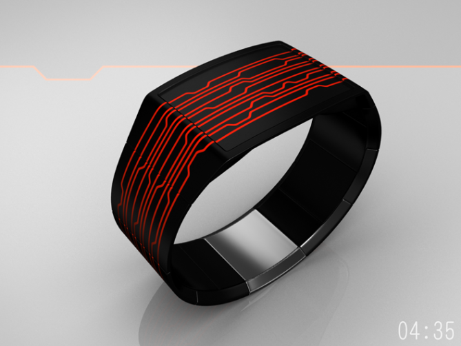
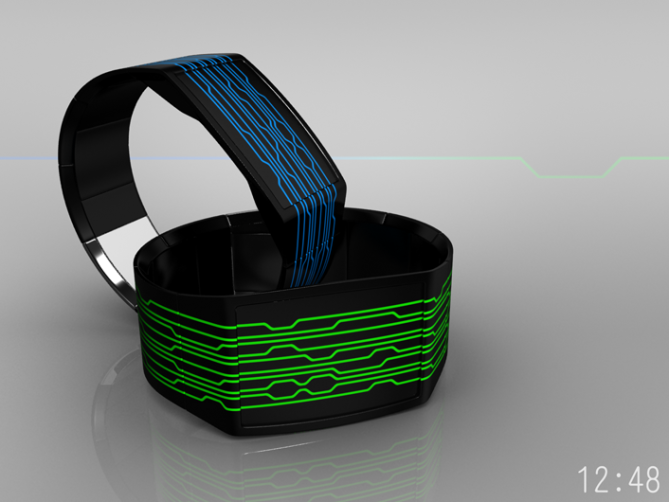
Sam says: “The inspiration for this watch design comes from bracelet watches with a continuous pattern all around the wrist. This time I let several lines surround the wrist and the result is the futuristic On Line.
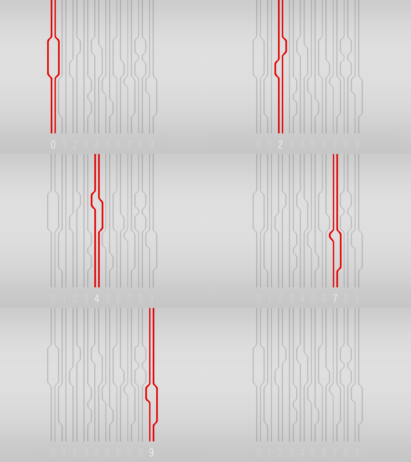
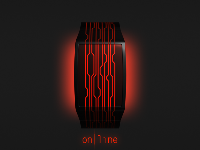
The display is made of vertical lines which escape the case and surround the wrist completely. The 10 lines are 4 pairs between two single lines. A pair can be recognized as two lines closer to each other (look at the top or the bottom of the display). I created these bends to let each pair form one number. 4 pairs = 4 numbers.
The single lines are an am/pm indicator and a time/date mode indicator. While the lines are molten with the strap segments, they are made of two components in the case region: a bright background (neon plastic) and an LCD layer. The “all around the wrist” theme works the whole day, because LCD is always on.
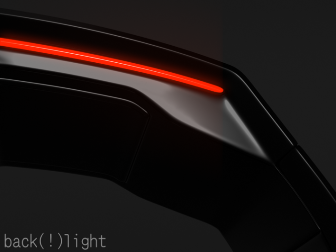
As a nice gimmick, I let the case “float” above the wrist. There is airspace between arm and case. I gave the back of the case LEDs which enlighten the wrist when it is dark. This is inspired by a certain flat screen television’s ambient light. The display is touch sensitive. Setting the time, seeing the date and activating the backlight can be done with according touches. The unusual behavior of the case, the touch option and the ambient light make the futuristic look of the watch complete.
This is a watch for men and women who like to wear some artistic, technic inspired bracelet. On Line is a fashionable wrist watch from the future. It is a challenging watch at first, but actually a really easy to read one. It needs a little practice to distinguish the single elements, but the wearer has the advantage to learn and to impress the friends.”





hey, sam!!! ok, so i love the look – i love the colors – i LOVE the backlight glow!! i love the concept too, and it certainly deserves 5* and “yes” from me…”always on” and “touch sensitive” are awesome!
i do have to acknowledge, as i believe you show above as well, that the 4, 7 and 9 are very similar and can be difficult to distinguish when you don’t see them near each other…but i think that can be learned…also, i feel that the two indicator lines on either end make it a bit harder to read….perhaps the bends in these lines can be either above or below the rest of the digits to avoid confusion?
LikeLike
Thanks alot Heather for your lovely (my fault) and critical (yours 😉 ) review!
Oh yes, about the 4, 7 and 9: I thought, before someone tells, they seem similar, I show their differences right away. You make a good point about the confusion…
Everybody, concentrate on the upper and lower edge of the display. If two lines are closer, follow them to a number. No matter if the moon explodes or donuts are sold out, this is will always help you.
But I see your point Heather. I gave the two indicators another thought. Look at this. I let them bend outside, not inside the array of lines. This little twist takes the visual pressure off the time display and also relaxes the display a bit.
LikeLike
yup…i agree, sam…the link you showed me does relax it a bit, without taking away from the general feel. i definitely think this would help make the time reading easier for many.
LikeLike
Such critiques are higly welcome! If the watch appeals right away, perfect. If someone sees an issue, oh yes please, let it out 😀 Thanks Heather!
LikeLike
easy, wow red hot can’t say anymore, but because of its feminine look, It would probably take me 3 days to think to buy though! 5* and yes would buy!
LikeLike
A real man can wear it 😉 Thank you Fir!
LikeLike
Whats not to like here, simple but futuristic design, cyrptic but simple time telling method, slim line design with a glowing wrist backlight. Works for me 5 stars and Yes Sir! 🙂
LikeLike
Please accept my grateful thanks Sir Peter.
LikeLike
it’s been a while since i lasted commented on any design here. but when i do it is, of course, one by sam.
this is one of the slickest designs i’ve ever seen here.
plus i actually do like the fact that the usage learning curve is not too shallow – it can become extremely easy in a very short time to read the watch face, but will remain cryptic to anyone not familiar with it. excellent. 🙂
LikeLike
I really like I get feedback here! I looked back at this watch again and again before and also after the submission to Tokyoflash. On certain days it was exciting cause it was easy to read, which is normal, because I made it. On other days I thought, isn’t it too hard? If you give it a quick look, it’s like a bunch of hairs. But then, if you know the twist, it’s a piece of cake. Thanks your sharing your thoughts about the learning curve. That’s how I hoped, the display will be recieved. And thanks generally for coming by 🙂
LikeLike
very attractive design, it makes me think about your san sen watch, with a touch of the very succesfull on the blog gradient watch, i find this one very (aboutie ), my only critic would be same as heater about the readability.
LikeLike
Worked on it, its better now. If it’s still hard, practice practice practice and make your friends look perplexed 🙂
Hmhm, this >all around the wrist< topic is kinda rooted in my mind. I tried this idea out on some watches. It's so cool that you remember my San Sen and the Gradient watch!
Thank you Rachid.
LikeLike
I like the fact is a little challanging, its only a visual challange which in my mind is prefferable to a mental challange, where you have to work the time out due to a different language or code of some sort. Suits me just fine! 🙂
LikeLike
That’s what I like in Heather’s watches, the easy time telling with a little visual challenge.
LikeLike
Thanks for the compliment, Sam! 😀
LikeLike
I think I won’t stop admiring you… 😀
LikeLike
I’m flattered :3 In germany this is called, to spread honey around one’s mouth, thank you D!
LikeLike
Hi Sam, a new penmanship for a new watch.
Beautiful work 5*/Oui!
LikeLike
Oh c’est interessant 😀 Merci beaucoup monsieur!
LikeLike
I always loved your designs and this one joins the lot,but i find it complicated to get the time fast on this one…practice makes perfect…….but i would defenetly buy it…you amaze me Samuel.
LikeLike
Hmhm, I can second the thoughts about the complication, especially about the practice 😀 Form follows function was yesterday, hehehe. Thank you for stopping by Nexu!
LikeLike
Sam, the illustration is beautiful, no doubt about that. However, I’d like to see it showing the gaps between the LCD segments.
Ambient lighting is a great idea for a TF watch!
LikeLike
It was a joy to implement the backlight and the floating case parallely to the main topic.
About the LCD segments: Good hint, but this time I’d like to keep it idealistic this time. I hope it can be done as close to the renderings as possible. LCD is 40 years old, the has to be a way 🙂
Thank you Logan!!
LikeLike
It can be done with LCD or e-ink of sufficient resolution, but I believe you have to sacrifice power consumption or cost unless you produce huge quantities. Well, maybe the engineers at TF can find a way. If it can be done, it will look great.
LikeLike
Surprising, but look fabulous. It’s BEAUTIFUL. “Bravo” :-))
LikeLike
Thank you Alain, I’m glad it pleases 🙂
LikeLike
Nice idea Sam. 😉 I just wonder if you added a few little bumps here and there it might make some of the digits a bit more distinct. Like with the 2 and 5. It might also make the 9 less like the 7. Anyway, just my opinion – for what it’s worth. 😀 5*
LikeLike
Comprehensible hint 🙂 The trick is, using just one element (the 45° s-curve) to achieve the goal. Adding more bumps in different sizes would make the display even more complex, less minimalistic. That would definitely increase the readability, but would look less stylish maybe and would be even more technically challenging as it is right now. It is always a risk of inconvenience when using a stylish typeface. But once you get involved and throw yourself into it, it’s fun. Thank you Lloyd for your impression and your rating!!
LikeLike
No worries. 😉
LikeLike
another great design.
just two things though.
1) as i normally say, have an SS version 😛
2) i’m not sure i like the lines going all the way past the screen. it makes it look slightly childish…..cool, but gimmicky. ya’know what i mean??
imho it would be better just to have the lines on the screen. it’s would look more wearable to me.
LikeLike
Well thanks alot for the feedback!!
SS could be possible. This is black LCD on neon colored ground. SS would be red LCD on metal. Less shiny colors but still awesome.
Naw, cutting the lines off would be bad, cause it’s all about the continuation. Letting the lines suddenly end would have meant a whole different display development. On my Gradient watch concept, I let the lines continue as subtle relief. That would be an alternative… But this watch has been sent back from the future, you just have to evolve, hehehe. No honestly, I see your point 🙂
LikeLike
It’s a really cool and futuristic watch indeed. Like the backlight, too.
LikeLike
Thank you Rch 😀
LikeLike
Nouvelle semaine, nouvel article: http://www.hebdoblog.com/2011/11/13/on-line-montre-design-a-lignes-continues/
LikeLike
The display and the way you create digit from lines is really cool & unusual. I agree the watch loses sense without the continuity of the lines. But the way you turned it is not something I could wear. Maybe if the lines were relief, not colors. Bref, maybe not as is but I like this concept, creative and clever.
LikeLike
I didn’t realise this ended tonight, good luck with this one Sam, its cool! 🙂
LikeLike
and 3.9 sucks! should be a mid 4!
LikeLike
Thank you Pete!! Yeah, we know, the rating’s are overrated. I’m glad it is recieved pretty well according to the comments. Of course, improvements are always possible.
Thank you all supporters for your time to comment and rate! I didn’t have time for a red-LCD-on-metal-version, but I’m making one as soon as I can. Just check my page (click my yellow name) and you’ll see then. Liking the page is generally a great ideam hehehe.
My best regards,
Sam from Jordan
LikeLike