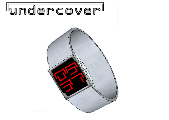
Design submitted by Heather from the USA.
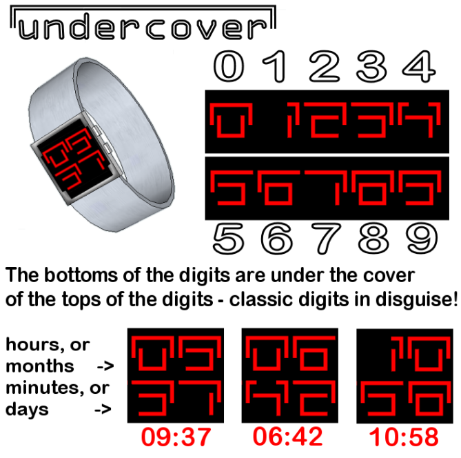
Heather says: “I’ve been playing with the idea of splitting digits lengthwise to make them cryptic but readable. It appears to be a code, but they are just digits in disguise!”.
The “undercover” digits are formed by starting with classic digits, stretching the top part, and pulling it down slightly as a “cover” over the bottom part. These digits seem cryptic at first, but with a short learning curve, can be quite recognizable at a glance.
This always on watch design is appropriate for both men and women who like to wear a fashionable, ultramodern conversation piece that tells time.


looks like a very nice layout you got there and the number scheme is very creative i like that its not very hard to determine what time it is also it looks like it has a sleek design i would most defiantly buy it 5/5*
LikeLike
not as good as your previous concept, but no doubt still the best of 1st page because its simply unique, not desperately unique. 5* and yes + need some tweak on the design.
LikeLike
Thanks for your comments and your vote, Firdaus. The main design was the display…not so good with 3D rendering, so I just make a strap and a simple case to show the digital display idea. I also had in mind that the digits could be adjusted to look even more cryptic if the tops were just pulled ever so slightly more down over the bottoms. In the end, I submitted this slightly easier to read version.
LikeLike
Well Heather, it’s just a new writing, bravo!
5 * and yes of course.
LikeLike
Bought 😀 TF could make a series of your display ideas. You have many similar designs so it would be easier to make a series of watches than of mine for example. “The encryption series” sounds nice. I think that would the best for you. Maybe a single watch isn’t strong enough to make it. And if it does, it would be a pity if the others don’t, because they are close. There could be one basic case, different straps and materials, and then the different displays in different colors.
As for this concept: impressively simple and effective and easy to make – op-ti-mal!
LikeLike
Sam, thank you so much for your comments. 😀 It would be so awesome if TF made a series from my designs! What I like best about this design contest is that some day I may be able to wear my own design on my wrist. So cool.
LikeLike
As I said on your page I like this!
Simple but cryptic numbers that are quick to learn but un-readable to the passer by with a clean and simple case.
Would work it a variety of different coloured numbers too. 5 stars and Yes
LikeLike
good job Heather, I like your style
LikeLike
Refreshingly cryptic, yet easy to read. When you see the method it becomes instantaneous. I like the miminalism of the design too, square face with a leather strap not dissimilar to Kaidoku. 5/y from me, would love to see this on my wrist.
LikeLike
Very nice!
LikeLike
Best design for a watch I have seen in a while. I haven’t bought a new watch in 10 years now (that battery must be getting old…) but would definitely purchase this if it hits the market. Six Stars!
LikeLike
wow! that’s quite a compliment! Thank you! 😀
LikeLike
I love your design, as usual, Heather! Once again, a really cool looking, almost alien/sci-fi feel on the surface, yet such a simple underlying concept with such easy to read numbers. Very creative and of course I’d love to have it!
LikeLike
This watch design is very original! I would defiantely purchase this watch if it went on sale!
LikeLike
This looks great. Smart looking and not over-designed. I would definitely buy this
LikeLike
Not long left on this one Heather, best of luck 🙂
LikeLike