Collaboration design submitted by Peter from England and Sam from Germany.
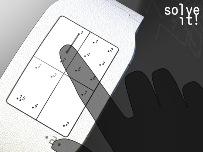
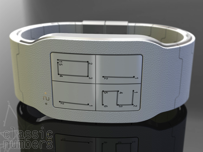
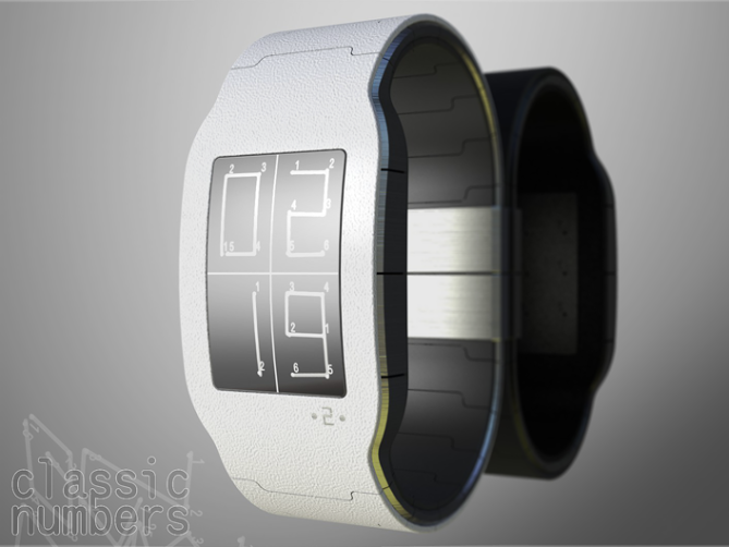
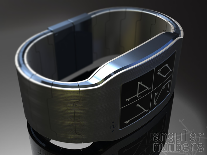
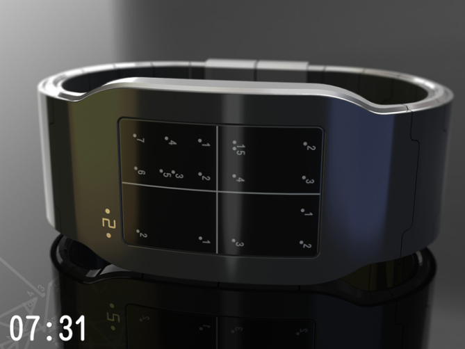
“The idea for this watch design concept comes from dot to dot drawing. These “coded” images have their own artistic appeal and make an interesting display for a watch.The time is told by numbered dots. This might be confusing at first, because the numbers don’t tell the time directly. One quickly figures out that the dots have to be connected to show the four digits of the time display. If there is not enough time or imagination, there is a button for a quick solution. But why not solve it yourself? You can join the dots with your finger thanks to the touch sensitive e-paper display.
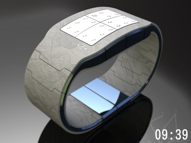
The e-paper which reflects the inspiring paper drawings and lets the display look less technical than LCD. It also allows different styles of numbers. There is a bit for everyone here. The display is cyptic, more or less challenging, but easy to decipher. It gives the watch an artisitc note without becoming kitschy. And last but not least, it is unisex.”




Hi guys! Nice collaboration. I like (5* and Yes) this interactive concept! It’s really unique. Congrats!
LikeLike
Thankyou Laszlo 🙂
LikeLike
Hi Laszlo! Thank you!
LikeLike
Indeed, collaboration beautiful for a beautiful watch.
5 * / Yes, what else?
LikeLike
I’m glad you like it Patrick, Thanks for the vote 🙂
LikeLike
The idea crossed my mind, to work with Sam, you have been right, because I love what he does and I appreciate his comments.
LikeLike
It wasn’t a planned thing, the dot to dot drawings just came up in conversation. Its seemed a nice idea for a watch and the rest happened quite organically.
I was very flattered and happy to do this project with Sam as I am a fan of his work and his constructive critique.
The best bit is we are both very happy with the resulting design and hope everyone likes it too. 🙂
LikeLike
Congratulations to both, it is successful!
LikeLike
sounds like a wish for marriage lol.
LikeLike
Thank you Patrick, for your vote and your nice words! You too Pete 🙂
Yeah, it was a spontaneous decision that guided us into this collaboration. It was exciting to see this project developing with the each other’s part of the work.
LikeLike
Completely outstanding and eye popping design submission. Congratulation to both of you. Nothing negative to say here except I have a weird feeling and unsure about it, (probably seen on Sam’s page or so) need to confirm it later, but never mind, I love the idea, rendering and all of it. A design from Heather caught my attention on the first page and this one just add to the line. 5* and yes + respect.
A note: you guys might scare other designers…
To Peter: This kind of design, very good for you…
This is good.
LikeLike
This is on the more conservative side for me as you will know from my other submissions, and shows a turning point with my approach to entries for the blog.
It was a fun project to do especially geeting to work with a ledge! (Sam) He also made me raise my game!
So hopefully all my future submisions will be of a similar quality.
I’m glad you like it.
Thanks for the comment and the vote Firdaus 🙂
LikeLike
Thanks alot Firdaus! Good to read your comment.
Oh yeah, Heather is back!
Maybe you remember my Polygon watch. That also has a zodiac-ish display.
To the note: I hope we don’t scare people. I cannot mention this often enough: Kaidoku was a sketch from a boy! Everyone, alone or in a team, 3D skilled or not has a chance. Have a striking idea, be convinced by it, that’s all it needs 😉
LikeLike
Yeah, of course I’m back 😉
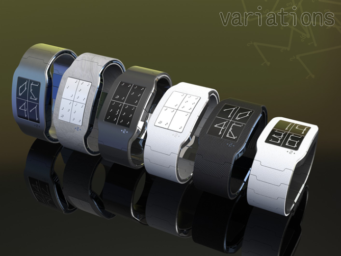
I like this design a lot. It’s a great idea — interactive if wanted/needed, but readable without it — I do think it’s more readable with the classic numbers because people are used to the shape, and I like the look of them better — they match the rectangular display…I like the black display better than the white, even though it doesn’t look as much like writing on paper. The idea of the interchangeable strap parts is awesome. Great job, you guys! An excellent pairing!
LikeLike
The advantage of using the e-paper for the display is that you can choose which colour screen/numbers and the display style. So you can have your preference.
My personal preference is the black screen with the brushed steel strap and classic numbers (very classic looking), but then I think ummm carbon! to many choices! hehe
Thankyou for your feedback Heather 🙂
LikeLike
Yeah thank you indeed 🙂 Good critical (in a neutral way) review! I must say, I like the metal version most.
LikeLike
Wow now thats fantastic, critpic but fascinating…you just want to solve the puzzel.
Looks great and I love the interchangable parts.
I presume that the e-paper allows you to choose between black or white screen and numbers and the number styles. That really makes it customisable.
Great work, a fine collaboration! 5* and Yes
LikeLike
The reason we choose the e-paper display is that it gives you the option between number styles and the choice of black or white (or shades of) for the background or numbers.
I know that TF have not favoured this technology in the past due to its limitations or low resolution.
I think in this context these limitations are not a problem as any lack in resolution adds to the original theme – dots on paper inspiration. This combined with the interchangable strap parts should make it attractive to more people.
Thanks for your comment and vote 🙂
LikeLike
Thank you Cole!
Yes, you picked out the advantages of the e-paper! Pete and I believe that this is hard to make, but variety and freedom of expression were convincing in the end. LCD lost it’s advantages after some serious brainstorming. It’s cool you got fascinated.
About the resolution: I’d like to refer to e-books. Grown technology + made for reading = definitely sufficient resolution. I think the translation into a watch is the problem… although this has been done before. Wherever the obsticle is, this concept needed to be shown with it’s full potential 🙂
LikeLike
This is really stylish and I love the clever display, its difficult at first but you soon get used to it.
I like the fact that you can draw the numbers in or press a button to reveal them when your in a rush. 5 stars and yes please!
LikeLike
Thankyou CLP for your comment and vote! 🙂
LikeLike
Thank you CLP! I like the view you have on the watch 🙂
LikeLike
good work guys, no fair teaming up, lol 5*
LikeLike
I need all the help I can get! hehe
Thanks for the comment and the stars! 🙂
LikeLike
Hehe 😉
LikeLike
Most original! E-paper plus touch sensitive.
I like!
Seems like after a while one would not even need to trace, as you would eventually learn the dot positions. Then you’d look like even more of a wizard when people asked for the time!
Love it!
LikeLike
Yeah I think your right Cory, it would become automatic after a while like becoming fluent in a language.
Im glad you like it, thanks for the comment! 🙂
LikeLike
Yeah correct! Later you’ll be a pro and see the time right away. We used different styles of numbers to keep the challenge as long as possible. But when the day comes, you see the numbers without solving, you can let the one, who asks you about the time, solve it. What a cool communication starter 😀 Thank you Cory!
LikeLike
watches that make us look like magicians, hmmm i think Cory is on to somthing!
LikeLike
Does that mean you have to ware a Tux?
LikeLike
and tap the watch with a wand
LikeLike
Harry Potter inspired watch, anybody?
LikeLike
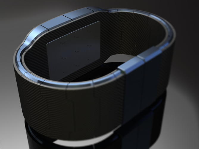
…and the hidden vertically mirrored PF logo on the battery cover! Tiny, cute idea! I like it!!
LikeLike
Nice you saw it! Make another guess 😉
LikeLike
Now this cool, very sleek and sexy with a clever twist.
Hurry TF this will make an ideal christmas present! 5 stars and yes sir!
LikeLike
I can only second this, hehehe. Thank you Dek!
LikeLike
TF would have to go some to produce this for this christmas! But next year would be realistic! hehe
LikeLike
This watch is truly beautiful. I enjoy the fun of the concept and the unsaturated colors of it, to go with the ePaper. Another serious win for consistent winners.
5* and Yes. I’d vote more than once, If I could.
LikeLike
Great comment! I wish you could vote more than once! hehe.
Im glad you like it, thanks for the comment and the vote Xenagogue 🙂
LikeLike
Hehe, nice statement Xen 🙂 Thank you!
Although the rating is decreasing progressively, the resonance seems is pretty good, don’t you think Pete?
LikeLike
I agree Sam, going on the comments rather than the ratings this design seems to be being well received.
Thanks to everyone who has commented so far! 🙂
LikeLike
great concept! great design! 5/ yes you make a good team guys, tf design team have to be jealous about this one 😉
but i have one technical critic, the band have a very beautiful continuous aspect but unless the watch is made to measure it can’t be done like that or it will pinch the skin, but anyway congratulations guys
LikeLike
Hi Rachid, I’m sure the TF Design Team have nothing to worry about hehe 🙂
I anticipate that the main part of the strap connected to the case would have removeable links as per a regular stap. The inner and outer strap parts clip onto the main strap and the ends insert into slots in the clasp. These parts would be made of soft materials (plastic/rubber) with a finish applied (carbon, steels effect etc) and could be trimmed roughly to length, as the ends insert into the clasp the ends would not be seen. (I have a Phillip Stark watch which needs cutting down in a similar way)
Thanks for the great comment! 🙂
LikeLike
http://gadgetsmatrix.com/archives/dot-to-dot-e-paper/8146
LikeLike
Beautiful !
I really like the shape of this concept. The idea is original also even if I prefer not to “manipulate” the watch before it tells the time (a matter of taste). But these shapes ! Clean but not too simple, angular but smooth enough, perfectly dosed. The combination of two materials gives a stylish hi-tech feeling. I prefer the classic numbers.
Just a thing, I’m not sure that the inner part of the strap is essential. It seems not to be visible when worn, it could raise the price and add flexibility problems, given the -stylish, but- really small space between the “links”
Anyway, beautiful result, I wish you 2 the best with that one.
LikeLike
The laminated apperance of the strap is kinda inspired by the iphone, its got a metal band (chassis) between the two pieces of glass which gives it a high end feel, that is what we tried to do here. I agree you could loose the inner band if it was necsessary to reduce cost or simplify the design.
Thanks for the critique NL1 🙂
LikeLike
Classic numbers and quick button solve for you then 🙂 The hint about the strap is comprehensible. Thank you very much NL for the detailed review!
LikeLike
http://www.stumbleupon.com/su/17gry1/www.spicytec.com/2011/10/dot-to-dot-e-paper-concept-watch-design.html
LikeLike
Uhh where did this masterpiece come from out of a sudden? I don’t know where to start about what I like! Everything has been said already. Now THIS is a watch worth 4.8 and not that boring rectangle counting watch. 4.8, 4.9, or 5.0, yes! But not 4.1. And I guess haters and cheaters are trying to rate it down until they are happy. This is pure creativity, pure passion for design, pure innovation! You cannot deny this. The only bad thing is, it’s just a concept. That’s making me sad.
LikeLike
Its was an interesting project to do, doing a colarboration throws up some interesting ideas and challenges too.
We were both very happy with the result (which is a bonus) and have been really pleased with how well its been recieved. It did hover in the high 4s for a while before it dropped to where it is now. Hopefully TF will pay more attention to the positive comments it has recieved.
Hopefully TF will make you happy again! Thanks a lot Acan
LikeLike
I agree with Pete. Very nice critique! That’s worth more than a decimal place in the rating. Thank you Acan!
LikeLike
http://technabob.com/blog/2011/10/12/dot-to-dot-watch-concept/
Thank you Paul 🙂
LikeLike
http://www.theplatform.info/feedcontent/article/49546
LikeLike
http://rohit-yadav.blogspot.com/2011/10/technabob-daily-update-cool-gadgets_13.html
LikeLike
Adorei esta maquina , quem sabe um dia usarei um ?
LikeLike
If it gets enough votes and TF feel the same maybe one day you will get the chance!
Fingers crossed x^^x
LikeLike
http://niub.tumblr.com/post/11411301162/prostheticknowledge-dot-to-dot-e-paper-concept
LikeLike
🙂
http://mastermaverick.blogspot.com/2011/10/conceito-de-relogio-faz-voce-ligar-os.html
LikeLike
http://techworldtop.com/concept-dot-to-dot-watch
LikeLike
http://neverchill.com/3103/dot-to-dot-watch-concept
LikeLike
http://technology.automated.it/2011/10/13/dot-to-dot-watch-concept-time-to-connect-the-dots/
LikeLike
Not bad for a 4.0 rating 😀 My 4.8 get less attention outside 😉
LikeLike
http://ohhitech.com/2011/10/13/dot-to-dot-watch-concept-time-to-connect-the-dots/
LikeLike
http://idigitaleg.com/blog/index.php/2011/10/14/dot-to-dot-watch-concept-time-to-connect-the-dots/
LikeLike
http://www.thegadgetsreview.info/category/wrist-watch/
LikeLike
http://www.techtudo.com.br/curiosidades/noticia/2011/10/conceito-de-relogio-faz-voce-ligar-os-pontos-para-descobrir-hora.html
LikeLike
This looks great! The world knows now!
LikeLike
Not long left on this epic entry, great work guys! It should have got a 4.8 imho!
I hope you do another colaboration cos this one is awesome, and I hope TF make it!
LikeLike
Hi CLP,
Thank you very much, it was a fun project to do!
Yeah would have been nice to score a little higher but the comments have been excelent, its had a good number of shares and been featured on a number external blogs.
Thanks for the comment! 🙂
LikeLike
Time is nearly up for this entry so I will quicky summerise
This design has been well recieved, and the comments have been really positive!
Its been featured on plenty of external blogs and has had a real boost in shares in the last couple of days.
It would have been nice if it had scored a little higher but the comments make up for that.
Thanks to everyone who took the time to commnet and vote.
Thanks to Sam for doing this project with me, it was a lot of fun to do!
All thats left is to hope its done well enough to be considered by TF
Kind Regards
Peter from the UK 🙂
LikeLike