Design submitted by Peter from UK.
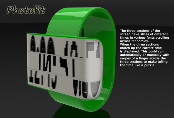
The inspiration for this watch design came from early photofits which were made up from three to four sections of faces. These sections were interchangeable so that a likeness could be made by combining the sections.
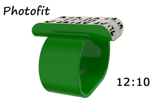
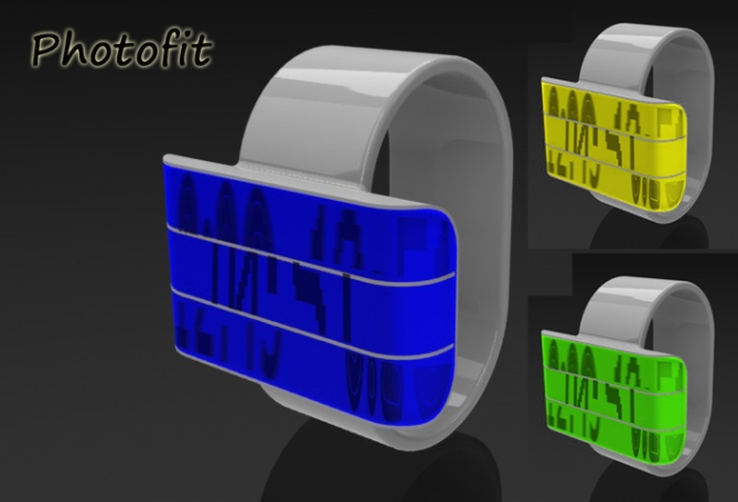
The display is separated into three horizontal sections. Slices of different times in various fonts scroll the three sections. Eventually, the slices of time match up and freeze in the center of the display showing the time for a few seconds before scrolling again. This is initiated by a tap on the display. To skip the scrolling and display time quickly requires a double tap and the three section can be scrolled manually by swipe gestures to make telling the time a puzzle.


Nice puzzle … sliding concept is really a nice one … exceptionally different …
LikeLike
Thanks Ranjan
LikeLike
Interesting display idea. I don’t think you need different fonts, though…it would be enough for me to have the three scrolling slices in the same font. To help explain this submission, it would be great to see an animation, even a simple schematic of the display.
LikeLike
I totally agree an animation would have been very useful in explaining the concept. I must really re-learn animations, its been a few years. I did wonder if it would be better off with only one font, I figured the blog would answer that query. Thanks for the feedback Logan
LikeLike
Thanks TF for adding this concept to the blog! 🙂
LikeLike
Nice simple idea, would be criptic at first but clear when the time freezes. I think being able to swipe the sections about would be cool! 5 stars/Yes
LikeLike
Yes the malipulation of the sections of time would be fun. Thankyou for your comment/vote! 🙂
LikeLike
oooo I like this one! Very original and simple. The strap needs more detail but I can see the display is the main event. 5 and Yessss!
LikeLike
I must admit to not spending much time of the styling of the strap, the display concept is the important bit, this is very much a cad sketch!
Also I didn’t mention in the submission that I think this could very easily be a unisex watch.
Thankyou for your oooo and your vote! 🙂
LikeLike
+ the three time splitting lines. GMTA, Pete 😉 I like how they play with the time display
+ the rounded sides, where the display flows over. Definietly an eye-catcher.
+ the touch option to stop the flow and read the time
+/- would work easily in LCD. Maybe not different fonts possible, but that’s not necessary.
the negative points are about the geometry only. Ok, one thing: although the geometry is pretty important cause it carries the concept and gives the overall impression of the watch, it’s still just a shell for the idea, which is way more important. That said,
– the proportions are unconvenient for me. Such a big and thick case and so small straps. Along with the colors, I have a little toy-ish impression. Maybe the chunkiness can be molten down with a fluent integration of the case in the straps.
+/- the strap details. I see they do influence people’s opinions. But actually that’s not that important. It would’ve been nice tough. Just imagine an optimal TF-handled strap 🙂
Cool support-worthy idea definitely.
LikeLike
I can’t argue with any of your points.
You know much more than I do regarding what is possible with different display systems. I would have no issue with only one font style. It would proabely be clearer anyway.
Again with the size and thickness I don’t know the limitations but I would have no issues with it being smaller or slimmer.
The strap to size of display is a subjective thing, I wanted this to look a little different and like TF have badged it conveyor like,I don’t know if that would be lost if the strap and display were more similar in width.
I might have a play with these proportions, strap style and colour to see what it looks like!
Thanks as ever for your in-depth critique! 🙂
LikeLike
Another new idea! I like the screen division and criptic display. The playful time display is amusing and interesting. A more subtle colour scheme and Im in for 5/Yes
LikeLike
I will have to do a couple of renderings in more subtle colours/materials.
I will post them on my fb page at some point. I’m glad you like the concept/idea!
Thanks for the comment/feedback 🙂
LikeLike
Hey Pete, definitly an eye catcher and easy to read. Fresh idea 5*
LikeLike
Thanks Gordon! Thanks for the 5!
LikeLike
reminds me of the times square news scroll, perhaps it could show text as well, like reminders of scheduled apointments
LikeLike
I like the way think Gordon, maybe a txt msg viewer too, save getiing your phone out etc.
There is a few possiblilities I haven’t thought of for this one! umm potential! 🙂
LikeLike
Hi Pete, I like the idea much, but it is the drawing which I like less, or to finalize the bracelet and an adjustable closing?
5 * and yes, especially for the idea.
LikeLike
The visuals are not my finest work, but if you like the idea I am a happy man!
The strap needs work for sure. I will at somepoint do some more work on it and add it to my FB page.
Thanks for the feedback Patrick 🙂
LikeLike
I have added some new images of this concept to my FB page (PF Design) with tweaked proportions and more conservative colours. Click on my yellow name to link to my page.
LikeLike
Aaaah much better, really much better!
This is a beautiful watch that I like!
LikeLike
Its amazing what difference a few subtle tweaks make, I think it looks a lot better too.
I’m Glad you like it. Thanks for the comment Patrick 🙂
LikeLike
http://www.facebook.com/pages/PF-Design/159423137472755#!/photo.php?fbid=172367369511665&set=a.172310606184008.43182.159423137472755&type=1&theater
LikeLike
I have attached a link above, if you would like to see updated images of this concept using feedback from peoples comments please click on the link or my yellow name to see my FB page (PF Design)
LikeLike
Very unique design and idea! I like it!
LikeLike
Thankyou very much Matt.L 🙂
LikeLike
Not my taste at all. I don’t wanna talk about the look. Regardless of the design, I like the idea of splitting the time display. Looks like a news ticker. And if time isn’t news, I eat a sock. However this idea get’s into the shop, Tokyoflash, make it. I know you have a good taste.
LikeLike
Im glad you like the priciple if not the style of the thing. Check out the updated images on my fb page (PF Design – Click on my yellow name to link straight there) the updated images are proportionally much better and in more sober colours.
Thanks for the feedback
LikeLike
I’ve got a feeling this one disapears into oblivion tonight so I will summerise.
I’m a bit dissapointed in the rating for this one, I can understand people not liking the visuals (and they probably didn’t look at the newer/better images on my fb page) but the core idea I think is good and right up TFs street.
I think if I had just submitted a writted description of the idea and TF had entreperated it into a design it would have done much better!. I would like to thank all the people who took the time to vote and comment! 🙂
Kind Regards
Peter from the UK 🙂
LikeLike