Design submitted by Gordon from the USA.
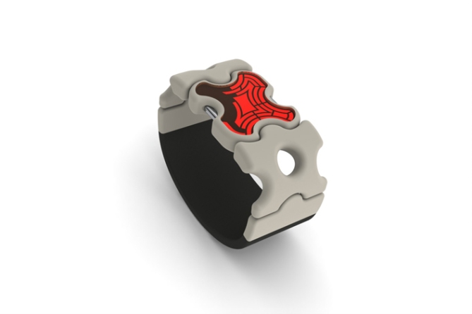
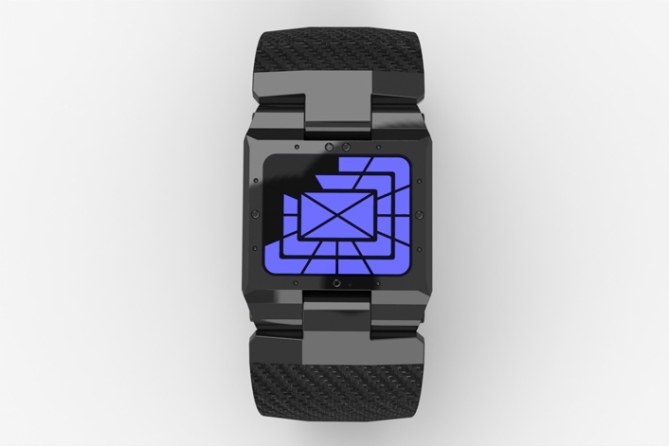
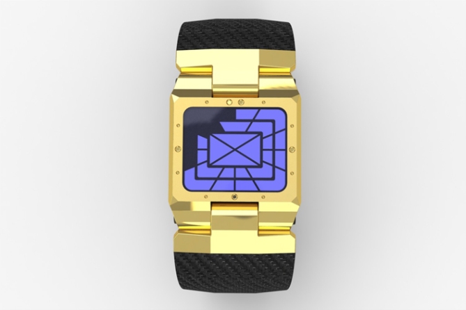
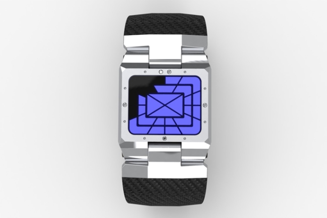
Time is told like an analog watch. The outer band of lights represent the hours, the second band of lights represent 5-minute intervals, and the inner band represent single minutes. The light in the center lights up when the is PM.
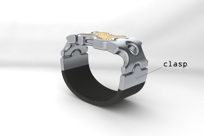
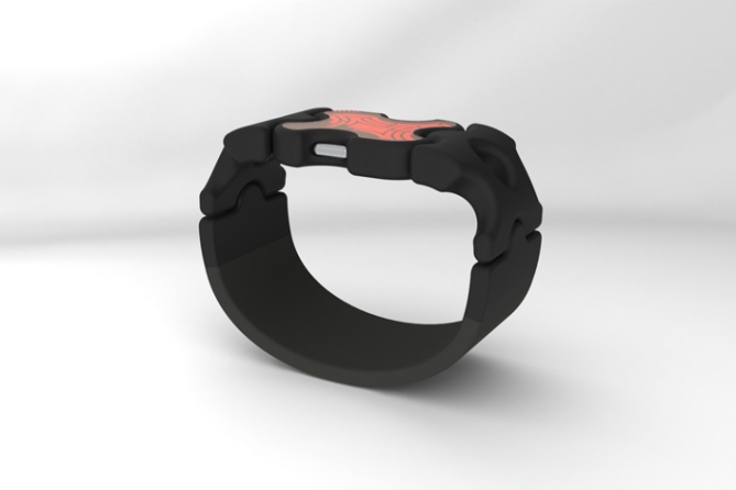
The clasp hooks onto the watch and tension is kept by a band made of elastic material to create a one size fits all comfort fit.


not my style, but pretty cool
LikeLike
i love the puzzle piece shape of the case- it’s very different. Also love the holes in the strap and the one size fits all is a great concept. The display looks very futuristic. I prefer the metallic looking strap choices. Great design, very readable. 5*/no from me. It’s only a no because it’s not very feminine – too clunky for a woman, but sleek and nice for a man.
LikeLike
thanks Heather, I just threw another version with a link strap at TF, I hope they see fit to post it on this entry. Stay tuned
LikeLike
Hi Gordon, the strap looks like a backbone, it’s pretty special, perhaps intended for adolescents “Gothic”?
5*/Yes for originality.
By the way, have you still your ant named George who knows and speaks the time, does it interest me?
LikeLike
Thanks, and yes George is fine thanks for asking, he is busy working for me right now so you cant have him
LikeLike
Don’t forget Ants have rights too, don’t work him to hard! hehe
LikeLike
Poor little creature!
LikeLike
Its very different, its got a bit of a Flinstone’s (rounded edges and chunky proportions) look about it. Very chunky and fun, I can imagine this appealing to teenagers. A nice piece of rendering too.
Not my cup of cha, 4*
LikeLike
Thanks Pete
LikeLike
This is Ledge.
It looks likes bones (H) damnn cool.
the reading is simple so its good, and shape is epic, i want to buy the red and black one (H)
5 stars and yes heehehe…i can fully see this in the TF store
LikeLike
Thanks Jun, love your positivity, stay tuned for future images of this watch to come with a different twist
LikeLike
Are you going to add them to this entry? How do you got about it? I have tried adding images via the submission form with minimal sucsess.
LikeLike
yeah, me too, I think I am gonna make a flicka page right now and post the link here
LikeLike
Thats the reason I started a Face Book page, click on my yellow name if you wish to see. Its very useful, especially as it can take a while for entries to get onto the blog so its nice to be able to post them there.
Look forward to seeing your other images.
LikeLike
True…a facebook page can allow us designers to give feedback for each others designs..instead of being lonely on our computers sharing designs with yourself haha xD…its good to show each other before it gets to the blog..it keeps you motivated xD
LikeLike
http://www.flickr.com/groups/1745527@N24/ can anyone tell me if this link works to my new flikr group with additional watches to accompany these
LikeLike
The page loads up but theres no images
LikeLike
how bout now, its working for me
LikeLike
Still no images, do I need to a signed it member for me to see the images?
LikeLike
http://www.flickr.com/photos/gordonlardi/ hey Pete does this work?
LikeLike
Yes mate, so many colours! my eyes my eys!! hehe
LikeLike
Big fan of the strap, not so much of the face. The link strap concept is quite brilliant.
beautiful rendering. Fully fleshed-out concept, but just not my style. Do love the Black case Orange display idea.
4*/n
LikeLike
thanks Xena
LikeLike
http://www.flickr.com/photos/gordonlardi/ CHECK IT OUT
LikeLike
holy crap this is awesome!!
LikeLike
thanks bro, i like the strap more on the flckr site photos
LikeLike
COMPOSITE, carbon and titanium, cool man!
LikeLike
This is pop art great for skaters!
LikeLike
thanks Firdaus, this watch is definitly for those looking to grab attention
LikeLike
http://www.flickr.com/photos/gordonlardi/ ok i am done, on to the next
LikeLike
Hi TF, I appreciate you posting the additional pics but you put them in the wrong submission, those belong in the Billet watch i last submitted
LikeLike
Doh! at least your additional images got added even if they are on the wrong entry. Additional images for two of mine never landed, God knows where they ended up.
LikeLike
Hey Pete, Im learning how to use flickr it seems to be a good way to go. That way if people are interested in your design you give them a link to dig deeper
LikeLike
Its definatley usefull to have somewhere you can link too, to show extra/new images!
That was the reason I started my FB page (just click on my yellow name)
I don’t know how many people have taken the time to look but its there if they wish too.
Also its good cos I get very impatient with the time it takes for entries to get added so if I want to post stuff early I can.
Its all good stuff! Keep up the good work Gordon!
LikeLike
CHEERS SAME TO YOU
LikeLike
They look good. very cool style. So many LCD’s its hard not to like HAHA.
LikeLike
thanx brother!
LikeLike
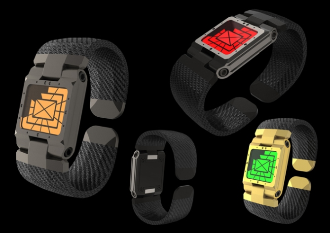
why there’s picture of your other / previous design posted here? or is it me who confused?
LikeLike
Yeah , i asked TF the same question but I wont complain, more advertising for me hahahahah!
LikeLike
The shape of the case looks like a children’s’ toy. It’s not very appealing. More goofy than artistic looking. Unnecessarily complicated. It doesn’t know what it wants to be.
LikeLike
OUCH!
LikeLike
You’ve been Timinatored!
LikeLike
the original hatr
LikeLike
I don’t mind critism as long as it is constructive!
I’ve had a couple of rough ones from him before.
Has he had work on the blog?
LikeLike
I dont know, my guess is no
LikeLike
It’s not my taste. The shapes might look good graphically but not within the context of a wrist watch. I can see the toy analogy of Tim. Good luck next time. The three last images are another concept right? That’s how a watch has to look like.
LikeLike
Best of Luck Gordon! 🙂
LikeLike
yeah thanks,wankers
LikeLike