Design submitted by Calvin from UK.
Calvin wanted to bring Pimp back to life, but with a twist to its simple yet unique time telling method. A watch that everyone would like and relate to.
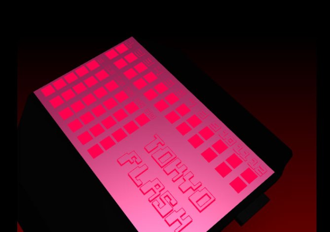
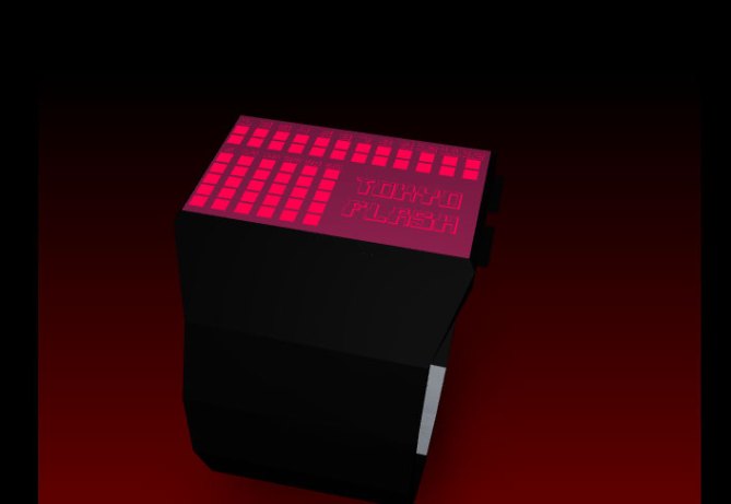
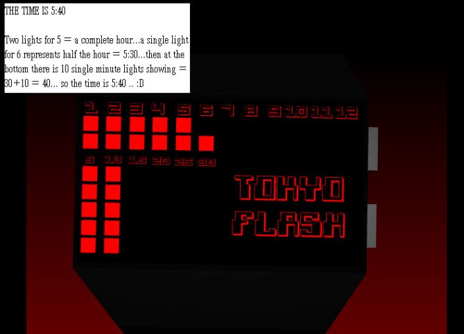
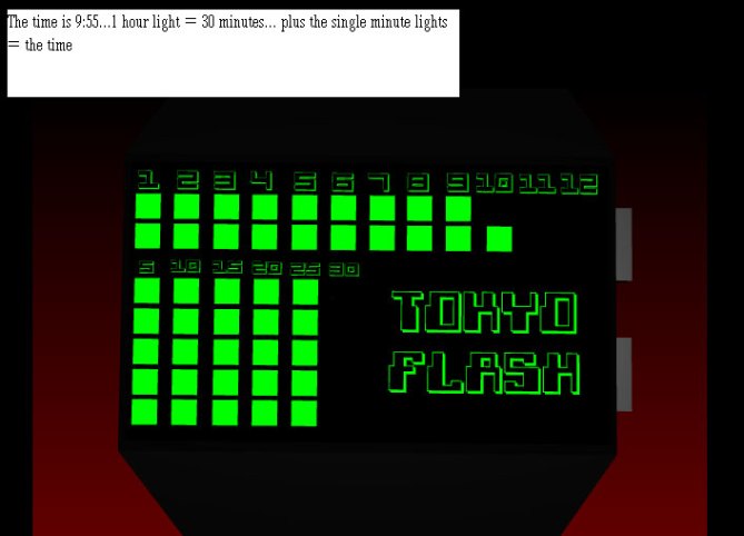
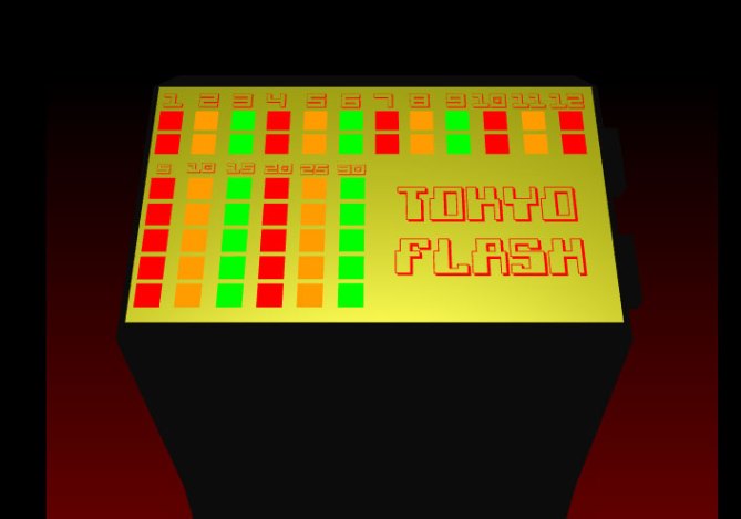
The design is veryle, black case and bracelet with an array of square LEDs, with a logo on the face consisting of Tokyoflash or Pimp. Along the top there are 24 half hour sections, instead of one light for the hour, there are now two and 30 LED squares to show the minutes. So if there are two hour lights showing, this means it is a full hour, if there is 1 light showing, it means it is a half hour. If there is a half hour, you must then count the sections of minute lights to add up the time which is simple because it is arranged into 5 lines of LED.
Calvin sees all people wearing the design because it it simple as the original Pimp watch, and it can be considered as a new version of Pimp which would make a lot of people very interested to see a legend return. It comes in a array of color including pink or purple which would appeal to women. There also could be a backlight version to make it more appealing or more techy. There is also another version layout where there is no word logo and the single minutes are spread out further across the screen.


i’m kinda up in the air about this design.
i like it, it’s something that i would buy (if avaliable in SS), but it’s been done b4.
or at least, things VERY similar have been done b4 at tokyoflash.
the “pimp” line for example.
only real difference is that the minutes only go up to 30.
that being said, i love the pimp watch. so i also love this design.
like i said, my only complaint to it feels un-original……other than that i like it.
LikeLike
btw i DID notice that you wanted to bring the pimp back to life. voted “4 star” and “would buy” 🙂
LikeLike
thankyou very much dude ^_^…The pimp range of watches are very unique ans signature for TF, i wanted to make a new pimp watch but of course we cant make drastic changes to the pimp line otherwise it will ruin the originality…so i changed the layout and added 2 half hour groups instead of 1 hours…and only use 30 minutes, its simple as the other pimp watches just different layout really, and I added the factor of a possible LCD version to make there a cool backlight version (the first pics) Im glad you like the design 😀
LikeLike
This isn’t my favorit of your design but its bold and bright and would certainly grap attention.
I think the strap needs more detail but I know you are restricted by your software. 5* and Yes (return of the pimp)
LikeLike
Same here dude, This bracelet here is just a template as im sure you already know i use it for all my other designs haha, because sketchup isnt so fun to make detailed bracelets with xD…but overall i think the layout of the screen is awesome i guess that would be the main thing people like hehe
LikeLike
I think I like this design, but I’m not really sure if I understand how to read the time. Voted 5 and yes because it fits my taste and I believe the real product would interestingly appeal. But I still need to rethink about the reading system.
LikeLike
If i can impress you it means the design must be good! xD…I guess the time telling is a bit sketchy but it can be simplified with TF’s work xD
LikeLike
Great job..i like this watch cos it has got a nice kwl effective eye catching colours like shinny kinds of watches fr anyone. So, i prefer to buy this watch ws made it fr real. it looks much more unique comparing with the ones that are on the blogs and clever way of designing this watch with the good use of different colours depending ro people choice of colours. 5* though heheh
LikeLike
yes, hehe…I thought if i make an LCD screen version too, people could see hwo cool it would loo kto have two contrasting colours with a backlight to make it more cool xD
LikeLike
I really like this design, with the bright colours and lights (I want the pink version).
The display is awsome! 5* and yes please
LikeLike
Thankyou hehehe, Im glad TF uploaded the pink version, so people can see the reality of how cool the LCD backlight would be on a pimp watch :D:D:D
LikeLike
Thanks TF for uploading, for everyone there is more Pics of the watch here on my FB Page! 😀
LikeLike
This has a retro feel to it, I love it. 5 Stars, great work!
LikeLike
thanks dewd xD Im glad you like the look of it, I would love a pimp watch that had backlight for coolness!
LikeLike
Its like a disco on the wrist! I think it just needs a bit of 3D on the face, raised areas or sunken areas just to break up the flat face a little. Apart from that 5 and Yes. (not sure if that vote saved?)
LikeLike
thanks cole 😀
I was thinking this too…maybe If the screen is sunk in to the bracelet more, so its like kisai console ^_^ it would be the finishing touch
LikeLike
i mean kisai satellite hehe ^_^
LikeLike
http://technologyinnovationsite.com/concept-led-watch
LikeLike
Nice one Bruce! 🙂
LikeLike
MUAHAHA XD
LikeLike
Reminds me of a circuit board on a computer, very techy and very cool!
LikeLike
Thankyou, i appreciate your compliments hehe.
LikeLike
Three stars is exactly my vote. The watch looks nice but it’s just boring squares. Filling up a quarter of the display with the logo is a poor decision but noone else seems to care. Reminds Matt of a circuit board on a computer? Mate, I want to have your imagination.
LikeLike
You say it looks ‘nice’…then you go on to say only negative things…? I don’t understand…people on the blog are quick to explain in great detail the negative things..but only give a hint on the good things. terrible.
LikeLike
Best of luck Jun
LikeLike