Design submitted by Peter from UK.
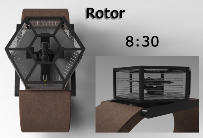
Peter says: “I wanted to come up with a single hand analog watch that uses 3D to display the time. I decided that the minutes would be shown in a conventional manner and the hours would be in a vertical plane. I looked into a means of maneuvering the single hand in both a rotational manner and up and down for the hours. The rotor arrangement of a helicopter fitted the bill. I then used this as a bit of a theme for the styling of this watch.”
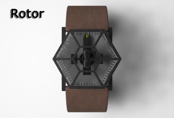
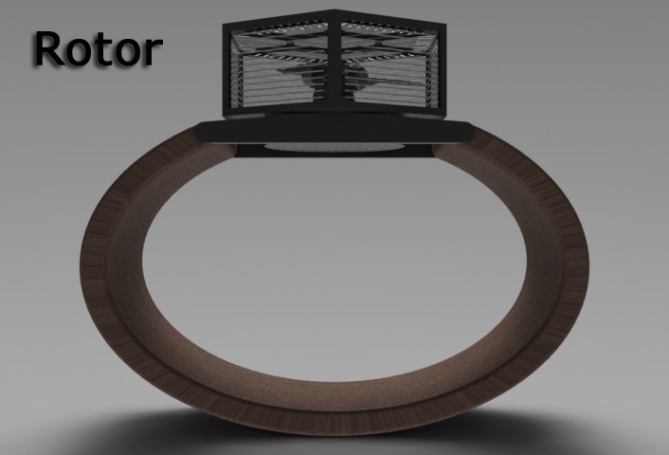
To see the minutes, you look at the watch from above as per a regular watch. To see the hours, you look at the perimeter of the watch where the single hand tilts to point at 1 of 12 bands/grooves which circle the case.
This watch design would appeal to anyone who likes analogue watches but fancies something a little different and adventurous.


I don’t really like the look of this for a watch. It’s a bit too clunky and not appealing to look at as an accessory. The idea is interesting, though. I think perhaps the concept would apply better to maybe a unique “coffee table clock” or a “desk clock” if it was made in a larger size, with maybe a sleeker look to it.
As a watch, aside from the fact that it wouldn’t really look nice on a wrist, it would get in the way of everyday movement, and would honestly be hard to read the hours because of how small it is.
On a larger scale, as a clock, these problems no longer exist, and the concept is intriguing.
That’s what I have to say as far as constructive criticism goes – I hope it helps.
LikeLike
Hi Heather,
I am not supprised this design does not appeal to a Lady or most men for that matter (I am supprised to see this one on the blog to be totally honest), its is very industrial and on the large side.
My original idea was to have a transparent cylindrical shape with the lines for the hours going around the diameter which may have been more sympathetic on the eye, but probably still on the clunky side.
I like the idea of the clock and agree that it would be clearer at a larger scale.
Thankyou for your comments
LikeLike
Hello Pete, as we say, you’re just “on” and it is because we must dare to move and walk in all ways!
Indeed, it is difficult to wear a watch (too angular and too thick), but I like this side invention of Leonardo da Vinci.
For me it is a 5 * with a Yes, because the idea is appealing.
LikeLike
Hi Patrick,
I do try to push the boundries on occaisions and probably not always sucessfully.
I am very glad you like the priciple if not the styling or scale. Thanks for mentioning LDV in reference to my design its a very pleasent compliment!
Thankyou for your comments and vote 🙂
LikeLike
this is why we like pete…he makes unimaginable..yet simple designs that when we see for the first time we think it was never possible! as someone said before he is a pure example of “design has no barriers” (H) hehehehe
LikeLike
Thanks JFL and sunglasses emoticon dude. There are plenty more crazy no barriers ideas in the pipeline! Will just have to hope TF put them on the blog! You keep up the good work too!
LikeLike
I appreciate the >outside the box thinking< and Patrick mentioning Leonardo da Vinci is not totally misplaced. The base idea is good, but there are several impractical elements:
a) Heather mentioned the clunkyness. I agree, everyday life would be more difficult with it. You cannot make it more flat because
b) the sides are divided into 12 segments which are already hard to count. On my 17" monitor all images are above real size and still hard to read. Brighter edges and an indicator at the 6th marker could help but
c) the upper three faces can't be read actually. Look at your wrist, and now try to bend it, so you can look at it from 45° above. You can't, I guess. I can't. I would need to turn my arm around. That seems doable but it's not beautiful. And the 11h face is still unreadable (if watch is on my left arm).
Ok, my suggestion, assuming, the motor mechanism is actualy no problem: put 45° mirrors around the prism to guide the light toward the wearers eyes. Embed those mirrors and the prism in a more "aerodynamic" case. Maybe you will encounter overall size problems. Use brighter markers and use helpers for the counting.
I like the steampunky concept and would like to see it improved. I give you 5*/YES although it wouldn't help. I do this to support you morally. I have an estimation about your skills and I have a good feeling 🙂
LikeLike
Hi Sam,
An in depth and constructive critique as always. I know this one needs a lot of work to make it remotely viable. The styling was a risk and could be much simpler and clearer but I agree that making the hour markers visible all the way around from the wearers perspective would be difficult and the most important detail along with the scale.
Thankyou for seeing some potential in this one and the vote (although I appriciate it will be proabably in vain) 🙂
LikeLike
Vain shmain 🙂 If you get comments, that help you improve, nothing is lost.
LikeLike
This concept inspired another that I am working on at the moment which I think is much better, so it serves a purpose! Thanks Sam 🙂
LikeLike
very nice artwork peter, i really like the look of the watch from the top but not a wrist watch, 2 /no
+1 for originality
+1 for the rendering clean and communicative
-2 for the size a watch have to be able to be hidden under the clothes it’s really too big.
-1 for the display because turning my wirst upside down to read time is really not practical
it may seem rude but i think it’s essential to mention those points, you have a good creativity very versatile also, you know well how to use a 3d software, but you have to think your concept more like a product and less like art.
LikeLike
Thankyou for your breakdown of your critique.
Im glad you like the visuals if not the design.
Thanks for the comments 🙂
LikeLike
Thanks TF for adding this concept to your blog.
LikeLike
Anything with rotors deserves a high rating from me, since im a huge fan of iL2 Sturmovik ehhehhe…the case is epic too, it so…cool…there is a word but i cant find it hehe..its just damn cool especialy the case!
LikeLike
Thanks JFL you always see the positives! I’m glad you like it! 🙂
LikeLike
I like the essential idea, but I would prefer an implementation that is easier to read and not as tall.
LikeLike
That seemes to be the general consensus. I will ponder over it to see if there is a way of achieving this.
Thanks for taking the time to comment 🙂
LikeLike
I really like the design with it´s tiny little rotor, though I won´t buy it, but I voted 5*/n, because it´s all about creativity and so I think you´ve done a great job on this ;-).
LikeLike
Thankyou very much nicolai 🙂
LikeLike
it IS creative, but i’m not really a fan.
tokyoflash watches are supposed to look futuristic imho.
however this watch looks more like it would be an antique to me.
for some reason when i first looked at this, i thought to myself “this looks like the type of watch sherlock holmes would have worn back in the day.”
LikeLike
I do suppose it has a retro look about it although that wasn’t the intention.
Thanks for the feedback 🙂
LikeLike
way to think out of the box! Call me crazy but I would put an ant inside and he could be my companion and i would name him George and ask, ” Hey George what time is it”?
LikeLike
You are crazy Gordon!
LikeLike
Gordon, I want to buy well the ant which speaks! ah ah ah
LikeLike
.:Or even more suited to a pocket watch design:.
LikeLike
Oh that’s a good idea. Then you look at each side easily.
LikeLike
I also thought last night that the whole body of the watch could be rotatable so you could see all sides with ease. Would require some kind a markings so you know its orientation. :p
LikeLike
That is a very interesting idea, like Sam says that solves the moving it around to see the appropiate side issue. Also the scale is less of a problem. A chain would also work with the industrial/un-intentionally retro stylie.
Thankyou for your feedback Jayne 🙂
LikeLike
I won’t bring something new to the conversation with this, but this concept is really creative !
It’s not really wearable, and it seems quite hard to read, but the idea to use the height is great, there is something to do with it.
LikeLike
It does need some work to make it viable it has to be said, but it is a rough concept, hopefully TF will see some potential in the priciple.
I am working on another 3d time telling method which I think works a lot better, I think it is a lot more attractive and more contempory/futuristic than this one.
Hopefully it will make it onto the blog in the not too distant future.
Thanks for taking the time to comment NL1 🙂
LikeLike
Since it is really different from what I’ve seen in this blog, 5*. Other than that, the visuals are self explanatory.
LikeLike
Its not everyones (anyones) cup of tea but its different, Thanks for the comments and the vote 🙂
LikeLike
Hmm, has a Leonardo Da Vinci look to it… but not really a realistic and usable thing to wear, But imagine the looks and the attention you would get wearing this techono-mechanical marvel. I give you lots of points for originality and uniqueness.
LikeLike
Hopefully TF will see a way of making it a more viable wrist watch,
Thankyou very much Travess.
LikeLike
Wow this is definately different! I like the glass box style. Its probably a bit on the large side for every day use. Slim it down and I’m in. 5* and Yes
LikeLike
Hopefully TF will find a way of using the principle in a more compact case.
Thanks for the comment and the vote. Thanks Cole
LikeLike
Hi, is this watch available for pre-order?
LikeLike
Yes but it would probably be a one off and retail for £10,000, let me just write up your invoice! hehe
LikeLike
hhaha xD
LikeLike
This is really cool in a steampunked kind of way. Bit on the big side but I like the idea. Make it smaller and I’d buy one. 5 * and Yes
LikeLike
The size does seem to its biggest issue. The styling was supposed to look a bit like the canopy of an attack helicopter, but I’m quite happy with the steampunk badge. Thanks for the comments and the vote.
LikeLike
This is another design that would work well as a clock. I like the idea of a pocket watch as mentioned above.
If this could be made smaller I would consider purchasing this. 5 * and Yes sir
LikeLike
Thankyou Dek,
I agree that this one too would make a striking clock. People seem to like the principle but not the scale,
Hopefully TF will see a way of reducing the size but keeping the mechanism.
Thanks again for the comment and the vote 🙂
LikeLike
http://www.theworldmatters.org/2011/09/26/rotor-analog-watch-design-takes-time-telling-to-another-dimension/
LikeLike
http://www.designbuzz.com/entry/rotor-analog-watch-design-takes-time-telling-dimension/
LikeLike
http://www.orangedwarf.com/pages/Engadget-Germany.html
LikeLike
http://gadgetsmatrix.com/archives/rotor-analog-watch-design/7656
LikeLike
http://de.engadget.com/2011/09/25/rotor-watch-bringt-3d-zeitanzeige-ans-handgelenk-praktisch-geht/
LikeLike
http://todaysbuildings.com/news-feeds?page=5
LikeLike
This is the most whimsical design I’ve seen on here in ages. The idea deserves 10 stars. The usability is bad though. If you put in some more effort to increase the quality, it would be a win for all of us.
LikeLike
Im glad you like the creativity/principle if not the design, this did not perhaps work but it did lead the way to another 3d time design called “sphere” that has yet to hit the blog, hopefully it will capture peoples imagination better than this one, keep an eye out for it. Thanks for the feedback Acan! 🙂
LikeLike
Its the last day for this entry so I will summerise.
Mixed bag of results for this one, the general consensus seems to be that this concept is better suited as a desk clock, where size and clarity are less of an issue. A pocket watch was another nice suggestion.
This concept got a fair amount of interest from external blogs which was nice, advertisement for the blog if nothing else.
Hopefully TF will see some potential in the priciple if not the design.
All thats left is to thank everyone who took the time to comment and vote!
Kind Regards
Pete form the UK
LikeLike