A new concept from the Tokyoflash Design Studio.
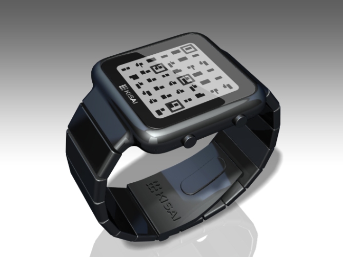
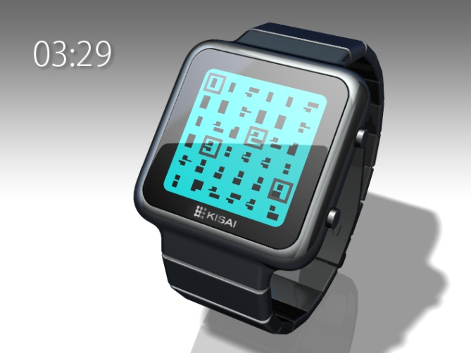
Introducing a fun concept watch design with an original display that should appeal to anyone with an inquisitive mind. The square-shaped colored LCD screen is made up of a a number of mysterious markings. Four squares move around the screen and appear around the outside of the markings to reveal complete digital numbers which represent the time. It’s easy once you get it!
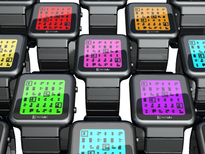
The markings on the watch display are actually the inner parts of digital numbers which are made complete by the square dropping over them. The watch has kind of a minesweeper, retro video game feel and could come in a range of LCD colors. It’s as simple to read as a digital watch but with a twist!
The case of this concept wrist watch design would be made of stainless steel and could come in brushed or polished black or silver. The watch would probably be quite light because of its slim case and strap. It could also have a date mode incorporated which would be shown in the same way as the time and could have a fun animation as shown in the video below.
How do you feel about this design? What would be your ideal case and LCD display color combination? As always, we’d love to hear your feedback and if you would like to see this wrist watch concept become reality, don’t forget to rate below and decided whether you would buy or not.


YES to the display concept. Ideal LCD color: reverse what is shown, so the background is black and the digit pieces are white. Ideal case color: matte black. Other thoughts: I would prefer an anti-glare screen, since it’s so large, and a more angular/less curved case and buttons to match the blockiness of the of the digit pieces. This feels like a very friendly design that could appeal to a younger crowd, if you could keep the price low.
LikeLike
It’s perfect! I think a polished black case with a red LCD screen would look amazing. If I had to change one thing it would be the font of the numbers, but that is it. 5* plus a yes!
LikeLike
Needs to have a button to show the date.
LikeLike
like it 🙂 5 stars for the concept.
LikeLike
Beautiful watch!
The square shape that continues on the bracelet, I like that.
I love the fun animations before reading the time.
5 * / Yes.
LikeLike
I almost always like the geometry of Tokyoflash’s concepts. This is no exception. Smooth and simple!
The display is pretty clever basically. I like the “I show the numbers, and adding an element makes them readable”. Here, I would try to let the LED elements be round in response to the case. And the frame around the display is a tad to thick. But that’s picky 🙂 I like the matrix-y animation. I agree with Logan, a negative display would be ideal, more eye-catching.
How about a widescreen version with 4 big numbers only? Showing their cryptic version all the day (recognizeable for the brains out there) and by pressing a button, the helping squares appear.
LikeLike
Very simple but very clever, I like the overall shape and the time displaying method. My only critism is that the case maybe a little plain, but this might down to colours and materials and would probably look a million dollars in the flesh!. This reveal priciple would also work nice with written numbers like the “Kaidoku”.
5* and a yes from me 😉
LikeLike
Sweet watch, the time telling is confusing and alien at first glance, but when you realise how to tell the time its easy, that’s what tokyoflash is all about. 5 stars and yes, id buy this watch any day, just like id buy ANY watch that TF has made on this blog…why some people seem to dislike and rate down on TF’s designs is beyond me, there are so many watches that I would love to see made…the main ones being: Space Face, Electric blue, Grid Lock, Futuristic vent watch goes cybernetic, Lock-Up, Sport Mode, Right angle LCD watch,….But i must say, space face is by far the best watch ive ever seen on this blog.
LikeLike
very cool
LikeLike
This kinda reminds me of the Ip*d N*no and strap for some reason. I don’t think that nessesarily a bad thing! 🙂
LikeLike
Very Tokyoflash. Abstract at first glance but not too difficult to read and has an interesting angle to it. I quite like the friendly shape and colors. I agree with Logan above, it is ideal for the younger crowd. If I had to choose a colour I would like brushed silver with either a light blue display or orange display; something a little unusual but fitting with the theme.
LikeLike
Ваще ни а чём!
LikeLike
I like the design and evething i just dont like that its square maybe you can aim for something more rectangular so we can have more of the animation???? But love the concept. Will buy if its rectangular 🙂
LikeLike