Design submitted by Sam from Germany.
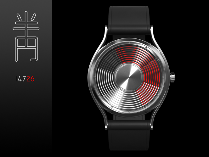
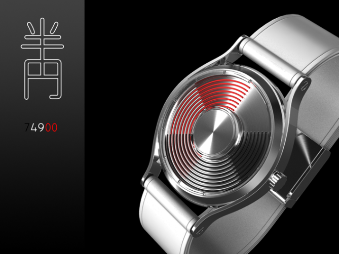
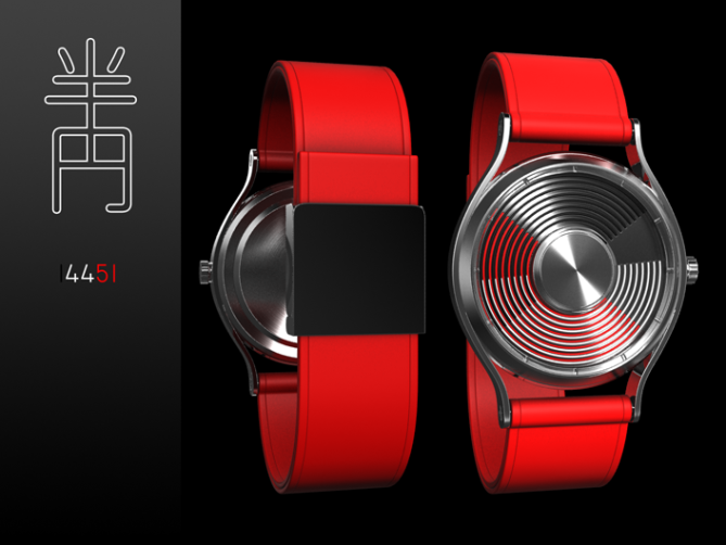
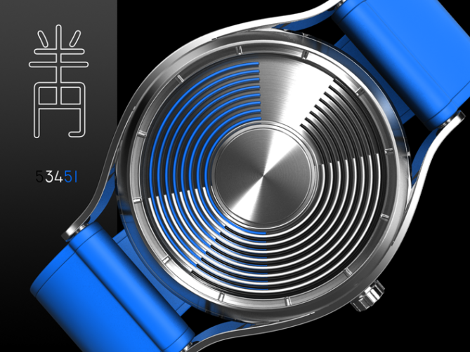
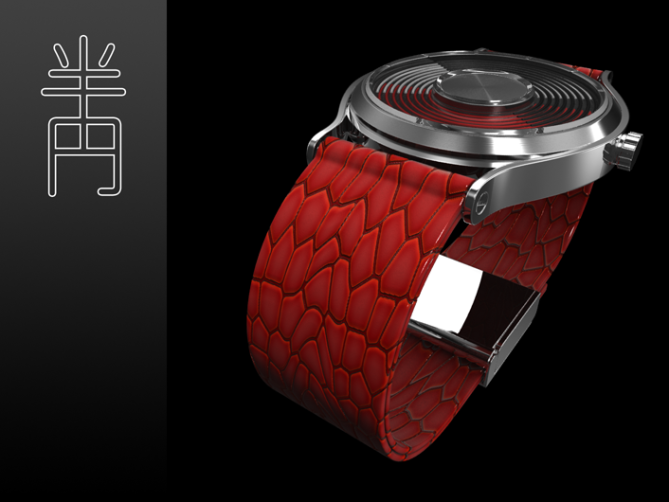
This watch design is a simple analog watch with three superimposed half-circles as watch hands to create an unusual display.
Each of the watch hands consists of eight thin half-circles. The top black half-circles show the hours, the middle white ones show the minutes and the bottom red half-circles show the seconds. The clockwise facing end of the half-circles are the actual watch hands. The different lines are slightly offset so each color can be seen anytime. This creates an interesting display with different situations.
This fashionable watch has a strong expression but stays sober in style.



nice renderings. nice design. 5 stars from me 🙂
LikeLike
Gahh 4.9? I guess the downswing can begin >.<
Thank you Gabriel! 🙂
LikeLike
Its annoying, on this blog people give low ratings on SUPER cool designs…as if they dont know the meaning of cool? it really bugs me…there are watches on this blog that got less than 4.0…when they really did deserve more…its a shame
LikeLike
I’ve posted this here before, but it deserves being reiterated. I don’t pay much attention to the stars ratings anymore for this simple reason, one or two extremely low troll ratings will throw off the whole curve, so that what used to be a 4+ or higher, suddenly drops to a 3.8
Now, on to the design. The case and strap are awesome looking, particularly the place where the strap meets the case. The time telling method is not for me, though. Replace the timing method with another (maybe zaga?) and I’m in.
LikeLike
I think the 4.9 came from the first votes and that it won’t stay there is ok and realistic. Ratings are overrated indeed, but it’s always good to stay critical.
Aww, no half circles for Cory? Not even in
blue? 😉 But thanks for sharing your opinion. And the rating pic is true, so true.
LikeLike
The blue is much easier on the eyes. Looks less like a stove top too 🙂
I’m so ambivalent about this design… Case is awesome, display is too busy. maybe a minimalist display similar to RGBsquared? o.O
LikeLike
Oh I forgot, here for you 🙂
LikeLike
Good, the rating issue is still up.
LikeLike
Nice and okay design. The reading system is quite okay too. Verdict: Okay to purchase. 5*
LikeLike
Thanks Fir. Okay is alright and fine and nice.
LikeLike
Black, white, red and chrome… elegant! I like it, and i give you 5* and yes i want it!
LikeLike
Thank you Laszlo! Yeah I reallly like colorless designs with a single added color.
LikeLike
A new beautiful watch from Sam.
I just put the hours in red, white minute (or vice versa) and the second in black, because the most important for me are the hours and minutes, and therefore more readable at first sight?
This is a detail.
5 * / Yes
LikeLike
Thank you Patrick!
Yes, that’s a good point. My thoughts were these: The faster the watch hand, the more noticeable the color, but the deeper the position. I wanted to emphasize the constant movement but without disturbing the important hands. It is ok I think, if the time is readable at the second sight 🙂 This might be a small detail, but it went through your mind, so thanks for sharing your thoughts.
LikeLike
Really like this design – a super twist on a standard analogue.
LikeLike
Exactly my thoughts. Thanks for commenting.
LikeLike
Very classy and stylish design, I’m having trouble reading the time, am I missing something?
LikeLike
I’ve got it now, bit slow on the uptake. I like it but could be a little clearer.
Still worth a 5 🙂
LikeLike
Yeah it’s a bit hard to find a level between clearity and looking interesting. I can be more cryptic, making your brain melt, but also more simple, making you feel like floating.
Pete, hanks for taking the *drum roll* TIME to get used to it 😀 And thanks for the *bell ring* rating!
LikeLike
Epic watch….just what i wanted somebody to design!!!
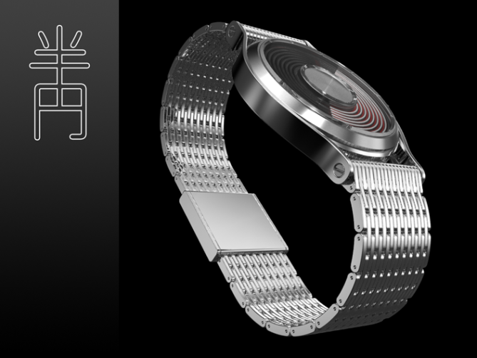
I would buy this watch if it had a cool silver matching bracelet, that would look soo futuristic, all silver watch with just red hot circles of light on the surface…groovy xD.
LikeLike
5* yes as always hehehe
LikeLike
sweet looking watch Sam, very elegant! 5*
LikeLike
Sam, you know I like this design, and, for me, it feels automotive. I wonder how it would look with a crocodile leather strap, something with a lot of texture. Seeing the watch again, I think the case feels like a luxury car, but the strap not quite as much. Regardless, it’s one of my favorite of your analog designs.
LikeLike
@ Jun: Thanks alot! I think I will try out a silver strap later. I thought, the case feels more precious, if it’s held by a different material. But it’s worth a try 🙂
@ Gordon: Thank you Gordon!
@ Logan: Totally comprehensible point about the value of the straps. I somehow felt it was too simple but didn’t know what I should do. Crocodile leather hm? I will try that out! I also see the automotive motif. It reminds me of a 50’s car cockpit (driver’s cab?) detail of the radio or the speed gauge. I’m kinda glad, I could top my other analog watches, but I’m not through with this topic yet, hehehe. Thank you Logan, for the inspiring words.
LikeLike
Now that you mention it , it does kinda remind me of a speedometer on an old corvette or mustang
LikeLike
Havent voted yet, still trying to figuer out how to read it =P (cant see the watchhands)
LikeLike
Nvm i got it =P Got confused cause the pic looked like it was pointing at 1400 =P
LikeLike
Perfect ! Confusion first, then being willing to understand and then understand. Thanks for trying ;D
LikeLike
Yeah, that is exactly what i want from a TF watch. 5* Yes (and i almost never vote yes)
LikeLike
i love this idea, and the execution.
the only question i have is.. how were the colors chosen for each of their counterparts; black for hours, red for minutes, etc. it could be me, but the most important information when i see a watch is hours and minutes… black for hours makes it harder for me to tell the hour at a glance because it’s a non-color. maybe swapping black onto the seconds ‘hand’ would help for quick visibility of the priority information?
very nice work.. if this ever becomes a real production; i’m all over it! black/red/white ftw 🙂
LikeLike
Thanks alot cort 🙂
That’s why this blog is so cool. When I was working on the watch, I lost the sense of difficulty after a while. Now, with new eyes looking at it, I understand better.
You’re the second who sees an issue in the choice of colors/ the hand order. My idea was: speed = red, lethargy = black. But I see your point. I think keeping the color order but changing the hand order would be the solution. The top layer would be black and visibly moving. The lover one red, good to see but not too good since it’s “covered” by the others.
BRW FTW
LikeLike
I agree, the strap could look more detailed. There is this amazing display and the elegant case and suddenly comes a blank strap with plastic feeling. Metal would rock like hell! I wonder why nobody else brought such a simple idea onto the screen. It is simple, but effective. As far as I can see, none of your fabulous watches has been made yet. It is about time, don’t you think? Good luck and *****/YES
LikeLike
Thank you Aphosno! I will ask TF to publish my new pictures of this concept here. I made a metal strap too so stay tuned! Or click my yellow name and see it now 😀 I also sometimes wonder, if I’m the first who made such a design. I google first and sometimes others have been quicker, sometimes I’m lucky. Every idea comes out sooner or later. We just don’t know who claimes it first. Oh yes, it’s about time. I’m ready for the next step, hehehe.
LikeLike
Sam, when you need to add new images to an existing blog how do you go about it?
Do you submit them the normal way but ask that they are added to the existing entry?
LikeLike
I checked out you metal strap version, very nice Sam 😉
LikeLike
holy sh*t, those straps bring this watch up to a fine jewelry level, maybe not Tfs audience but I sure as hell would wear the metal one(love the sepant too, i just dont look good in red. lol)
LikeLike
SWEEEEEEEEEET THE METAL STRAP ONE!!! I WANT XD
LikeLike
Join the queue dude, I’ve already placed my order hehe 😉
LikeLike
…and one for me!
LikeLike
I have pre-ordered! haha xD
LikeLike
I love the normal Black and Blue straps. Anyone that can photoshop a green version please? =)
LikeLike
Thanks for your comment!
There you go 🙂
LikeLike
Thanks alot for your work. However I think the black one is still my favorite. Cant wait to buy it
LikeLike
wow, i really like this watch!
just one thing. i’m a stainless steel guy. so if they make this, i hope they give a steel option on the strap. (only saw one in the pics of the watch)
some type of lighting might be nice too. other than that this watch is flawless.
LikeLike
Thank you diclonius! Yeah, I added the steel bracelet version later. I’m glad people asked for it and it got posted so quickly. I also like it very much. I do see the need of light. What would look best: a small ring of light around the center disc, a big ring of light that frames the display, a full background light underneath the half circles or 12 LEDs where the indicators are? I think, I will do a little study for this 🙂
LikeLike
This watch HAS to go into production. It’s so elegant, but playfull at the same time. I freakin’ LOVE all of your designs Sam, you’re kind of a genius, a creative mastermind. In every watch it feels like everything have been thought through. There’s a thought behind every single detail, and I can see that. That’s why I love your designs so much, and even more than other designers on the blog. Again, this watch is brilliant!
LikeLike
Hello GEEK! Thank you thank you thank you! Your words are so encouraging! You know, I was working on a detail of a watch yesterday, asked myself if it is even necessary and gave it a rest to look at it with fresh mind today. This really pays off. Now I can’t wait to continue. Feels good to be seen that way. You’re so enthusiastic, please tell around 🙂
LikeLike
Hmmm, nice. It took me quite a while to work out how the time was displayed. I quite like it now I get it. It reminds me of an electric fan.
So am I right in saying that this would have two coloured discs on an analogue dial with some kind of metal grid on the top to give the rings effect?
LikeLike
Thanks for taking the time to get used to it Ava! I can always recommend that! The electric fan analogy is nice 🙂
It is a normal analog mechanism indeed but there are three watch hands actually. Each of them is a transparent disc with 8 thin half circle lines embedded. So they cause their rings effect on their own. Maybe this helps you to understand it better. Probably confusing but it shows the hands’ hierarchy.
LikeLike
Is this watch available for pre-order?
LikeLike
Awww, I’m afraid no(t yet). But nice that you ask, after you pre-ordered hehehe 😛
LikeLike
Do you offer interest free credit with all pre-orders? hehe
LikeLike
muahahaha xD
LikeLike
Gahhh! I wish I was at that point where I could negotiate about give-aways xD
LikeLike
that would be epic hehehehehe
LikeLike
This looks like a stove top. Weird. I think I would have trouble looking at this and not being annoyed by all the tiny lines. It’s just to busy.
LikeLike
No problem Tom, thanks for yourhonest view!
LikeLike
The blue watch is sexy
LikeLike
Thanks JB! Sexy is my favorite adjective for designs 🙂
LikeLike
The silver and the red one are really beautiful.,,and the blue. too. I thing i had bought them all 🙂
LikeLike
Thank you Mi, that sounds great 🙂
LikeLike
Not long to go on this entry – Best of Luck Sam! :p
LikeLike
Thank you Pete :3
LikeLike
Phew, one month over again! Thank you all for your comments, ratings and suggestions.
As I always like to add: stay critical!
Best regards,
Sam from Germany
LikeLike