Design submitted by Rachid from Switzerland.
After reading different comments on Rachid’s previous design, Always 10:10 LED Analog Watch Design, he decided to redesign the concept with a different approach.
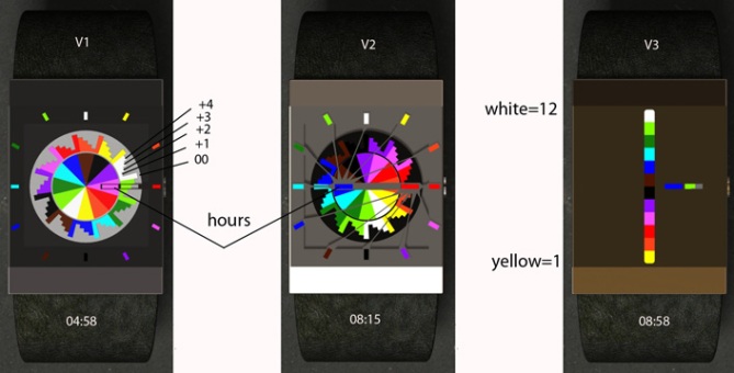
There are 3 different case designs to interpret time. Left square on all designs indicate hours and right square for the minutes.
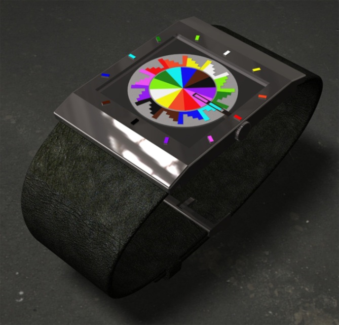
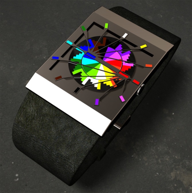
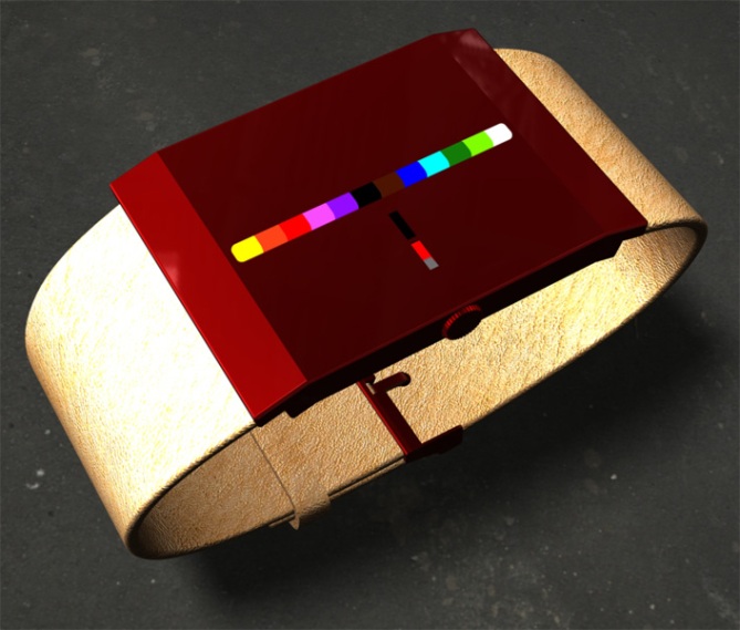
V1 is a version with apparent mechanism and a minimalist pseudo-hands. V2 also has an apparent mechanism but the p-h are inspired by 80’s sunglasses. V3 has a minimally hidden mechanism using a linear color marking system.


Of these, my favorite is V3, but I prefer your original version because it expressed the display concept, which I like, the most clearly. I can envision having V1 as a wall clock, though.
LikeLike
thank you for your comment, V3 is also my favorite 🙂
LikeLike
Well Rashid, this watch is very colorful and I like it much.
5 * / Yes.
LikeLike
merci pour ton commentaire encourageant patrick
LikeLike
V3 is wow! No hestitation to buy it. There so many colors, but they are contained so cool. Time reading system is still great. Minimalism rules!
V1 is a direct improvement of your original. I like analog watches in rectangular cases. The color wheel is a bit too much for me, but it looks interesting – no doubt. V2 is a nice alternative.
Rachid, please add more description to your explanation image. Say “minutes 00 +1 +2 +3 +4” and enumerate all colors for the hours. I know, we should know the time reading already, but just pretend we are all new and we need to be guided. Why do I say it? Because I was a little confused but was willing to spend the necessary seconds. But I think, many people let themselves influence by the first impression and run or rate it down if it’s too difficult. I just think so, I’m not sure.
You get my vote and my purchase. And I cross all available fingers for you.
LikeLike
thank you for your advice i’ll try to improve my communication skills for the next submissions.
LikeLike
I really liked the original concept, but not the watch design… now with V3 you’ve hit the nail on the head – superb
LikeLike
I like the visuals, especially V3. But I can’t read the time.
Do I need to be famillier with the original concept?
LikeLike
I like the form of v3 over the original concept, but your idea of the broken watch, which i thought was cool, no longer aplies. The look is fresh and i give you 5 for originality
LikeLike
V3. Actually it’s not really a problem, but I think the designs would look better, even great if you didn’t use a warehouse/garage as HDR probe, and change the watch strap to metal. You should set a studio box, that would make the presentation sleeker and neat. Ok back to the concept, i prefer V3 out of other versions, but I believe the watch can be made more creatively. Regards.
LikeLike
thanks for your advice firdaus
LikeLike
SIRS, CONGRATULATIONS. DELIVERY IN BRASIL?……………THANKS, DIDIER
LikeLike
IDEM
LikeLike
V3 is awesome. Hard to believe that it’s analog when you look at it. Good luck for this design!
LikeLike
thanks for the comment
LikeLike
Very good design dude, awesome and unique!! I wonder if this would work with LCD screen? that would be awesome?
LikeLike
My favorite is V2 but I Love this concept so much that I would buy any variant you made.
LikeLike