Design submitted by Lucas from the USA.
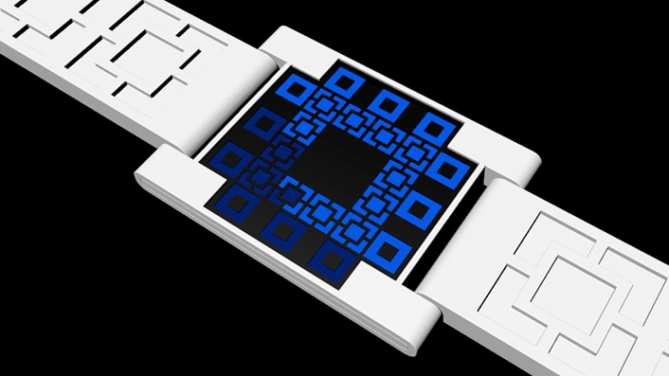
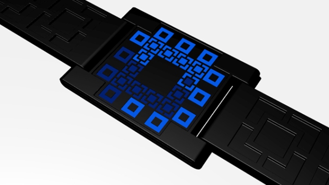
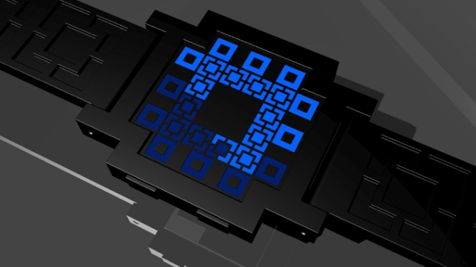
This watch design is a progression of designs centered around the idea of “five minutes in one block”.
The outside boxes read the hour and the inside boxes are the minutes. Everything is in an analogous place to a conventional analog watch face.
This watch design is clean and the strap reflects the central element. The brilliance of the way that the minutes are kept tracked is what makes this design most unique.


There’s a couple things I think you forgot to include in your description and images like:
Is the face always on or is it activates by buttons? If buttons, then where are they on the watch?
How do you set it if there’s no buttons?
Is the strap a plastic/rubber material or metal links?
I like the overall appearance of this watch and I especially like the way you continued the design onto the strap. Maybe another color variant with green LEDs would be nice 🙂
My vote is at 4* and a no, but I would like to see more of your ideas Lucas!
LikeLike
It is an interesting design, but I think the strap is rubber. I don’t see anyh links. With metallic strap, will be great. with a wider metallic strap it will be masculine. also like the design and how it goes on the strap also.
LikeLike
very interesting concept, simple clear presice display,it has huge variation possibilities round shapes, flowers, letters for example using T W E L V E O C L O C K instead of the hours squares could have been very nice etc… so why only black and white?
i gave you 4*for the concept but it deserves more developpement.
LikeLike
Hybrid analog. Squares decorative. Minimal. Agree with most of the comments above (except I voted 5). Goodluck and keep it up! 😉
LikeLike
Nice work Lucas. I like the black version, cause the display blends in. The time reading system is cool. And I like squares!
I agree with Jordan, a comment about the buttons would’ve been nice. If you want to make a statement like “I want no visible buttons” and give a comprehensible reason I would understand. But now it seams you didn’t think this though. Let’s say it’s touch activated 😀 Another statement about the straps would’ve been good. But I can imagine this with elastic or hard and segmented straps.
I give you 4*/yes. Means, if the price is right, it’s mine. And yes, keep it up!
LikeLike
I’m not sure every watch design needs 150 variations for it to be a beautiful idea. Look at RPM, Satellite, Console, and now Kaidoku… How many variations did their original concepts have? (if you answered ‘one’ then ding ding ding! a cookie for you)
Yet look how many variations TF has released of the gorgeous original RPM… Saturn, Pearl, Clear Purple…
Anyway, on to Lucas’ design. I like the layout and the time telling method very much. It’s a great variation on the 4 single minutes display concept, and the negative space in the middle gives it a cool design characteristic.
I voted 4/y as I could see myself wearing this watch for a good price.
LikeLike
I totally agree with you! Variations can be made for sure and if people see that in a concept, it’s a good concept. If it’s a mere color change, the people want, you can be happy as designer. I sometimes feel, the people need a little push in the world of variations though 😉
LikeLike
Good idea Lucas, i like squares but a little similar:
http://www.tokyoflash.com/blog/2010/11/full-square-led-watch/
http://www.tokyoflash.com/blog/2010/11/led-bricks-watch-concept/
@ Jordan: the buttons are on the other (right) side.
4*/Y
LikeLike
5*/yes… if the band was as wide as the display. I would like it to have a sort of bracelet feel. Very cool though.
LikeLike
i prefer your second variant, the band looks well proportionned on it, good job!
LikeLike
I liked the first, the smooth sides of the case were a nice complement to the plus shaped display. I think the second variant’s case is too angular for my taste. Such is the risk in doing multiple versions, can’t please everyone, and to try can sometimes lead to design suicide.
That said, they are both skillful in their execution. 😀
LikeLike
yeah tastes and colors… beauty is totally subjective. but making different versions developpements and variants of a concept, gives the designer opinions about them, that are very useful information to product orientation, especially when like here people explain why they like or no.also variations help people project them selves on the use of a product.
now i still think that it’s a great concept, very fertile, but it will be sad to stop the devellopement here.
that said version 2 with green or orange leds, why not on my wirst…
LikeLike