Design submitted by Andy from Ukraine.
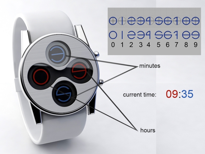
This watch design is based on an idea using cross-reading and 4 circles to show the time.
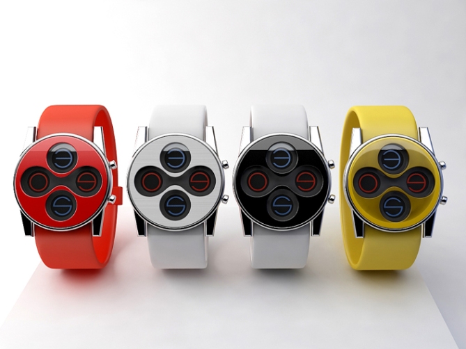
Cross section format is used to tell the time. Horizontal digits are hours and vertical digits are minutes. Colors are also used where red indicates hours and blue the minutes. All digits are in round format making the design smooth, simple, and amusing.


This design looks so sick!! I love the colors and tbe font of the numbets!!!!
LikeLike
Thanks for you comment. Namcy
LikeLike
Cool idea about the round holes and the round typeface – like that pretty much. The display reminds me of a playstation controller at first glance… mhhh I should use that for a watch, hehe 😉 I like you color variants, different colored numbers for each watch would’ve been nice. I would take a full black version with white hours and red minutes.
5*/y for this smooth, simple, artistic, eye catching and unisex wrist watch.
LikeLike
Ha, ha,ha , I agree with you, Samukun- it looks like Playstation 🙂
LikeLike
I expect a playstation inspired watch soon, sam lol.
LikeLike
Your colors are great and telling the time is simple but still very unique. I’d also like an all black version, but the all read one is great too. 5 stars and a yes!!!
LikeLike
Thanks for you comment, question mark! I think black version will also nice
LikeLike
Hi Andy, it’s been awhile since you were no longer on the Blog.
Very nice your new watch.
As we say in France “cool” ah ah ah
5 * / Y, of course!
LikeLike
Hi, Patrick! I’ll be back 🙂 Nice to see you comment too.
LikeLike
What a stunning watch design. I wonder is it lcd watch? I’d buy either white or yellow version. An amusing watch in a good way, simple, and sleek. Love it.
LikeLike
Thanks, Firdaus! Yes, I think it has to be LCD watch
LikeLike
I think, and if the company wanted to, this could be your first massively produced watch. If you allow for a full spectrum of colors/patterns and the creative ability to mix and match the bands with the watch faces, this product could take off in a huge way for Tokyoflash. Set this product at an affordable pricetag and it could potentially be what draws new consumers to the company. Maybe create limited edition acetate/ brushed metal watch faces and leather/suade watch bands/clasp.
LikeLike
I think you comment is great. You are a great market man!
LikeLike
What a great design this is! You could easely add a date display mode to it! I would keep the 7 somewhat simpler by leaving out the small dash in the middle in order to make it easier to produce but that’s only from a production perspective 🙂
LikeLike
Maybe you are right, Erwinh! Thanks
LikeLike
Very chic design, Andy! I’d go with the black w/ white band for sure. Reminds me of a zoomed in version of TF infection, and that’s not a bad thing at all! 5/y
LikeLike
Thanks for you comment, Cory
LikeLike
my first 5 on this blog, it’s a very good job, exept for the missing buckle but lets say it’s a detail, (i think few have noticed) your product has a strong visual identity, easy to read and can be customised at almost no additional costs, it has a very good potential.
LikeLike
Thanks for you 5 and nice words about my design, Rachid
LikeLike
The best summer design! Nice shape and idea! 5 points on it!
LikeLike
Winter,sping, summer, autumn…. Life is short, time is long. Good luck
LikeLike
great work Andy!!!!
LikeLike
Thanks for you comment, Gordon!
LikeLike
Looks like the Eleeno watches that were made a couple months ago except nicer 😀 5/y
LikeLike
Yes, maybe like Eleeno, maybe like Playstation, our vision on things lives in our brain. Thanks for you comment, Jordan
LikeLike
5 for the design. I would most likely not buy this watch, but i belive that allot of people would.
LikeLike
I will present for you if it will be realized as a product and I think sometimes you will use it. thanks for you comment, Tzu
LikeLike
=)
LikeLike
I serious, if it will be reailzed as a product I promise it to you.
LikeLike
Andy, your idea is great and i cannot find any negative point to it, i love the white one and i cannot wait to see it on sale, so will be lloking forward to it. congratulations on this very good taste idea!!!!!
Cheers from Mexico City.
LikeLike
Thanks for you nice comment, Fernando!
LikeLike
This concepts needs to become reality! I would buy this with out thinking twice!
LikeLike
Thanks for you comment, Tee Fred
LikeLike
Great design for both, men and women. I totally love the numbers! My girl likes the red. I take the white. *****YES!
LikeLike
Thanks Aphoso for you comment
LikeLike
Love the watch. My only suggestion would be to make the centre line of the 4 extend all the way, if you see what I mean. At the moment, it looks too much like a 9.
LikeLike
http://yfrog.com/kfv499j
I did a quick drawing showing what I mean.
LikeLike
Thanks for you drawing, MD1500. I thought about it, but I decided that it’s looks esthetic. But generally you are right
LikeLike
This design is hotfire! Needs to become reality soon!
LikeLike
Thanks for you comment, Doug!
LikeLike
5*/yes. Love the circles! Looks great and looks like it would feel great. I would like a black strap color option though
LikeLike
Thanks, Hermit!
LikeLike
If I can vote, this should be the next concept to reality watch from TokyoFlash. What a clever design, simple, minimalist, yet futuristic. The beauty is in the simplicity. Great Job Andy!
LikeLike
Thanks for you comment and high level mark on my concept
LikeLike
Wonderful performances, but not very original idea. (Only the game signals) but it’s really amazing! (5 * / N)
LikeLike
Thanks, Laszlo!
LikeLike
Excellent designs Andy.. Cool.. I like the comment from Samukun that the watch looks look like a playstation. This is fantastic and future concept to watch time. Thanks..
LikeLike
Thanks for you nice comment
LikeLike
Lol, thats an interesting way to spam blogs. Kitchens huh? Lol.
As a gamer, i understand the playstation connection, even if unintended. The display is very stylish. The full white version is my favorite. But also here, the price has to be right.
LikeLike
Thanks for you comment, Aphosno!
LikeLike
I must admit it took me a few looks before it grew on me but 5* and Yes
LikeLike
Thanks. Peter!
LikeLike
Not long left Andy. Good Luck
LikeLike
Andy, I said before, this reminds me of a Playstation controller and I made a concept, based upon one. I would like to share this here, cause you made me do it 🙂 Here is the foto album.
Good luck to you and keep up your stylish work!
LikeLike
Underrated!
LikeLike