Design submitted by Adrian from Spain.
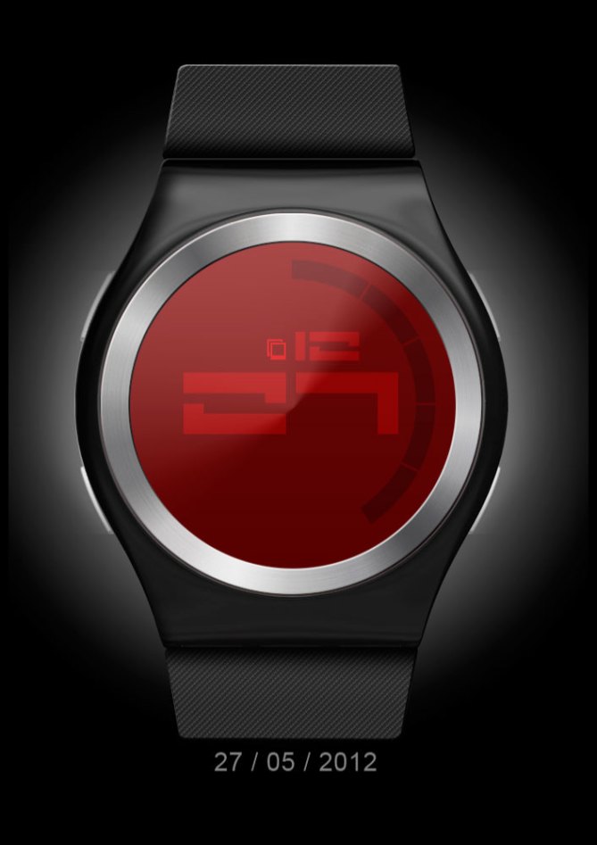
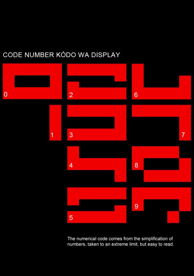
Adrian’s watch concept was designed based on an idea to simplify numerical codes aesthetically.
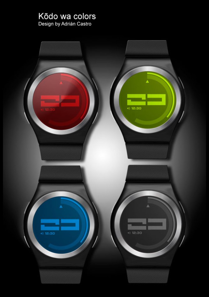
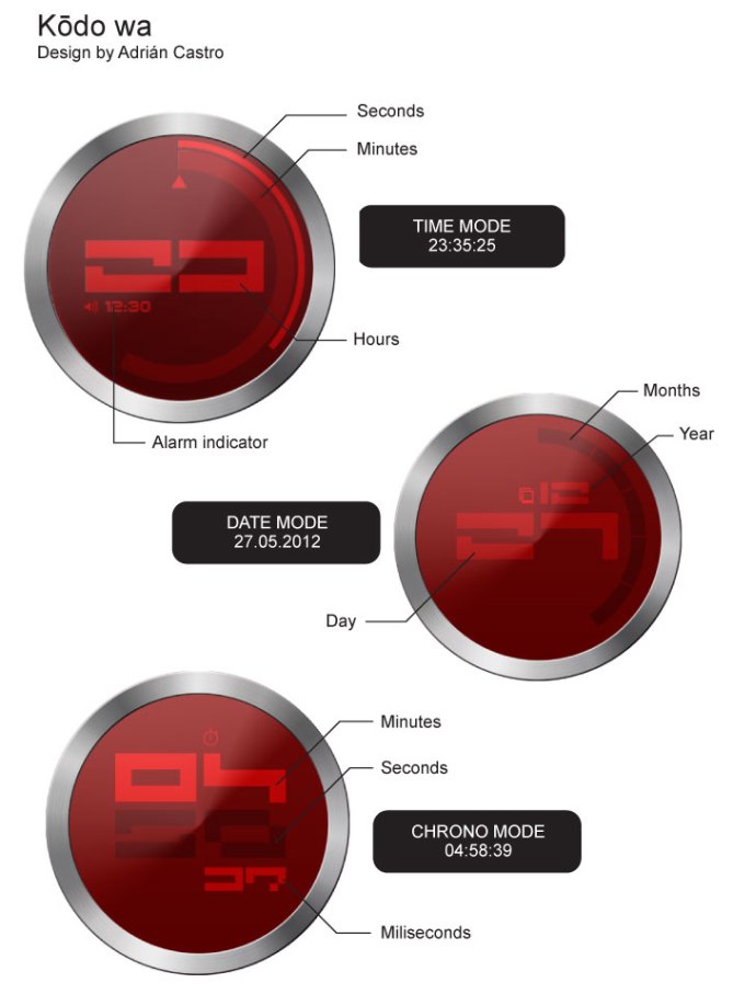
The hour is displayed in numerical code in the center face of the watch. The inner circle indicates the minutes and the outer thinner circle indicates seconds. There is also an option to change the display for date mode and to show time in chrono mode. Alarm time is also displayed in digital format.
The numerical codes make this watch interesting and unique. It’s a simple and elegant watch design that will appeal to a wide range of people.


Beautiful watch, but difficult to read (the 9 resemble the 7?)
The Yes for the design.
LikeLike
Fine design, but looks too much 70’s and OK with Patrick.
LikeLike
Adrian, good work! This is cryptomaniac watch… and memory-booster gadget.
LikeLike
“The numerical codes make this watch interesting and unique. It’s a simple and elegant watch design that will appeal to a wide range of people.” I agree!
LikeLike
I also agree.
LikeLike
Very professional submission. A design and concept that suits Tokyoflash product line. Good luck, 5 yes.
LikeLike
I like the font, but I’m not sure how it will look as an LCD, because of the necessary gaps between the segments. I don’t know what is the minimum gap size that Tokyoflash can produce. So far, their LCD watches have had visible gaps, and this is something to keep in mind when designing for LCD. I wouldn’t mention this ordinarily, but since your design is so focused on the font, it might be important.
LikeLike
AWESOME!!!! Reminds me of the game Wipeout. Very futuristic, therefor very me! Really like the font used and actually find it surprisingly easy to read.
Personally id like to see a metal strap, but thats just being picky. Good job.
LikeLike
Me encantan los modelos muy finos, que no tengan mucho volumen, tanto en correa como en esfera.
Enhorabuena por tu diseño, Adrian.
LikeLike
Really nice design; cool font; once you have it cracked really easy to read. If it went to production definitely one to get
LikeLike
Thank you very much everyone for the great feedback about my design, and hopefully I can become a reality!!!
LikeLike
Great design from a great designer. I wish this watch become true. I would buy it!
LikeLike
Cooooool!!!! I buy it!
LikeLike
Underrated. Why! This is pure style. Looks hot! I like the scifi numbers, makes the watch look like from the future.
LikeLike
Yes!!! really future look hots 😉 I like this watch…to much!
LikeLike
where did u get the font from; would really like to get hold of it; ur watch design is class as i mentioned before
LikeLike
I love the look of this one, but find it a little difficult to read. 5*
LikeLike