Design submitted by Sam from Germany.
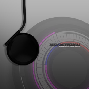
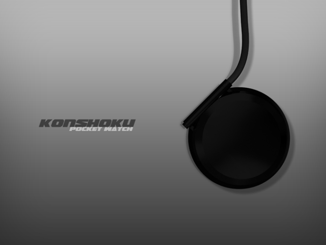
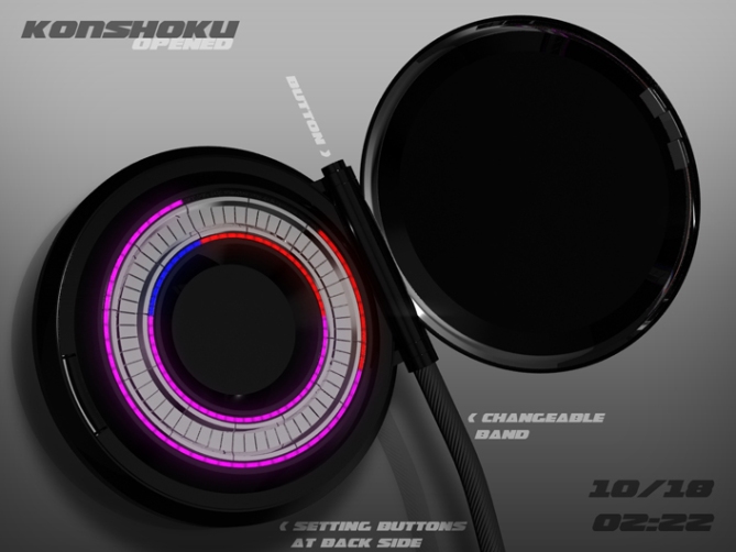
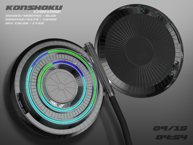
Sam has reinterpreted the traditional pocket watch with its chain and clasp in a modern way. In this watch concept, it has an IP black case and clasp and an interchangeable band. The attachment of the band and the hinge of the clasp are integrated with its button into one cylinder at the watch’s side.
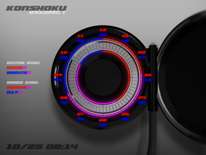
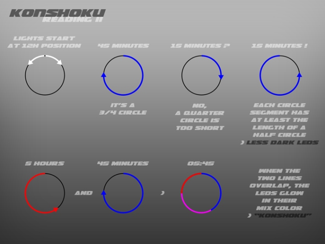
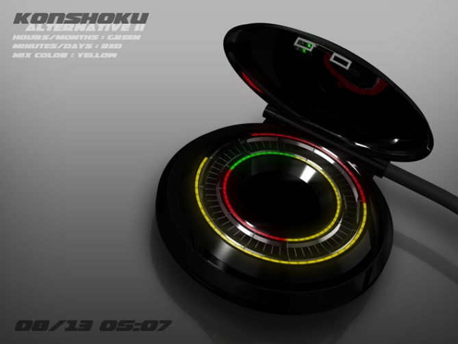
The time reading works with a derived version of an analog watch display. Red LEDs show the hours, blue ones show the minutes. The LEDs are aligned in a circle and form a circle segment which always starts at the 12 hour position. The end shows the analog watch positions of hours or minutes.
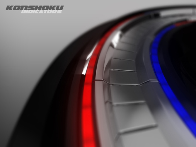
Every time blue and red lights overlap, the LEDs light up in their mix color. This makes the display look confusing but interesting. To avoid dark LEDs as much as possible, the circle segments are at least as long as a half circle, never shorter. So if you think 15 are shown by a quarter circle, that is not correct. They are shown by a 3/4 circle going the opposite direction. The end of this circle segment still points at the 15 minutes position. The conclusion: you need a little concentration to decode the display. That is the price for the interesting look it has. There are two LED circles. The outer one is for the time, the inner one is for the date. There is a chrome ring with indicators between the LED rings to ease up reading.
When you press the clasp button, an animation plays when the watch is half opened. After some time the LEDs go off, but they do it anyway when you close the clasp.
If you like a modern and unusual reinterpretation of a pocket watch, this could be something for you.


Wow! That’s amazing! Instant buy. Well done Sam. You’ve always been my favourite designer but this one is beyond everything I’ve seen before, Good job.
LikeLike
Woohoo thank you Maciej! Sounds good 😀
LikeLike
Wow…so sick!!!!
I can imagine if you made this as a wrist watch, withc s ilver case like RPM it would look DAMN EPIC
LikeLike
The reason, why I made this a pocket watch is the way to reaveal time. First its in your pocket, then you have to get it out and open the watch, then the light switches on and finally you have to LED overload. I think a wrist watch would look cool too actually. Thanks for your hint 😉
LikeLike
I’m impressed as always by the quality of the presentation.
The challenge to read the time, is the overlap of colors, the animation is very nice.
For ease of use on my part, I would need a little learning, I vote YES, because the work and the result, merit!
LikeLike
I tried to be more explicit this time. The dynamic angular font was relly helpful 😉 Thanks for your vote and for telling, you would accept the challenge to learn reading the time.
LikeLike
Fierce! time telling could be instant recognition rather quickly, and some times would look really sweet, like 12:01 would have it almost completely overlapping, which would be cool. Reminds me of a clam shell, and the time is the pearl when you crack it open. Nice work!
LikeLike
I must admit, I had to check the dictionary for “fierce” 😀 The analogy with the clam shell was exactly what I had in the back of my head. That time unwrapping makes the information a bit more precious, like in the old days… and not like today, where you can know everything everywhere (exaggerations ftw). And you’re right about the 12:01. That must look very confusing to the untrained eye. Thank you Cory!
LikeLike
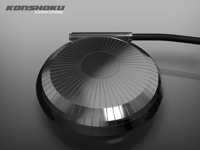
Sam, I like the concept a lot and I’d like to see the texture of the chrome ring continued all over the case, inside and outside the LED rings, with no smooth surfaces.
LikeLike
Oh cool, thanks Logan!
Do you mean the little gaps of the chrome ring? Mhhh that would look interesting… I think I build that alternative soon 🙂
LikeLike
Yes, I mean to continue that structure radially around the entire surface of the case, everywhere, instead of just the flat surface. You can have all the segments meet at the center of the back side of the case.
LikeLike
Well exactly meeting at the center is something I would’t do, I’d let them stop before they touch. I will check how both looks.
LikeLike
Logan, look at the last pictures, what I’ve done. I didn’t let the lines meet – the piece of cake look is too different from the design. But you get an idea and I must say it looks good 🙂
LikeLike
Nice job, Sam. I think I like it best, and I imagine the case will feel more interesting in your hand when it has some texture.
LikeLike
Effin cool! Someday, this might go into production, you might never know, Sam. Looks very cryptic, not even I can read it, even after reading the manual.
LikeLike
Hehe, yeah it can be an eye challenge. Little summary: end of all blue (pure blue or the blue part in magenta) is the minute, end of all red (pure red of the red part in magenta) is the hour on the analog like display 🙂 Oh I hope I will realize the production… at least the payment for my idea 😉 Thanks for your comment, Anon!
LikeLike
With this awesome design, why you ever need the close cover? I am afraid where you put button is not quite, ergonomic…? lol my first impression is it is an audio jack…. mp3 pocket watch with the ring as equalizer…. blah blah blah…. btw still a good….. design. Go on!
LikeLike
There are some reasons for the cover. It comes from ye goode olde pocket watches, there is this little sequence you have to do in order to reveal the time – which I like, and I have a up-and-down-ish watch face (humpy, embossed) and I need to cover that.
The button is perfect where it is. Assuming you wear the watch on your right side. You pull the watch out, then it lies in the “cavity” which the fingers form. The you press the button with your thumb and the cap lands in your palm. If you wear the watch on your left side, you place it on your palm after pulling it out. The button can be reached by the thumb then. The cap opens and lands on your fingers. Summary: The hinge is always where your “hand’s hinge” is – where the fingers meet the palm. And that spot can be reached by your thumb 🙂
Thanks for your thoughts Firdaus!
LikeLike
I just say:
POKET WATCHES!!! <33333333333333
LikeLike
INDEEEEEEEEEEED ♥
LikeLike
hab btw. immer noch Probleme bei meines… Ich versuchs immer wieder (zwischendurch) aber ich kriege nie das gewünschte Ergebniss… bin wohl einfach zu wohl für die ganze 3D Szenerie.
LikeLike
Mal sehen, wie weit du mitlerweile gekommen bist 😉
LikeLike
I like this, but I don’t like pocket watches. Put it on a strap and the chrome one would be a purchase.
LikeLike
Okidioki! I will see what I can do 🙂 Thanks for your comment!
LikeLike
I like pocket watches, and it’s quite easy to read but I would like more of a display, rather than thin lines and metal in between. Does look cool though.
LikeLike
Comprehensible preference (I mean the pocket watch and the display preference 🙂 ) Thanks for stopping by Ava!
LikeLike
Thank you all for your comments! I see, some liked to see this design in a wrist watch. My gears are turning for a similar wrist version. I can always recommend to stay tuned!
If you’re a fan of my designs, follow me here http://www.facebook.com/futurewatches. Next to all of my designs, I will show work in progress images and previously unpublished designs.
Thanks again, come back and stay critical!
Kind regards from
Sam
LikeLike