Design submitted by Devindh from the UK.
Devindh says: “When I was a child I owned an LCD digital watch that had its screen accidentally cracked. I remember being saddened to see the entire face blacked out by Liquid Crystal. This design takes that incident and uses it as the inspiration for a Hybrid Analog/LCD wrist watch.
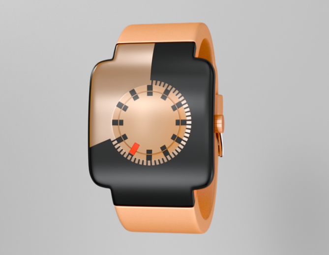
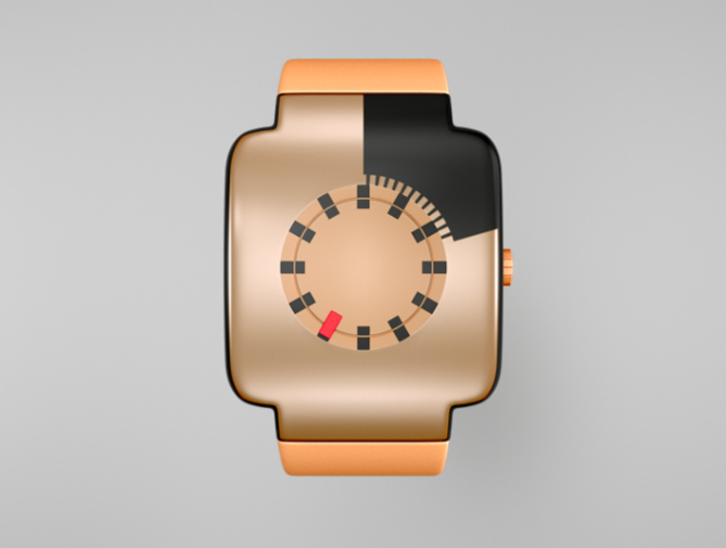
The concept for this watch design is simple. The analog element of the watch consists of a central ‘dish’ that shows the hour markers. The mechanism for the hour hand is beneath the surface giving it a floating appearance.
The rest of the face is an ‘edge-to-edge’ LCD display indicating seconds. At the beginning of the hour the watch appears as a uniform colour. As the time ticks away the screen becomes gradually filled with black Liquid crystal and the second markers are revealed.
This watch design is for fun loving, fashion conscious people. My idea is that buyers choose a custom colour online and then have the watch made to order so it matches the trends of the season.
My watch design is distinct from many of the other designs because it attempts to address the analog and LCD criteria specified by the Tokyoflash design studio.”


That is actually a cool concept that came from an unusual thing, like a broken watch.
LikeLike
Thanks Maec.
LikeLike
Yes, interesting that the inspiration came from a broken LCD. Is the LCD running all around the edges? I’m not sure how that would work… although I quite like the way it fills up the watch giving it an entirely different colour.
LikeLike
It’s not clear from the renders, but he LCD does not wrap around the face entirely. The edges are a black colour to match the Liquid crystal. That’s a compromise that is probaly needed because of technical limitations (having said that, I don’t know what the state of the art is in terms of LCD’s). Thanks for commenting.
LikeLike
First of all: Yay, Devindh is back!
Oh I always liked your shiny materials 😀 The case LCD is a very cool idea! I don’t know if LCD layers can be bent in two directions simultaneously and even that strong. Maybe some lens tricks help to achieve this appearance. But from a conceptual point of view it’s just brilliant to involve the case like you did. The simplicity and the clarity are convincing to me. Definitely outstanding analog watch.
LikeLike
Hi Sam. U missed me? It’s nice to be appreciated:) Thanks. I’m glad that you approve of the watch. I think that your latest design explores similar territory in terms of materials, and the interplay between positive and negative space. It will be interesting to see the direction the designs move in during the coming weeks.
LikeLike
Just need to credit the font used. It is called ‘Dusty’ and is available from dafont.com
LikeLike
Edit The font used for my previous design is called ‘5th Agent’ By Daniel Zadorozny also available at dafont.com
LikeLike
There’s a nice idea…=) I really like the LCD display, the technical adventurousness(?) appeals to me (as you might expect, given some of my own designs)… I’m hoping to finish an LCD design of my own soon, if I can just knuckle down and get her done… Curse this job that gets in the way!=)
The colour isn’t one I’d choose, and I think maybe the shape could be tweaked (the round face vs the square body) to give a more harmonious appearance, but as I said, I like it!
LikeLike
Hi Anders. I’m sad to hear that a trivial thing like work has stopped you from designing…..:) The colour I chose to render the watch in was a response to fashion trends. Ideally it would be cool if customers could choose their own colour online and have the piece shipped to order. I look forward to seeing more from you.
LikeLike
The Idea behind the watch is really cool and original, Hybrid LCD analog is something that could give rise to a really awesome line of watches.
I personally don’t much care for the color choice. The Copper on black tonal range clashes to the eye. It seems that silver/black or white/black would fit better into a wide range of wardrobes.
I like the shape of the case a lot, as it is different from most stuff on here, and Uniqueness is a definite plus. The rounded square set against the circular display creates a neat contrast.
LikeLike
Thanks for sharing your thoughts Cory. I hope that the technical obstacles do not prevent this idea from being considered. I too believe that a ‘hybrid’ style watch could find a place in the Tokyo Flash product range. Have a look at the response I gave above to find out why I chose the colour I did. Look forward to seeing more work from you.
LikeLike
wow, such a beautiful design. I would like to see different color variation, but the concept itself does not allow my finger to hit another button but 5 star and yess….
LikeLike
Hey thanks Firdaus:) I hope others feel the same as you.
LikeLike
Cool design, but how do you tell what minute it is?
LikeLike
Hi Ice,
I made a mistake in my description of the watch. The LCD is intended to display minutes. There will be no ‘conventional’ minute markers on the case because I feel that the overall layout is ‘familiar’ enough that the user will be able to gain an accurate reading of the time by using the hour markers to visually divide the minutes up into blocks of 5. I hope this makes sense. Thanks for commenting.
LikeLike