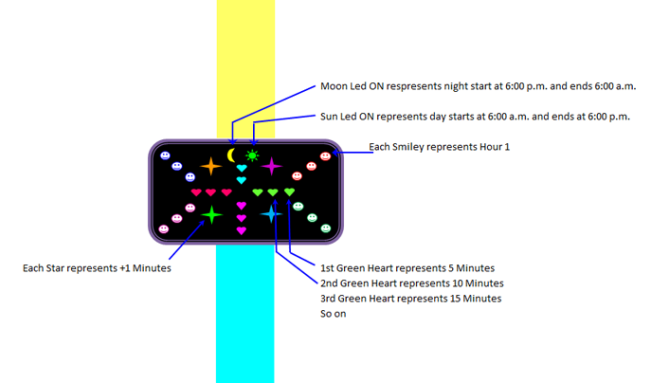
Design submitted by Ranjan from India.
Ranjan says: “The inspiration for this watch design came from chat symbols such as the smiley, falling hearts, showering stars, rising sun, moon light. Using these symbols, I have designed a watch.
The design is very simple, vivid, and romantic. It also includes animation. The time is very easy to read; SMILEY – represents 1 HOUR each, HEART – represents 5 MINUTE each, STAR – represents +1 MINUTE each, MOON – represents NIGHT, SUN – represents DAY
This watch would be ideal for Lovers. You can gift this watch to your beloved, girlfriend, mom, sister. It’s unique because nobody has ever used icons such as Smiley, Hearts, Stars, Sun, and Moon to represent the time. It’s really a romantic design and definitely win the hearts.”


Ah that’s not a watch for me 🙂 This isn’t an ideal combination of layout and shapes. If you use funny shapes, you maybe should find a funnier layout and case – those are too serious for the cute images. Or the other way: if you like to have this strict layout, pick some more neutral, less different shapes. Even if I imagine a super cool chrome case and translucent and wider plastic straps, I…just…cannot…want….to wear hearts and smileys 🙂 But I think the main internet chat users (15-25 year olds) could find this pretty funny to have. That’s a target group, one shouldn’t underestimate. If I think this a little further, then you should use different smiles ( 😀 🙂 :O 😛 ) for example. Actually much more different shapes, so the childish eye doesn’t get bored so quick. Ok, that should be enough for now. Welcome to the blog Ranjan!
LikeLike
It’s definitely a new and original way to view time, but i’m not sure it’s easily readable. I guess you would get used to it but it might be off-putting to be so complex on first looks. Quite like the two coloured strap, thats interesting.
LikeLike
Wow so colorful, but looks lilbit childish imho. Other than that, I think it suitble for those who have certain interpretation of art.
LikeLike
Its like a childs watch but too complicated for children to read. still i think using the familiar msn emoticons could work, maybe use different emoticons like Samukun suggested and simplify it.
LikeLike
Clearly too childish for me sorry. Sam’s idea is good. Maybe a new approach would be good…
LikeLike
Reminds me of those marshmellows you find in Lucky Charms cereal.
LikeLike
I loved this concept of watch , Its too colourfull . I loved the concept of hearts , smiley’s and stars in it. A suitable watch for the youngster’s group. A very nice and different approach .
LikeLike
A perfect combination of stars , hearts and smiley’s . Its simply awesome design . A well versed design which is suitable and will be well carried by the youngster’s group.
LikeLike