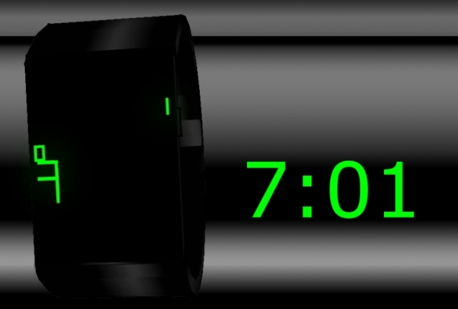
Design submitted by Sandra from Estonia.
Sandra says: “The shapes of the numbers inspired me, so I started to combine them and ended up creating something that looks quite cryptic. It looks messy at first, but its actually very logical.
With one press of a button, all numbers appear on the display. Then, after couple of seconds, the time is displayed on the screen. Bigger numbers – hours, smaller numbers – minutes (0, 5, 10…) and four stripes – single minutes (1-4).
The watch is suitable for everyone who likes something different and original. Its simple, elegant and futuristic. This watch is also quite easy to read. My approach to numbers and time telling is quite unique; different times create different combinations of numbers which look interesting on display. Some combinations can look more cryptical than others.”


What a well thought out design! Reminds me of the “Etch and Sketch”
LikeLike
Oh pretty much in the mood of Tokyoflash. The base image is interesting. Maybe you leave it on and let the digits flash instead of showing those only. You could also make a flashing animation: all digits flash a bit and then the important ones stay. A little picky detail: the 1st and the 7th hour would look better if left-aligned 🙂 I really like the minimalism of the geometry – a flat blank screen! The complicated looking display is a cool element. Good work Sandra!
LikeLike
Thanks! I actually thought about making the digits flash, but as I don’t like flashing that much, I kind of ended up just showing the time itself.
LikeLike
Good works Sandra. Very decorative digital watch. And easy to read too. Since there are numbers so its also possible and easy to make it capable of telling date?
LikeLike
very nice design that’s easy on the eyes
LikeLike
The band and case both are a wonderfully simplistic contrast to the tangle of LED numbers.
Having the LEDs in such a tangle at first makes it look like alien glyphs or some futuristic readout, which is very interesting. Once the time pops up, it becomes instantly clear what time it is, so you’ve really found a great transition between cryptic confusion, and total clarity.
This design is excellent!
LikeLike
Well said. Thanks!
LikeLike
Great stuff Sandra. Really like the idea here. I think when all LEDs are lit, the overall image isn’t that appealing. I wonder if you can work with different typefaces to make it more attractive…
LikeLike
i like. top 10 for me
LikeLike
Fantastic design, make it so I can buy it!
LikeLike