Design submitted by Sam from Germany.
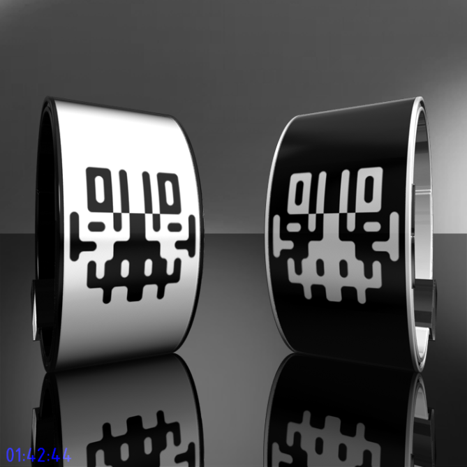
Sam says: “I am inspired by the so called Rorschach test. This phsychological test works with symmetrical images which should judge a person’s perception and imagination.
These images fascinated me since we made them in kindergarden by putting some paint on a sheet of paper and then folding it in the middle. After unfolding, always interesting images appeared. You can find more information about the Rorschah Test here.
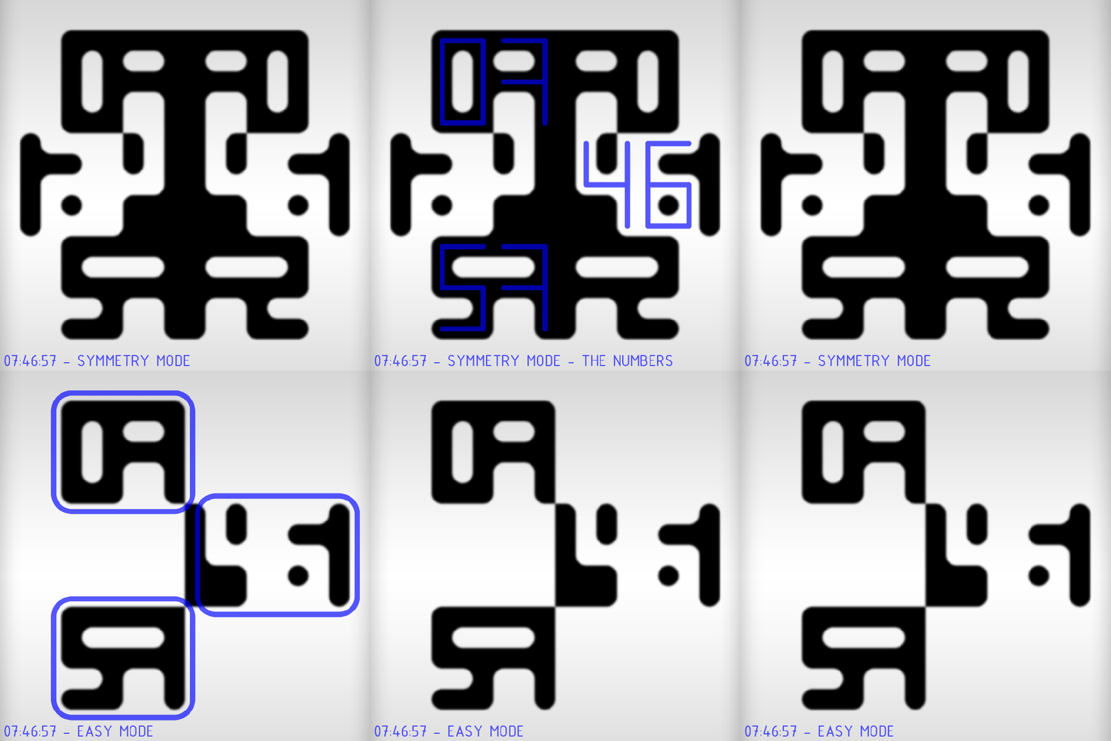
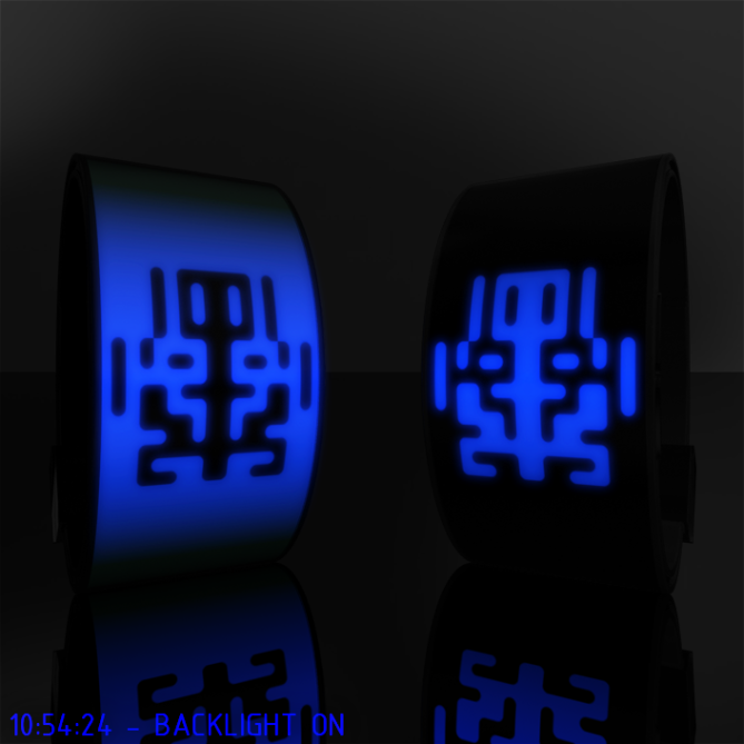
I tried to find a middle way between a traditional digital display and the organic, arbitrary but symmetrical inkblots. The display’s inkblot is actually a digital display showing hours, minutes and seconds. There are three rows to display them. First row, left side are the hours, second row right side are the minutes in negative, and third row left side are the seconds. The other areas are symmetrical and pretty confusing, so one has to concentrate on the above mentioned areas. The ever changing seconds should make it easy to learn how to read the converged numbers.
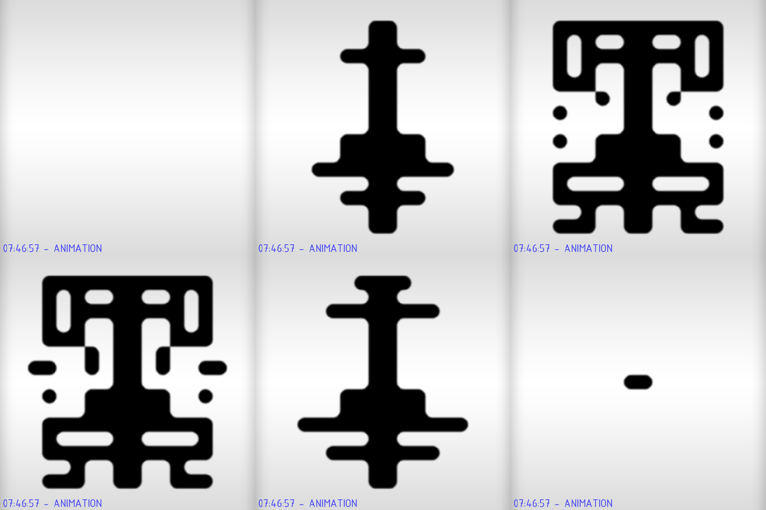
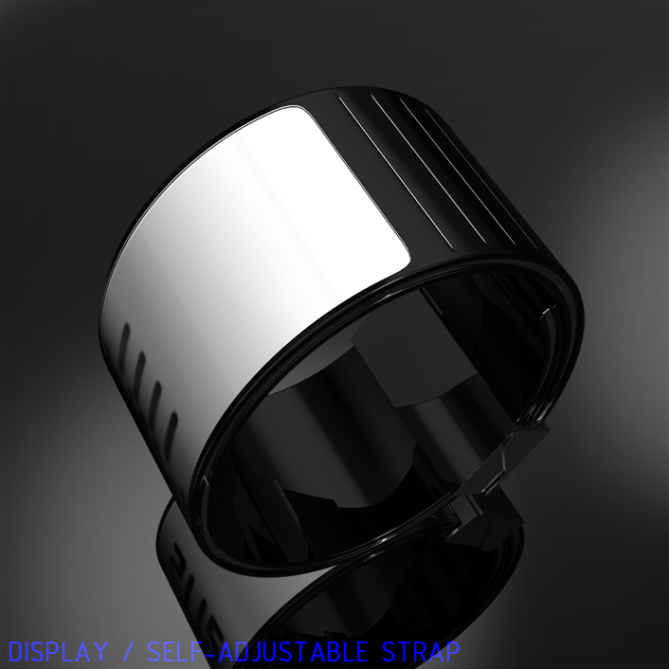
There is an easy mode wich hides the irrelevant areas of the inkblot if a quick time reading is needed. The display is planned to be always on, so easy mode has to be activated by a button, as well as the backlight. The display goes through an animation regularily, if wanted. I used a simple strap without emphasizing the case, it should look like one piece, just like the Rorschach cards. The display is using e-ink according to my inspiration. But LED could be used too, if technically practical.
One needs to be a little crazy for this watch. People who like arts and therefore like to use their imagintaion might like it too. It is confusing but actually very easy. It has a high recognition value coming from the simplicity and the strong duality.
Here you can see how the different times look like. They are randomly placed.”


Wow!! this is a first i’ve seen E-ink featured on a TF design. good job!
i’m acutally diggin the idea of E-ink for TF. your band design is awesome as well.
LikeLike
Thank you Joses! Actually there have been e-ink designs before 😉
LikeLike
Nice idea !!!
LikeLike
Thanks!
LikeLike
Great design… Very original.
Looks like there is a hidden space invader in the lower part of the ink shape.
Would the band strap format be too big on a small wrist? would like to see this idea in other form factors…
LikeLike
Hahaha, yeah I also thought I saw space invaders. Also african masks and… oh I should stop influencing you people 😉 As for the form factors, check this out: http://www.abload.de/img/sam-jerichow-image-07-huyx.png Depending on the diameter it changes its appearance. And yeah, on a small wrist it looks too big. Hard to find an universal band strap. Thanks for the comment hunter!
LikeLike
sam, you outdid yourself again. 🙂
very original design idea. of course, it’s obvious that the learning curve to read this watch quickly and correctly is quite steep – mostly because of the way human brains are hardwired to interpret symmetrical patterns – but that aside i still think that it’d be worthwhile to put this design into production. great work,
LikeLike
Hey thanks! Yeah I wasn’t sure: can it be read easily or is it just me because I work with the display. I wouldn’t have mind more confusion, since it would underline the topic. Well without the reading hints, it looks confusing at first sight. There is only one first impression, and if that is how I can read in the comments, I’m glad 😀
LikeLike
Sam, your watch stroke my wife in the heart…….I feel I am going to loose her. You have my 5.
She……….as so many women, is touchy for unspeakable values in life (I hesitate to write it down)!
Succes, Jan.
LikeLike
Awwww Jan 😉 Say hi to your wife and thank you! I’m glad we have a woman’s opinion here too.
LikeLike
Hahaha Jan! I’m sitting here with my girlfriend and we both like the watch. First I thought it is too thin for me but the proportions are ok. The display is an eye-catcher par excellence!
LikeLike
Yeah the watch looks different on different wrists… Well thanks to you two 😀
LikeLike
I was looking for an address to maybe drop into whilst I’m over in Japan soon, but I came across this instead… It’s amazing, please release it! And it didn’t take me too long to figure out how to read.
LikeLike
Hey wow, that’s so great. Passing by and getting convinced 😀 I wish you a wonderful trip to Japan. Thanks paulie!
LikeLike
Very cool design, but hurts my brain to try and read. This seems a great conversation piece if you’re at a party or friend’s house.
LikeLike
Awww Cory, maybe you are not crazy enough 😉 Yeah I think there would be some talking. Thanks for your input!
LikeLike
Or too crazy 😮
LikeLike
5/y. I love this kind of stuff, even though I do think that I won’t wear it as watch, since it seems to make me stress everything I try to read the time, but I just feel want to have it. Maybe because it itself a freaking cool unique thing. I love the idea to use e-ink. I think its time for TF to release watch base on e-ink tech. This one is superb example.
LikeLike
Hey that’s nice. I also think e-ink would be perfect for this big, bent display shwoing organic shapes. And I also have this “I have a little problem with this, but I want it anyway” feeling often here. Thanks for sharing these thoughts!
LikeLike
I really like this design. The only potential problem I see is the e-ink. If the watch uses e-ink to display the time, it can not have a back light. The reason no e-reader that use e-ink never have back lighting is because the e-ink is inside an opaque panel that does not allow light to shine though. The watch could alternatively be done with LEDs and there would be no need for a back light or it could be done with e-ink but no back light.
Either way I’d love to see this watch made, preferably with e-ink even at the cost of no back light. Really cool and original watch, kudos.
LikeLike
Ahhh frak you are right. I wasn’t sure and just made it: the idealist in me was stronger 😉 I googled a bit and yeah, e-ink displays are opaque. Only front light can be done… Let’s see what is possible in the future. But I think this watch could go without backlight – the e-ink display itself is unusual enough. Thanks so much for the comment!
LikeLike
I agree completely. The e-ink display would make this watch stand out like no other, especially with the Rorschach Ink Blot design. I don’t really use my watch much at night most of the time anyway, as I’m too busy doing other things. Besides, there are other options available for lighting an e-ink display, such as side lighting using LEDs built into the sides of the watch just above the display. The watch display is small enough I think that the side lighting would produce little to no glare.
Either way, lighting or no I hope to see this e-ink watch made. It’s a fantastic idea and I think Tokyoflash would be making a mistake to pass up this watch. They should at least try to find a way to make this watch work, and if it can’t be done fine. But I want to see them try to make it and not just pass it up!
LikeLike
That c’ is an original Watch!
I find Sam of the beginning, a little insane and brilliant.
Fortunately for me qu’ there is a version ” reading facile” , but c’ is very beautiful!
YES!
LikeLike
Hahaha yeah that’s a nice description of me 😀 And I am glad, the easy mode finds a user. Thank you Patrick!
LikeLike
Very well thought out. You blew my mind with the way to tell time in this design. That was ridiculous.
LikeLike
Thank you Rawr! It’s nice, I provoked that reaction. Actually I had to check my dictionary for “mind blowing” if that is good or bad, hehehe.
LikeLike
I like the idea of E-ink in a watch and it doesn’t seem too hard to tell time. It’s awesome to see something a other than LED or LCD being used in the watch display. Awesome idea.
Ace
LikeLike
Thanks Ace. It’s all exciting to read such comments 😀
LikeLike
I’m sorry that I’m writing this here, but there is no other place to make this public. You and other designers get so many good comments but the valuation is getting worse and worse every time that I come here. Only good comments here and the rating dropped from 4.6 to 4.0 since yesterday? This is a contradiction and I think there is something wrong. I observe this behavior for quite some time now. And it’s time for something to happen. Have not you noticed? I know you said the rating is not that important on another part of the blog. But If there is disrespectful behaviour, it should be reported. You have all my respect and luck wishes, Andreas.
LikeLike
I agree with Andreas! Very strange things are happening here lately.
LikeLike
I commented on this subject on another design a while back, and this seems like a good time to reiterate. I think it would be good to show the number of votes cast on a given design, and perhaps also the distribution (how many 5’s, 4’s, 3’s, etc.) That way, the voting would be more transparent. I’m sure Tf’s is aware of this and on top of it (and if they’re not then they should start), but showing it might save designers and voters some frustration.
It might be that the ratings shift is a result of some regular voters not voting any more, thus giving more weight to the ‘casual vote’… It’d be interesting to find out…
Oh, and the design’s very nice by the way! =)
LikeLike
@ Andreas: Yeah it is off topic but you are right, it is currently the best place to mention it. Thanks for considering at all! I did notice indeed. And it is a little frustrating too. But you mentioned yourself: Some people who don’t like a watch, vote down. Still strange that this development is contradicting the mood in the comments. Tokyoflash is aware of this I think. Well I mailed my little doubts to them, but I don’t know what they know and what they can do.
@ Laszlo: Let’s hope there is a solution.
@ Anders: When did you comment? I’d like to read it. An Amazon-ish register for the votes would be good. An overview should make it all more tranpsarent. It is a little frustrating indeed. As student of architecture I can handle critiques though. But as Andreas mentioned above, the critiques are good here. Casual and regular voters… interesting point. Making this destinction would help to judge the votes. Let’s see how far this goes.
And thanks for the last comment too 😀
LikeLike
Sorry Samukin, I didn’t notice the voting thing (I should really be working right now rather than drooling!
When I showed this to someone else and explained things it did strike me that distinguishing between 7s and 9s might be tricky, but as with other TokyoFlash watches I’m sure that it’d all become (almost) second nature… Besides, one would have to be really out of it not to have a feeling for the hour of the day which would be the important one – who’d really complain about a couple of minutes either way?!
LikeLike
Drool Paulie, drool! Yeah the seven… maybe a 7 is better than a mirrored F (mind the second horizontal line). The destinction is tricky with other numbers too so one has to really practice a bit. Tokyoflash will add a link to the description. That is a link to an image which shows all hour/minute combinations. There you can practice. I made a 24h display so if one does not know that bright sky means am, then the watch tells 😉
Thanks alot for your impressions.
ps.: As for the voting thingy: 5 stars mean “I drool when I see it” and YES also.
LikeLike
I can’t remember where or when I commented, but as I recall I said almost exactly the same thing…=)
I agree, the comments here are generally very good, to the point and more often than not constructive as well, so no problem there. And you have to be able to take the odd person who thinks your ideas are… Bad…=) Everyone can’t like everything, heaven knows I don’t…=) And it’s good to know that TF keeps track of these things as they’ve commented below.
LikeLike
Great one Sam ! Very hypnotic display and not too hard to read. I hope that one day Tokyoflash will produce such e-ink watches 😉
LikeLike
Merci beaucoup! Thats great, I hoped to reach this balance between the effectful look and the readability. Yeah e-ink gives watches a new flair.
LikeLike
Hello everyone,
Thanks for your feedback on the voting system. Please don’t worry about the voting behaviour, we review the votes and assess the trends carefully for each design posted on the blog so we can see exactly what is happening.
Also, the final rating is not the main factor that affects choosing a design to make. There are a number of other factors that hold weight in the decision. These include but are not limited to:
– is the idea is completely unique
– is it is feasible for the design to be manufactured
– is the design is economically viable
– does the design have an interesting theme
– will the design fit into our product range in 9-12 months time
– is the design suitably different to other designs that we will have in our product range
Thanks for all the positive feedback on the designs, we’re reading the comments every day.
LikeLike
This is good news indeed! Considering some of my favorite Sam/Laszlo/Firdaus (and many other names et al.) designs are not getting the star ratings that I think the concept deserves. Would a RPM or Bright Time get the upper fours in this environment? maybe, maybe not!
Thanks for the clarification, TF! My fan loyalty grows by the day 😀
LikeLike
Please, sell this watch! 🙂
LikeLike
This is hilarious. One new comment: “please sell this watch” and the rating sinks again. What!? If you review the flawed votes, then all is already lost. Assessing a trend for this watch isn’t difficult: it’s downwards since it got shown here. That’s a false trend.
But thank you for caring and making some things clear. I think more feedback from you would be good here.
LikeLike
Tokyoflash, thanks for telling…
Yeah Cory, this is indeed another environment than back then.
Raph: xD
Aphosno: Hm… what can I say. I just hope TF sees all this from a better perspective.
LikeLike
This is pure art! But first I need to get rid off my doubts: The big flexible(?) bent display, is that possible? Maybe a small square case is better. The display is like nothing ever seen on a wrist watch. Let me work through the points Tokyoflash posted:
– is the idea is completely unique – YES!
– is it is feasible for the design to be manufactured – Could be better, but this looks great as it is!
– is the design economically viable – sure!
– does the design have an interesting theme – YES!
– will the design fit into our product range in 9-12 months time – Who will ever know that earlier?
– is the design suitably different to other designs that we will have in our product range – YES!
About the ratings and comments: This is one the best commented watches here. I think there is a cheater out there, who is just envious. There are ways, how to do it. If Toykoflash cannot handle them, the rating part of this blog is a farce. Looking at the comments, this watch has nothing to fear!
Nevermind, I would buy a black and a white version in an instant!
LikeLike
@ all: check the link at the end of the description text 😀
Oh Shrike, I’m not sure if that’s efficient, but I think the watch can be done flexible. I also thought about a more traditional case-strap combination. Maybe I make one…
I think I have to handle jealousy since my Solar Powered Ito Watch. But thanks for sharing the impression, this watch has nothing to fear 🙂
Black and white version for you, understood! Thanks man!
LikeLike
Please can you say when this watch
Is coming out
LikeLike
I would be more than happy to tell you, if this moment ever comes. I interpret your question as enthusiastic interest 😉
LikeLike