Design submitted by Laszlo from Hungary.
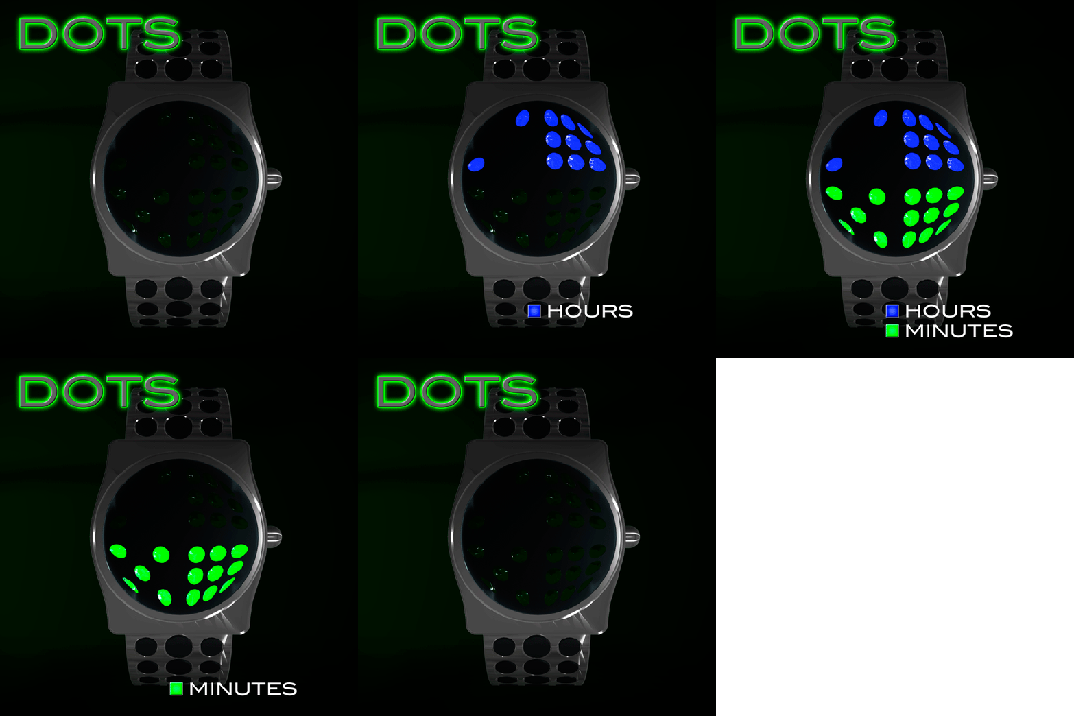
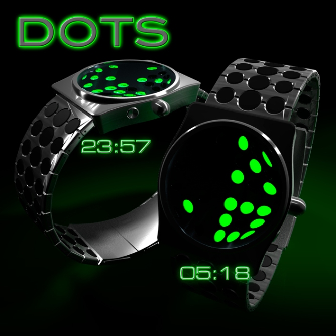
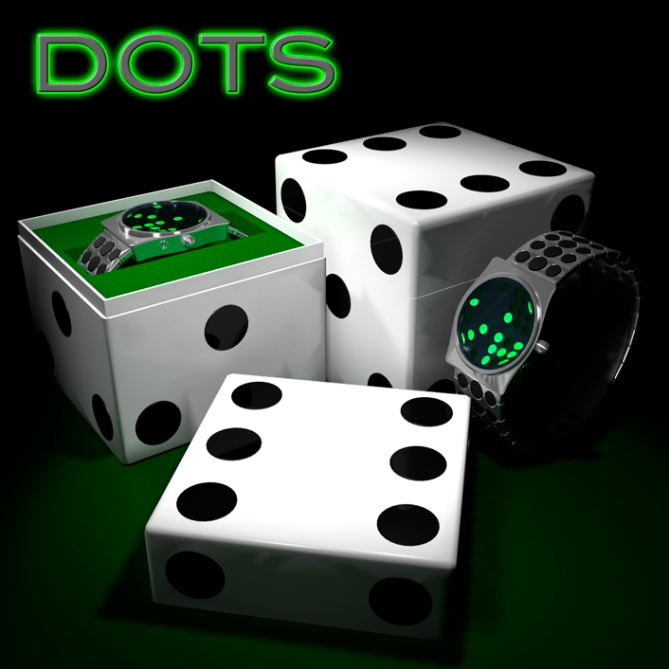
The latest wrist watch design from Laszlo features a 24-hour time display that shows the time in 4 digits. The inspiration here is that each digit is represented by the dots, just like on the sides of a die.
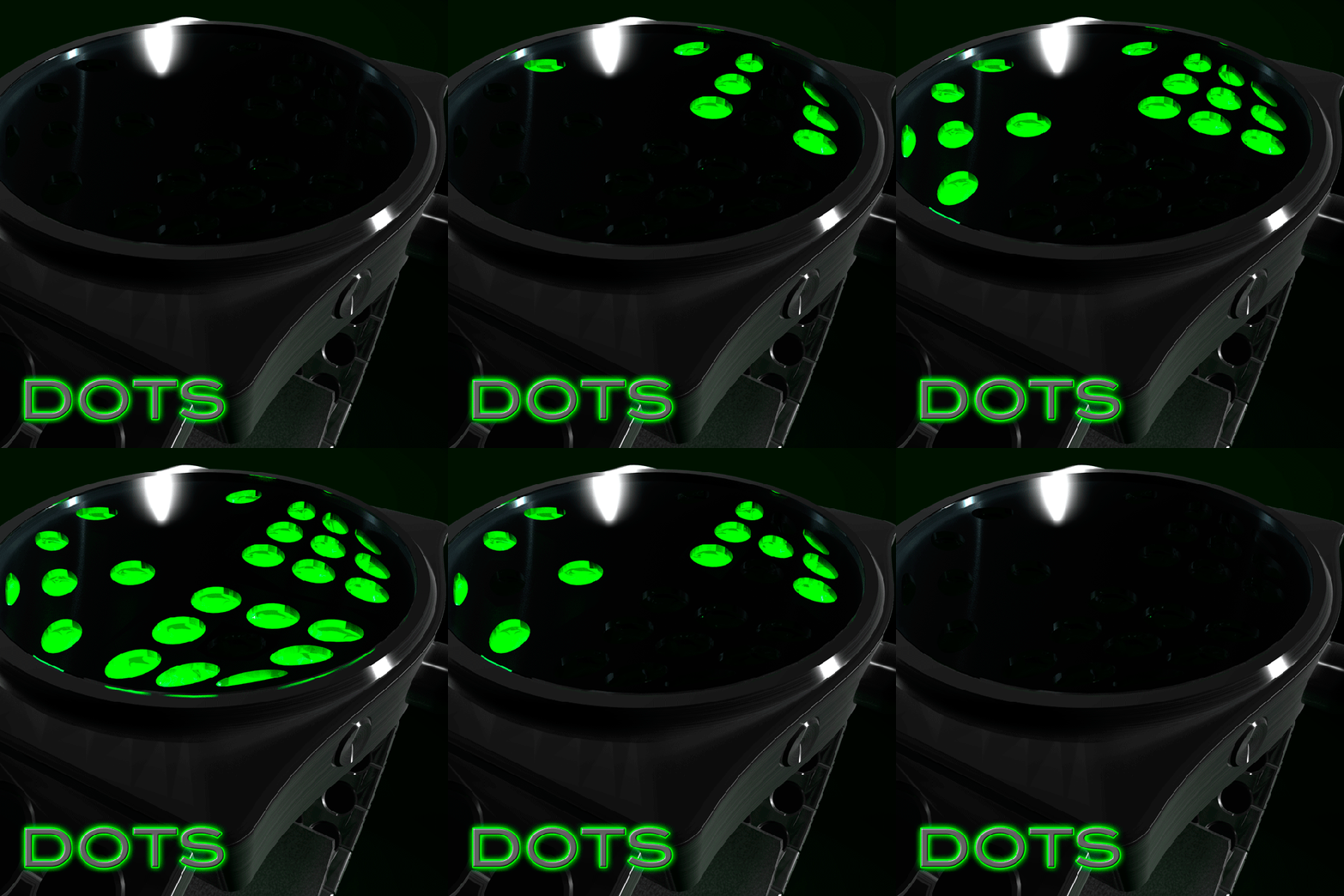
The upper half of the display indicates the hours, the lower half of the display indicates minutes. Simple. The circles that make up the display taper off towards the edge of the curved interface and the strap design achieves a continuous look, that matches the interface. The design is shown in silver or black with green LEDs.


Yes. 1st to comment on new blog interface. Excellent job Laszo. The watch does give me another dejavu, but this one really looks more funky. And as always, nice box 😉
LikeLike
Yes deja vu! I like this one: http://www.tokyoflash.com/blog/2010/11/3×3-led-watch-design
You have so many own ideas, why tron, stargate and now sam? I’m not voting for this because I don’t think this is coincidence.
LikeLike
Certain times, j’ have evil to include/understand the comments? (however j’ appreciate Aphosno and Firdaus particularly that I know less) Laszlo practically made that square Watches and there, it is different, with a very sympathetic bracelet. That n’ do not remove qualities of the Watch of Sam, yes c’ is the same system of reading, but the look is different. J’ hope that I do not make a lay with Laszlo by appreciating his new Watch, because by seeing my notes on Blog, I am not really, a reference, ah ah ah
LikeLike
What is j’ and evil thing do you mean??? I don’t think its like Sam’s though. It appears like Oberon at first glance, but just my perception. I don’t have problem with that too. And of course its a different think if you evaluate further. It likes something fit to wear in casino and during specific indoor events. I has art value of its own.
LikeLike
No criticism was made in respect of Aphosno and Firdaus, I just wanted to say that Laszlo style changes a bit and I think it’s very much in the idea, an open mind goes further.
(Google translation may misinterpret my thoughts, but know that I respect all comments)
LikeLike
Sorry if I sounded mean. But when I saw sams watch I never saw such a reading system before. ANd suddenly here we have that again. It is totally subjective. What I see first is my reference and following stuff gets judged by that. I repsect laszlos work. So here my independent judgement: The casino idea is nice, the reading system is coll, unusual looking but easy to read. But I don’t like the distorted dots the shape of the case and the straps.
LikeLike
Aphosno, I agree with you, but the shape of the watch and the bracelet that changes a little habits Laszlo’s all.
I want to hurt anyone and I apologize for my poorly worded translation.
LikeLike
I believe you mean “I don’t wanted to”. Yeah I already suspected it’s the translation tools. How dare the translation tool misleading us… hahaha 😉
LikeLike
The band on this watch is my favorite part. It fits with the domino motif very well. I like how the watch face skews the LEDs underneath. 5/y!
LikeLike
I think we need to give Laszlo a bit of credit, he has done this past months excellent watches, with a common denominator for all of them, now he is trying new things, and he is beeing influenced by other concept artists. But i wouldn’t mind to see a concept watch with ideas from laslzo and sam (one of the better concept watchtes designer here, in my opinion) for example. Don’t be so hard on them, it’s good to be critic in some points but dont acuse of copy, even tokyoflash does it, and weres the problem??
This is an art, and art is based in sharing opinions and trying new influences.
Good job Laslzo, i really like this one.
LikeLike
Well said, Toys.
LikeLike
Toys said it right 🙂 There is no problem. This watch is another interpretation of something free to use: The dice or domino number sytem. Aphosno was a little hard, but he didn’t mean it disprespectful. Ok I could talk a while about this, but that’s off topic.
The watch 🙂 It has a certain 60s James Bond casino retro charme wich could appeal to many people. That comes from the artistic display, the color green, the big round button and the brushed metal. Many little elements wich fit together. I would have tried to achieve the taper effect with a lens/magnifying glass instead of really deforming the display… feels better to me. Anyway, it’s cool you try different things Laszlo. Inspiration is everywhere!
LikeLike
i really like this. its on my top 5.
LikeLike
It’s just ugly for me, sorry Laszlo. The number system is nice, but that’s not your idea even. Next!
LikeLike
Fantastic display of the 3D effect. Again, this is a bit Vasarely. Very very good.
LikeLike
Have any of Laszlo’s designs been actually made?
LikeLike