A new concept from the Tokyoflash Design Studio.
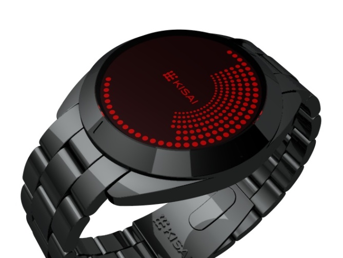
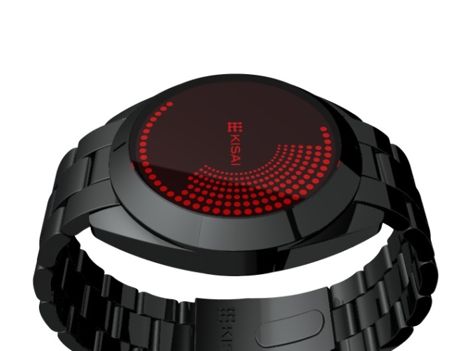
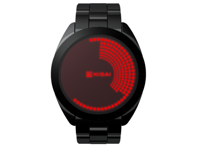
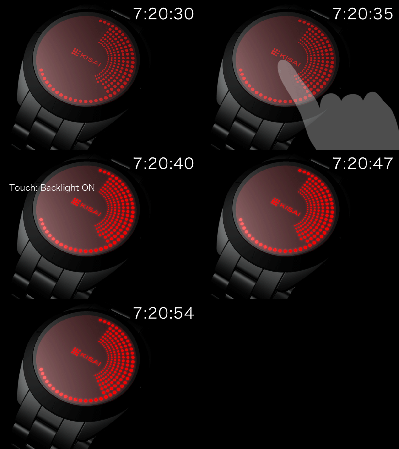
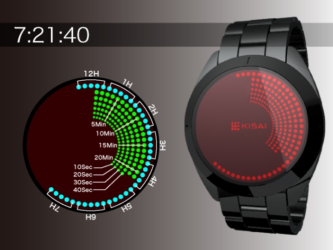
An intuitive touch screen concept design that displays the progression of time with through a matrix of LCD dots that build up to fill the screen as time progresses.
Hours are displayed in the outer ring of dots, in the same position as hours on a clock face. Seconds in groups of 10 gradually build up each minute line to show the current minute in the same position as minutes on a clock face.
This concept would have an LED back light that is activated by touching the screen, adding a tactile element to the design.
Housed in a standard IP black case, this design may appeal to people who like regular wrist watches but also to those who crave something different. Tokyoflash watches are all made in limited production runs so you can guarantee that your watch will be that much more unique than watches you find in regular watch shops.


Yeah, great job.
I definitely would like to have one like this one !
Continue the hard work 🙂
LikeLike
Looks great, but would be way too annoying to figure out the I fear. No-one wants to stand aroound counting a tonne of dots in a hurry. Maybe I’m just not getting it though
LikeLike
I think i’m right in saying all of the above pics show approximately 7:20. Hours and minutes are in the same positions as on a normal clock. At 6:15 for example, there would be a ring of lights running around the edge to the 6 o’clock point, and the first quarter of the circle would be full.
I’m a big fan of this design, especially in black and red.
LikeLike
I like it, but I think it would be better (easier to read) if the full hour markers and every 5-minute group (0min, 5min, 10min, etc) were marked (by size or shape for example), to make it easier to see which hour is showing, and which 5min group you’re in… Other than that, very nice!
LikeLike
I WANT IT !!!!!!!!!!!!!!!
My eyes are on fire !!!!
LikeLike
Great work, i love this one, but to make it clearer to read the hour you could change the 3rd dot of each 5th group of dots that make the hour, so the 3rd dot could be a darker red, so it’s easier to know at wich hour you are, also i think the strap must be as thick as the sphere, to make it more “masculine”, (just an opinion, i prefer watches with thicker straps).
This is a must buy watch, well done, it would be nice to see it at this years christmas.
LikeLike
Outstanding!
LikeLike
I am Interested in the tokyo flash watches,if you have a full color catalogue, I hope you can to send me one with the complete sale price at this address
Felix
H 7 Villas Florida
Florida,Puerto Rico 00650
LikeLike
The first thing is, I would remove the work “Kisai”. Let the logo stand for its own. The word destroys whole beauty of your display in my opinion. “Kisai” on strap lock, case back and packaging should suffice 🙂 The second thing is, I need a marker for the 5 minute steps. The hours are ok but distinguishing single minutes is too hard. I like those little markers on the case, but four are not enough. Make 12 (not necessarily for the hours, but for groups of 5 minutes) then it’s great. I like the progression of time in 10 second steps. I would like to see more times of this watch to get a better picture of it’s appeal. The case looks a little too retro, but I also thought that about the RPM and now I own it and it’s cool in real. Red is a hot color! The touch screen feature is a nice gimmic. Could be a seller!
LikeLike
reminds me an awful lot of the oberon watch, except a lot harder to read.
i think it could work though.. .instead of changing your concept, maybe making some simple marks or hashes on the ring around the face to indicate groups of five (for minutes) or hours would make things much, much easier to read.
also, i agree; the kisai logo is too much. why does everyone put that logo on their designs? seems a bit presumptuous to me. let them handle the branding if/when it becomes reality.
LikeLike
I think the hours, minutes, and seconds should be a different color and/or shape. It’s very hard to read for me when they’re all the same shape and color. Adding spaces between each number (1, 2, 3 and so on) would be better too.
LikeLike
Sorry, this is just not my type of watch, it’s way to hard to read and I wouldn’t spend my money on this.
LikeLike
I like this one a lot. I think the different sized ‘spots’ look very good when clustered. I like the red colour and I even like the Kisai word there. I like the strap, case and its thickness. I do agree with several of the above comments concerning the readability. I think ???’s idea about having a small gap between numbers would be the simplest and best option. This would enhance readability but maintain the mystery of the watch. I am not sure about the touch screen though. What happens when long sleeves brush the top of the face, would the screen be activated? I would also like to see a day/date feature and USB charging.
LikeLike
Cool, I would certainely buy one, but only if it was multi-colored (something like the Round Trip [I already own one and love it !]) … Cos’ actually it looks difficult to read with all this red … : ]
LikeLike
I feel like you guys aren’t taking a very big risk with this design. And by that I mean, you guys have done similar designs like this, such as the Oberon series. It’s very similar.
LikeLike