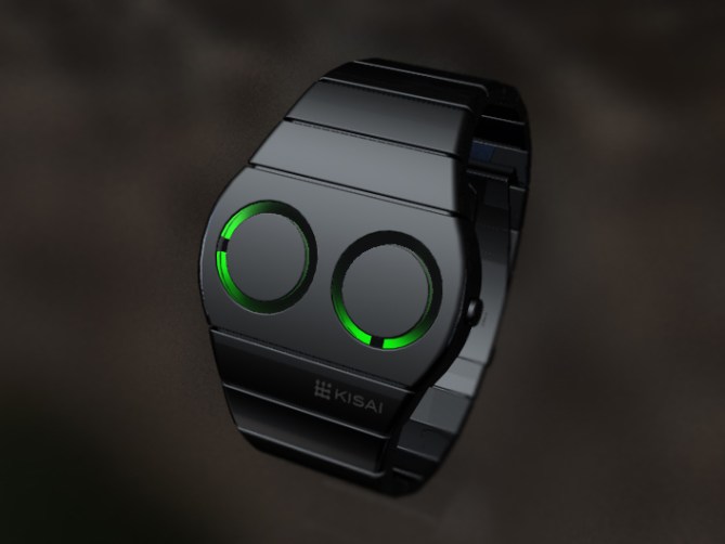
A new concept from the Tokyoflash Design Studio.
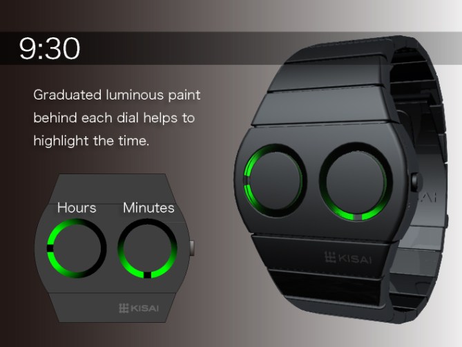
A simple, analog watch design with two windows that display the time with a luminous trail.Simple to read, hours are shown on the left and minutes on the right in the same position as a normal clock. The dials behind are simply analog dials with luminous paint behind which helps to highlight the time. The hands move around the dial leaving a black line to indicate the position of the current time.


Been a while since we’ve seen an new concept from Tokyoflash itself, but sorry, this design does not compare to the other high quality concepts in this blog by Laszlo/Jonathan/Sam/Anders/etc. Try again. 😦
LikeLike
It is a watch already made, it pleases me, because it is simple and easy to read.
http://www.tokyoflash.com/blog/2010/10/luminous-analog-watch-design/
Green suits me more, is more mysterious than the yellow, round shapes are beautiful, but it’s only a matter of taste.
It’s a Yes!
LikeLike
I think this is a good design, but is too “simple” for me … Tokyoflash you can risk more 🙂
LikeLike
I don’t know if I prefer this one or the square one, I like them both, good job.
LikeLike
I liked the yellow version with rounded squares too. This one is also very cool. It is so damn simple! Nice diversion towords the more complicated watches. If you offer different colors for the lights, this one could be a seller.
LikeLike
Come on, are you serious about this watch?? it’s not even worth to be at this blog, i might be very hard with my coment and i know designing watches is very difficult but i think instead of going for simple and easy things you should show more a concept watch that inspires peolple in future concepts instead of “just” making a normal watch, as they said up there, Laszlo, Sam, Patrick, Anders, etc, make better quality concept watches than tokyoflash at this moment.
Sorry to be so hard but i expect much more from TF.
LikeLike
“Errare humanum est, Perseverare,autem, diabolicum”
sorry for my comment, i think it was too hard and is not fair for those who designed it, and after looking it for a long time it’s quite nice.
LikeLike
A mí me encanta este diseño. Lo compraría sin dudarlo. Gran trabajo.
LikeLike
I think a few of you need to remember that Tokyoflash is a business! They need a slightly more mainstream watch to sell big numbers so that they can afford to make crazy designs that only the minority can read.
I think this watch is beautiful, and cleverly designed to look good but in a reasonable budget. I think it still looks strange enough for the average person to have to ask how you tell the time on it, and isn’t that the point?
Keep up the good work.
LikeLike
I prefer the previous version with yellow squares, instead of these green circles. Either way, I think a matte case will look better — maybe, even a soft-touch rubber. I hope this is a design you can make at a low cost to capture a more mainstream market, as James points out.
LikeLike
Thats a minimalistic functional watch unlike any other watch in tokyoflashs catalog. That would be an nice adddition and it would appeal to a new range of customers. I like it and if the price s right, ill get this one.
LikeLike
Personally i like simple ways to tell the time. I’m not keen trying to work out codes or patterns, so i don’t mind the simplicity of this design.
However, i much prefer the the square design over the circles. The green works well, but i think i still prefer the yellow. Really interested to see what the luminous paint will look like in reality.
LikeLike
I really like this design and I personnally prefer the round shapes. The color green is nice as it is gradual, giving the watch a general soft impression. Maybe you could offer many choices of color (i would personnally buy a blue color, like the one use in the R75 watch).
I really like the black strap. Maybe people will also like to have choice between multiple colors, like silver or gold?
Sure, it is simpler to read than other Tokyoflash models, but I agree with many that more mainstream watches should be made to draw more customers.
LikeLike
i love analogue watches.
i sort of wish this was one large face, and two bigger, backlit hands (however you describe the effect from the above design). heck, even if each hand used a different hue of glow, when they get near, you’d have a cool light-mixing colour blend!
LikeLike
I like this. It is beautiful and user friendly.
LikeLike
It’s nice enough, but I suspect that Tokyoflash has already committed to making this watch. It is just WAY too similar to the watch they posted back in Oct 30th 2010 http://www.tokyoflash.com/blog/2010/10/luminous-analog-watch-design/
This watch does look a little nicer than their previous luminous watch design, and I like that fact that it’s easy to explain to others how to tell the time. For me, it’s the difference between geek and cool, and this one leans more toward cool…
I’ve got a feeling that good or bad comments, we’ll be seeing this watch within a very short while since it’s so similar to the one posted Oct 30th. Tokyoflash, where’s our 7R0N watch ( http://www.tokyoflash.com/blog/2010/10/tron-inspired-led-watch )?!? LOL.
LikeLike
While the clean lines and minimalist look will appeal to some, personally, I have to agree with some of the above comments which state that it is too simple looking. Sorry, but I would not buy this one.
LikeLike