Design submitted by Anders from Sweden.
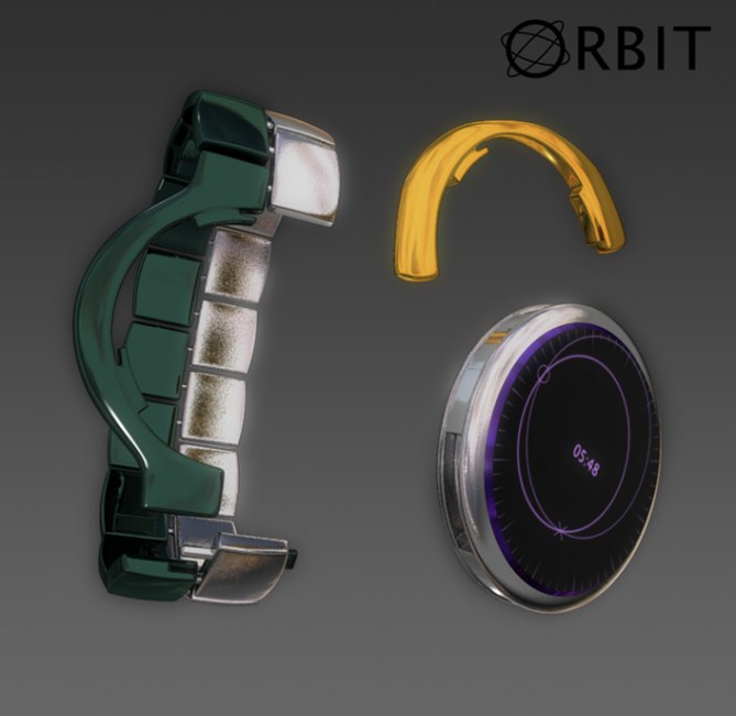
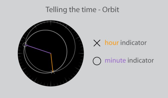
Anders says: “This concept is a continuation of my Power concept which I feel was let down by the display layout. The modular concept was recieved well however, and I wanted to make another effort with a cleaner look, easier to read and with several display options depending on the wearer’s preference.The layout is basically a traditional watch face with the hands replaced by two intersecting circles. The intersecting points rotate at different distances from the center, thus indicating hour and minute ‘hand’ respectively. The circles are thus sized and placed continuously to always show the correct time.
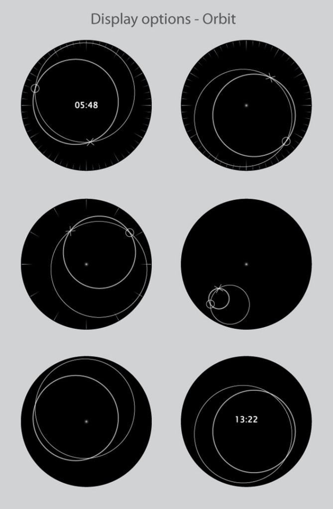
There are many options for the display; with or without minute/hour dashes, intersection indicators, time displayed on the face etc. These could also be made to light up in different combinations when a button is pressed. Combined with the interchangeable armbands, chains and grip pieces, there are loads of options.
The selling points of this design is the modular design and clean style. This watch would appeal to those who want an unusual but easily read time-piece of high quality, the metal body and armband give it weight and gives the wearer a comfortable feeling of solidity.”


This is a masterpiece. Its cool, you came back with the interchange concept. This time in an easy to read watch. The display is great.
LikeLike
Thanks! I thought this’d be better than the Power concept. Seems like less might be more after all…=)
LikeLike
Great work, this just show the effort you are putting into this. It’s a beatiful watch and easy to read, but don’t let down the concept of the power watch, it had a lot of potential, and the idea of having the power button in my wrist is so geek, i will love.
Very well done Anders
LikeLike
I never said the power concept was bad, just that this is better…=)
Well, the hardware in this watch is nearly identical (I suppose), and there are already quite a few display options, so why not have the ‘power’ graphic as an alternative (shamelessly angling for a higher rating…)? =)
Thanks! People liking my designs always give me a warm, fuzzy feeling…=)
LikeLike
Yeah Anders, thats great! I like the X and the O markers and the circles wich run through them. Your display alternatives leave not space for crying – there should be an option for everyone. Your wrist-watch/pocket-watch sytem is still great and I would use it if I had the watch. Such an easy to read display wich can look very irritating (in a good way)… I better say “fascinating” 😀 I really hope there is an affordable technique for such a display wich seems to have unlimited variations.
Your power concept was just too small detailed to be read comfortably. It was stylish and well executed just like this one.
Good luck!
LikeLike
Thanks!
Hehe, yes, ‘fascinating’ does sound better than ‘irritating’…=)
LikeLike
I agree with Toys, the power logo concept watch was a great idea! Don’t leave it! This one is really good as well.
But the power logo is quite a geeky symbol. You just need to find a proper way to use it very easy!
Good luck with everything!
LikeLike
I think that the only thing the power concept needs is thicker minute/hour indicators, then it’d be as easy to read as any other design (on average, at least…) =)
Thanks! =)
LikeLike
Power…
http://insideshirt.hu/power.swf
LikeLike
good desing, but i think it might get confusinf due to the small space between leds, maybe some kind of separation as the denshoku or using two different colors, but well done, it’s not as cool as ander’s but it could be another more viable option than the original design
LikeLike
Nice one, certainly more technically feasible than my version…=)
LikeLike
I really like this design! It would be great if the display could be always on, although I’m probably asking for too much there. Consider me a customer if it ever gets made.
LikeLike
According to Wikipedia at least, there is a kind of LCD (Cholesteric, I think it’s called) which is bi-stable like e-paper, that might be an option… If not now, then perhaps in the future…=)
LikeLike
THIS IS BEST AS POCKET WATCH, IF IT IS, IM IN!
LikeLike
The idea is that you get several options when you buy it, so you can use it as a wrist watch or a pocket watch with or without a chain. So I guess that means you’re in…? =)
LikeLike