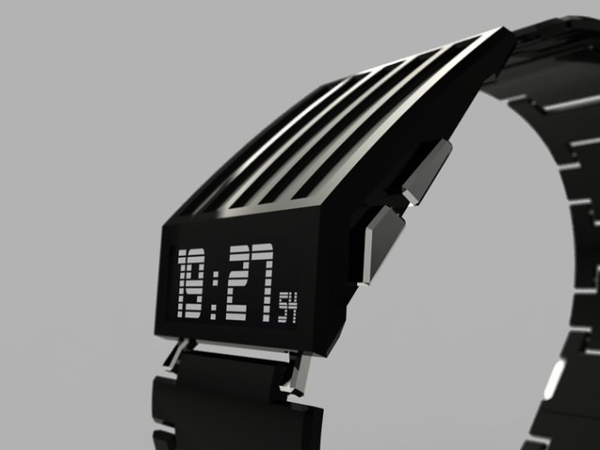
Design submitted by Jonathan from France.
Jonathan says: “I wanted to use e-ink technology which is ideal for small displays like watches; low energy, sharpness, contrast. The clarity of black and white is also interesting.
Glossy black metal, embellished with small chrome parts. The contrast with the white background of the e-ink display is particularly sexy. The digital display is complete, it is adjusted using two button. On the bottom time appears on a black background and merges with the color of the case. Located on the edge, it can provide telling time without bending the handle.
The watch is rather large on the wrist, the lines are bold and radical. Some brutality emanates from that object. I think this is a model that is primarily intended for man who wants to wear an accessory refined, exclusive, radical but certainly elegant.
E-ink technology is rarely used but offers many advantages, both technical and aesthetic. The case design is radical and sculptural, it is easily recognizable and unlike any other. Horodron HD-01, stand out with style !


It might not be a TF watch but it’s very cool and i would sure buy it. Simple, neat and defined, very very good
LikeLike
Love it !!!!! Great job !
LikeLike
J’aime beaucoup cette montre Jo! Très classe.
But i do have a suggestion, you should stack more info into each of the stripes, which is to say, like put “sunday” aligned left on the first row and “09” aligned right on that same row that way you could have less rows. But that’s my point of view.
Also, what does the last row stand for? 0-129?
LikeLike
i think is the amount of days since 1st January, because the 9 of may is the day 129 out of 365
LikeLike
Yes it is Toys 😉
LikeLike
I’d buy that piece! I like the hard edges very much and the displayed information. The shape of the case is very cool. This could also be LCD, maybe cheaper than e-ink? Anyway: Very well executed! 5*
LikeLike
Splendide ! Beau boulot 😉
LikeLike
Awesome looking watch and I would buy it if it were made.
JD
LikeLike
Belle montre pour homme. Une suggestion : pourquoi de pas avoir mis les lignes en écriture veticales ?
LikeLike
simply cool
LikeLike
When can I pre-order? 😉
(Might want an LED or two in the ridge, to spill light over the displays for night-time reading. But this is one of the few watches I’ve seen that I’d be willing to wear without that.)
LikeLike
J’adore!
Awesome design! I would definitely buy this one if it were made.
LikeLike
I love the contrast of vertical lines on the face against horizontal lines on the strap and main time, really nice detail. I can see some influence from the Thix T3 that I bought for my girlfriend a few years ago from TF but I think the sharp edges and fine detail offer enough of a difference to make this a unique watch.
LikeLike
I’d surely buy this one!
LikeLike
Add some color to it and I’d clamor over people to buy it.
LikeLike
Im very impressed with this one! Actually, thats the coolest watch I’ve ever seen! (and I have seen many, many watches) I’d really want this. Keep up with good work!
LikeLike
I like it. Very sleek, I’d definitely buy it.
LikeLike
I very like it.
I would buy it if it were made.
LikeLike
This is just perfect !
The technology behind is cool, the design is just the perfect “modern-retro” mix
What do you want more than buy this piece of art and technology ?
LikeLike
Wouhouu !! Oh yeah, i want it now !!!
LikeLike
I like it and would definetly buy it!
LikeLike
Love it 😀
It is probably my favorite watch i have seen on here in a long time
LikeLike
+1
LikeLike
Wow what to say…. This design is a standout from the rest and will add on to TF’s diverse and beautiful collection. The watch is not “simple”, but minimal and refined… Beautiful!
LikeLike
Sexy thing!
LikeLike
Amazing. This watch oozes with style. Will sell my car to buy it!!
Regards
LikeLike
I saw this on Yanko design, thought it was a rwal product and was searching the net trying to buy it…. my ideal watch, great design
LikeLike
Embarrasing…
Absolutely no Tokyoflashes!
Batteries? Strap? Too much, there is no guessing. No way!
LikeLike
Whats wrong with you? Make it better or leave reasonable comments.
LikeLike
It’s stunning Jonathan! I love the design of it!
I’m just a bit disappointed that the time is simply written in digits.
LikeLike
I so wish an e-ink watch could be make one day. This one can appeal to both mainstream customers (simple to read) and people searching for originality (the technology used). In my opinion, the seconds indicator and the “day-since-beginning-of-year” could be removed, if it can help to lower cost or increase battery durability…
LikeLike
Elle est vraiment magnifique !
Je pense qu’elle serait parfaite pour remplacer ma festina qui se fait vieillote.
LikeLike
Clean, simple, love it!
LikeLike
Wonderful design – stylish, unique, easy to read. oozes class. Please put it into production.
LikeLike
Très jolie ligne “Wonderful design”
LikeLike
very nice…its in my top 5
LikeLike