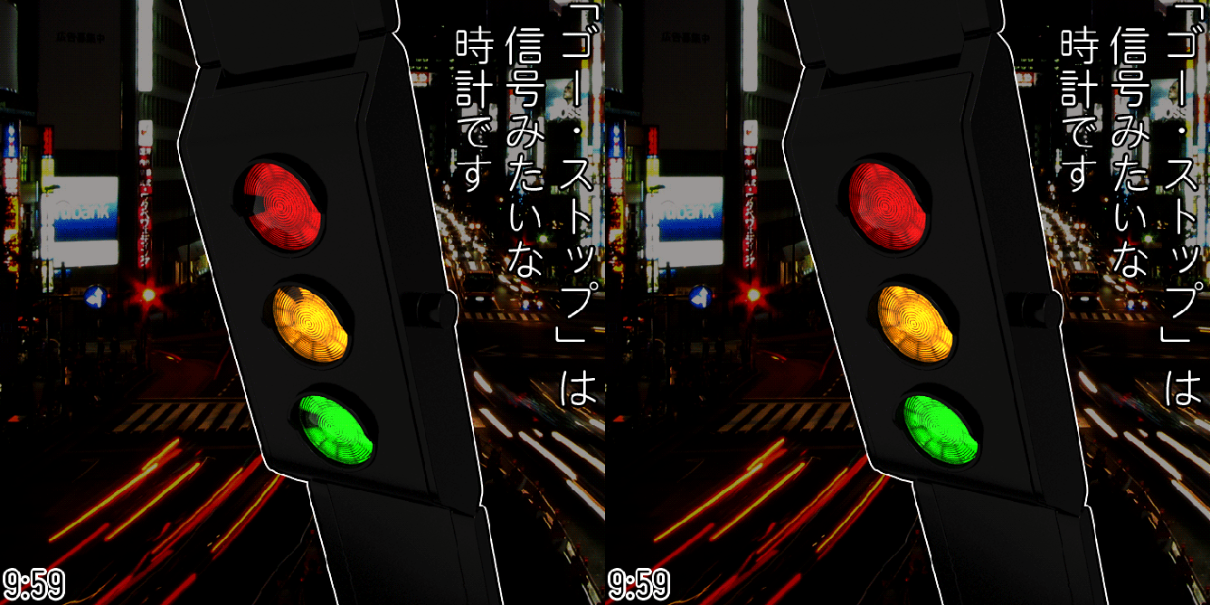
Design submitted by Sam from Germany.
Sam says: “In Japan, the term go-stop (ゴー・ストップ) is used for “traffic light”. This is where the inspiration for this watch came from.
I wanted to achieve the look of a traffic light with three lights which do not seem to work properly. The little “flaw” should be used to tell time. I divided all three circles in 12 equal segements of which one flashes to indicate a digit of the time. Each circle is provided with a bent shroud/ cover plate/ splash guard (I’m not sure about the english term) similar to that of real traffic lights. They are shorter here, so they do not interfere with your shirt’s wristbands.
I chose a gemoetrically simple case because traffic lights normally have a simple and rational casing. I am showing an expensive version in silver and black gunmetal with 39 LEDs and a cheaper version in plastic wich uses a single layer of LCDs on top of three separate light sources. The appearance of the circles shouldn’t differ that strong from the LED version. The colors come from colored watch glasses.
The red circle stands for the hours. The flashing part of the circle represents the analog watch position of the hour. The same system is used for the yellow circle. The flashing light shows the minutes in five-minute-steps. The green circle has four possible lights wich could flash (top, right, bottom, left) which stand for one, two, three or four minutes wich have to be added to the ones you already have read on the yellow circle.
There are two modes in which the watch tells the time. In traffic mode the lights show up in the way they do on a real traffic light. In quick mode all circles light up at once, so you see the time at a glance. The date can be told too. For example Red 12 Yellow 25 Green 2 = 12/27. Pretty easy.
The watch is for people who go with the time and keep moving – mentally and physically. The watch has a modern, a little retro, well quite timeless appearance. It uses an iconographic image, everybody knows. It is possible to quickly read the time since it is relying on base knowledge about analog watches.”


Good idea Sam, a watch, easy to read and truly original, beautiful!
LikeLike
The Gunmetal version: Green Way, 5 stars!
LikeLike
This is BRILLIANT Sam! Well done. Love the realistic effect you have created on the light lens and the way the red & amber lights stay lit together. It’s just flawless. I’m not sure how many people would actually wear this on their wrist, but it’s certainly fun.
LikeLike
Yes, it is Brillant.
LikeLike
So cool! who would have thought that something simple and colourful could light the way to telling time. Wonderful watch. Definitely would contest to my new watch if it gets produced!
LikeLike
Can I submit a idea?
LikeLike
@ Roger, you can submit an idea here: http://www.tokyoflash.com/blog/got-an-idea/
@ Avatara: Yeah, what you describe is the traffic mode. After the green light showed up, you are informed and can go, tehehe. This blog is cool. When I’m designing, I can only estimate a certain clientele. But in the end, it is my particular taste wich influences the design. The bog shows me, I’m not so “absurd” everytime 😀
Thank you all for your words! I tried to keep it simple, but with necessary details (the splash guards, the lens ripples). Seem I found a good balance 🙂
LikeLike
Simple shape. “Talkative” case. Funny idea. Easy to read. Bought! I hope people STOP by here and GO rating high for it!
LikeLike
Honestly, awesome!!
I love the fact in all your watch the concept is striking like that!
It’s funny but I think the little plastic part which protect the lens from the sun would actually be useful!
Great job again Sam!
LikeLike
Fans of kamen rider will love this design!
LikeLike
@ Aphosno: Thank you. Yeah I like it simple sometimes 🙂
@ said: Hey you’re right! Thanks for your words!
@ firdaus: Hehehe
LikeLike
Sam, watch Kamen Rider OOO and see his henshin belt 😉
LikeLike
えーーーすごい!Yeah that’s cool. Maybe you’re right.
LikeLike
very cool
LikeLike