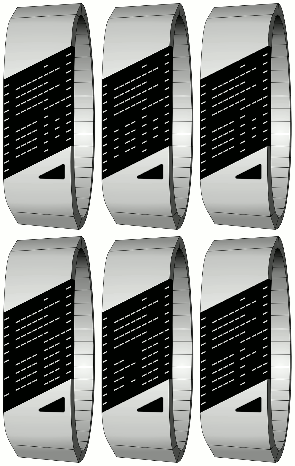
Design submitted by Logan from the USA.
Logan says: ” I started with the shape of the LCD, and the rest followed from there. Starship is an always-on LCD watch with an electroluminescent backlight and a small touch pad instead of buttons.
The time is displayed in 12- or 24-hour mode as 3-4 digits shown in negative space on the LCD. For hours 10-19 (or 10-12 if in 12-hour mode), the second hour digit is a little narrower than usual in order to fit, and for hours 20-24, both digits are narrower. Still, the 3-4 digits of the time can always be displayed at once.
When a digit changes, there is an animation where the new digit (in negative) flies in from the opposite side (from left to right for minutes, and from right to left for hours).
Instead of buttons, the watch uses a small touch pad on the face. Electroluminescent backlighting (blue-green) is used to provide uniform illumination of the large LCD. The case and strap are hairline-brushed aluminum.
Because of the large number of LCD segments, this watch could have additional display functionality such as a digital compass displaying the bearing, a graphic equalizer, or Bluetooth pairing with an MP3 player and showing track titles as scrolling letters (in positive segments).
This watch is the perfect graduation present for a new starship science officer. It’s a very sleek watch with strong techie appeal, yet it’s still extremely easy to read and always on.


Another hit by Logan! I like the slim light gaps ( I almost wrote LEDs but it is LCD void 😀 ) because they look stylish, the negative display because it is a good balance between strange looking and being readable, and I like the 30° angle because it gives the watch a certain dynamic. The touch pad is good – a thick button would disturb the futuristic style of this watch. 12h/24h mode is good. Animation as well. Additional display functionality is wise 🙂 Cool thing Logan!
LikeLike
Looks great, but the only way I could actually tell what the time said was to awkwardly cross my eyes slightly, don’t fancy having doing that every time I look at my watch.
LikeLike
6:30, 6:31, 6:32 and the last two: 6:30, 10:49
LikeLike
Chris, I’m sorry to hear you had trouble reading the display. If anyone else has difficulty, I hope they will also comment. It was not meant to be difficult to read, but quite the opposite. Something to keep in mind is that the images displayed here are larger than life. In reality, this would fit on your wrist, and when you shrink it down, I think it becomes even easier to read.
LikeLike
I’m kinda getting used to it, eyes are seeing numbers without strain now, actually works really well 🙂
LikeLike
It’s great!
LikeLike
@Sam, @Laszlo Great to hear that you both like this design! That’s a good sign. Thanks for your support.
@Sam You read my mind about the touch pad and angle of the display! I’m glad these choices are understood.
LikeLike
well i have a bit of difficulty at reading the time, not because it’s not easy but because i cant really know which number i’m trying to read, maybe using different colours or some vertical bars to separate, but great desing, it’s very cool, it looks like an addidas watch LOL
LikeLike
Trop belle!!
LikeLike
Merci beaucoup!
LikeLike
It took me a while to get used to it, but I can tell the time just fine. The design is awesome too. Great job!!
LikeLike
Oh yes I buy that. It reminds me of sam’s gradient watch where you also have to concentrate (if not even cross eying lol). I like the style and the way of displaying time. Just read it! Good luck logan!
LikeLike
Logan, I think this time you’ve got an idea which can be a huge seller watch. With a little modification on the case to make it a little more sleek and a crazy animation anybody would like it!
Great job and keep up the great job!
LikeLike