Design submitted by Anders from Sweden.
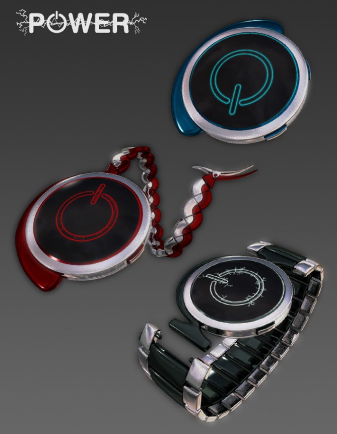
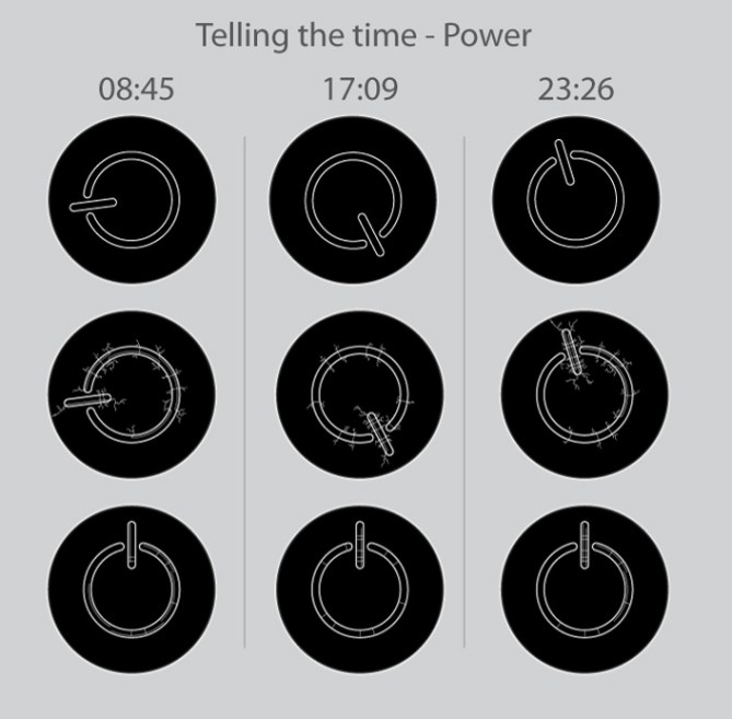
Anders says: “It struck me that the power icon on almost all electronics is not only visually striking, but could also easily be used to indicate time, all you need to do is rotate it, letting the straight line point to the hour and the circle segment show the minutes.
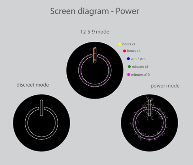
A very straightforward design, graphics within the power icon show the exact hour and minutes with the 12-5-9 system. There are however options for the graphics where the wearer can decide to show only the icon, the icon and indicators, or the indicators with ‘crackling’, possibly animated forks of lightning.
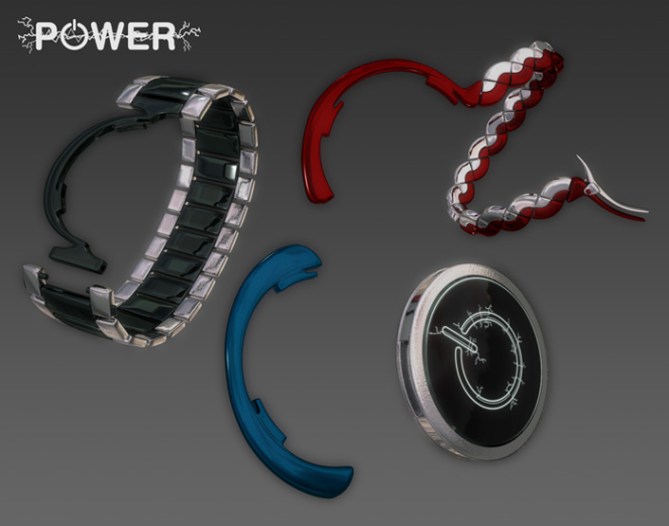
The target for this design is people who like their accessories understated yet powerful. There are many colour options, both for the screen and the easily changeable holder options. There is a classic armband, a pocket watch chain, and an accent piece for those who want something unusual and practical.
The selling points for this design are the bold display and the different options for wearing it. This in particular expands usability and the possibilities for personalization. One can easily imagine a range not only of different armbands in different colours, but also different watch bodies using the same mounting system.”


Wonde rif there is a Patent on this for watches? Looking at my MAC right now and think there must be. Nice design though.
LikeLike
@ Mike: Do you mean the power symbol? That is free to use I think and Apple is by far not the first brand wich uses it. If you wanna use a smiley like 🙂 commercially, then you would get some problems.
@ Anders: I like this watche’s appearance very much and I totally like your modular system wich allows to wear it on your wrist or in your pocket. Materials and color options are very nice!
The only problem I have is the readability. I have the original display size on my monitor (plus minus 5mm) and it is just too small. I’d say, make this an analog watch, with the power | as the hour hand (like on your discrete mode) and one electro-fun as minute hand, and another electro-fun as second hand. I think the readability is a mean flaw and it wipes away the strengths of this watch. Please reconsider it, it would be a pity if your building work was in vain. That’s of course only my impression 🙂
LikeLike
Thanks for the comment! I’m afraid the readability does look pretty poor, but I think it’s because I didn’t check the final size of the images enough, so it looks much worse than it is…=7 I think I might make a clearer image and put it on my own website and post a link to it…
LikeLike
Right, finally got the blasted thing up…=) You can find a (hopefully) clearer display image at

… Enjoy! =)
LikeLike
Oh cool 🙂 I get it now. The lines are clear and distiguishable. Quite thin…What do you think of the idea to make it generally easier? Your watch is so cool and practical and the icon is strong and simple. I think time reading could adapt, then you have a more consequent design. I suggest it again because I really like the watch itself 😀 Yesterday I showed a friend a new watch design and booom, I needed to remake it since it was too confusing to tell the time. I didn’t see that because I worked on it for some days and forgot the initial difficulty. After sleeping one night, everything was clearer to me and I newly began 😀 Now I finish it and submit it later and hope it makes it’s way in the blog. What I wanna say: Outside reviews sound destroying but are helpful, if explanation is reasonable. Good luck Anders!
LikeLike
i don’t know if it’s me but i don’t know how to read this watch, but is very POWERFUL, it’s the type of watch Nathan Drake from Uncharted will wear, lol.
As they said up there it would be better analog, mantain the big vertical sign if power but add inside the ring a smaller one with the minutes displayed vertically: 2
3
to make it easier to read. Also maybe the lightnings or thunderbolts ( i don’t know how to say it, but i think you can follow me) could come from the edge of the screen to make a bigger impact.
LikeLike
It’s not just you, like I said to Sam above, it’s because I didn’t check the final size of the images (and because I tried to fit too much into a single image)… Big mistake, it seems…=)
Interesting idea about the lightning, if this was ever made (fingers crossed) then it’d probably need some testing to see which is more effective… Thanks for the comment!
LikeLike
Hi, Anders. I really like the idea of being able to convert from wrist watch to pocket watch. I’m not crazy about the display method, because the elements seem a little small to read, but I would encourage you to consider more designs that are convertible like this. As usual, your strap rendering is amazing.
LikeLike
Thanks for commenting! I’ve uploaded a better display illustration, you can find the link in my second reply to Sam above… The display looks much worse than it is because the final images ended up smaller than I anticipated (not sure if I went wildly wrong or if TF’s scaled them down)…
I’m glad you like the modular concept, I thought it felt like a good idea…=) And thanks for the rendering compliment! It’s possible to have a lot of fun in 3DS Max…=)
LikeLike
Oh that is a very clever concept of a multifunctional watch. I’d also say, make the display a digital analog watch and you still have a strong watch. As I see, the ratings are under 3. That’s a pity 😦 I hope you don’t let the interchanging idea go but use it for another watch in the future.
LikeLike
As Sam said above, I agree that a combine of wrist watch and pocket watch is great. Still, I would like to see if it’s doable and resistant enough for a long time. The image of the power logo is a great choice as well. For the way to read the time, I’m sure you can find better! 😉 I also check your link and I would say the problem is not only the amount of little lines inside the logo but just the fact the lines are too small. If I were you I would try something like filling the logo of light to indicate the minutes or something very easy to see like that.
Well, it is still a great job!
LikeLike