Design submitted by Sam from Germany.
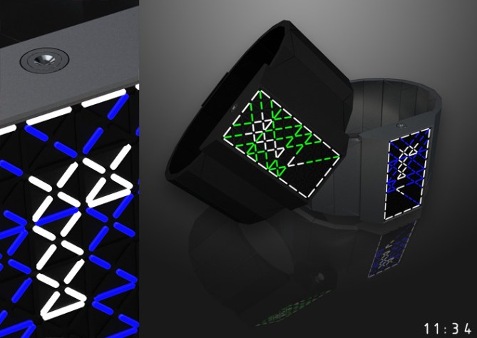
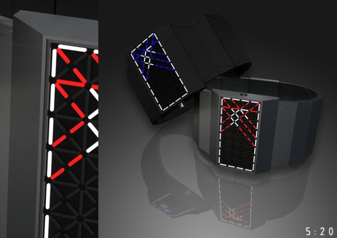
Sam says: “My idea was to make a digital segmented LED watch with roman numerals. I think they are in the idea of Tokyoflash to encode time. Using LEDs means a limitation of expression in favor of flexibility and so my roman numerals look a little cryptic at first.I tried various types of display layouts and my final inspiration comes from “the tholian web” – an alien space technology from Star Trek (image here). The animation before the time is displayed is also inspired by this. The working title for my watch was “Times New Roman” but this is a registred trademark, so I call this watch Times Digital Roman.
When lit up, the display has a white frame, red decorative LEDs and finally the important white roman numerals. There are two rows of numbers. The upper one shows the hours (or the day in date mode) and the lower one shows the minutes (in date mode months and with a little gap the year). Please check the explanation image for the meanings of the roman numerals. I made geometrically simple straps and an angled case wich slightly pick up the image of the display.
The hard edgy case is not anyones’ taste. But it is pretty straight and simple and fashionable it its own way. Well geeky people and fashion victims could like it.
The display and the watch itself have a strong appearance. The time display has a good balance between looking cryptic and beeing readable.”


The watch looks great Sam, but roman numbers never was my strong point. xD
LikeLike
Very nice Sam ! I think it’s a interesting way to use roman numbers. Great work and animation !
LikeLike
Sam, I like how you create the numerals from a uniform LED pattern, but I think you are not showing this effect to its best advantage with these colors. For my taste, it would be better to have more contrast between the numeral color and the non-numeral LED color. I’d like to see this with one color much brighter than the other. That’s easy to change, of course. As usual, you have a very nice animation to go with the design.
LikeLike
@ Ace: Thanks and no problem. 🙂 Stay tuned, I planned optional alternatives. Of course I don’t advertise them at this moment since the roman numerals are my main intention and shold be judged alone.
@ Genghis: Thank you!
@ logan: Ah I think it is a monitor thingy. I showed my watch to a colleague and on his monitor I saw the contrast wasn’t as clear as on my laptop. He didn’t realize at all thanks to sufficient explanation 😛 I think red and blue are good. The green is a little mean, tehehe. Thanks for your opinion and the important hint.
LikeLike
I work with roman numbers every day so I like them and how you elongated your digital versions with these red lines. Yes, I like the red display most! I also like the rough shape of the watch. That is pretty manly.
LikeLike
this is really clever.. once i figured out what was happening (the number chart), it all made perfect sense, and to me, this is the kind of concept tokyoflash deserves; it’s a gap they have yet to fill with this kind of idea.
i like the idea of seeing order in the chaos of the pattern; i don’t think it’s too difficult to pick out white from red, but i would say that more contrast is better, as logan suggested. whether that means using darker accent hues or not is up to the creativity of the designer.
regardless, excellent job. 5/5 stars and a ‘purchase’ vote from me!
LikeLike
Yes, I had to brush up on my Roman numerals again, but now I get it, I like it! Very clever. The case does look very masculine but is cool and fits the theme well. Go Sam!
LikeLike
We are looking for some more LCD and Analogue designs NOT LED for a few months. We have so many and more being made. We are looking to choose 5 new designs by the end of Jan so hope to see your ideas coming in. We will be considering past designs and if they can be done in LCD as well. Must be easy to read as well. No harder than 12/11/4 or 12/5/9 preferably easier than that even. Commissions seem very very attractive enough to put a sizable down payment on a house, so it’s not just fun and games, there is real money to be made! It’s like the “American Idol” of watches.
Sincerely,
Tokyoflash Design Studio
LikeLike
@ Aphosno: Thanks. Yes I tried a sharper style this time 🙂
@ cortjezter: You mentioned good points, thank you!
@ Avatara: Also thanks to you!
@ Tokyoflash: I wil try an LCD version of this watch 😀
LikeLike
No need to do a LCD version as we understand the concept. Basically we want to cater some designs to the people who even think RPM is difficult, (Which is about as easy as it gets) and or who don’t want to press the button to tell the time (which I can see being a turn off for some). We have had many requests, and we want to expand our designs to these people as well.
Sincerely,
Tokyoflash Design Studio
LikeLike
Oh cool thanks for making this clear! Then my energy will flow into completely new designs 🙂
Kind regards from Germany
LikeLike
Sam always has great ideas.
I have a small problem, I can not read the time?
LikeLike
Oh Patrick! Thanks for telling! That’s a biiiig problem 😛 Maybe the roman numbers (you know roman numbers right?) look too strange for you in digital mode. That happens 🙂 The red display sais IX XLVII, the green one XI XXXIV and the latter blue one V XX. Have a great weekend!
LikeLike
Yes, I know Roman numerals, but as anyone on this blog had problems reading time, I was worried about me?
With the explanation, I understand, phew
Thank you Sam, good weekend to you too.
LikeLike
Great design. It might be a bit difficult to learn to whom without idea of roman numbers, though. But a little brain exercise what the whole project is about, isn’t it. I would buy it.
LikeLike
@ Fantasmatic: You are absolutley right. Thanks for your thoughts 🙂
Thanks at all for your votes and comments!
LikeLike