Design submitted by Devindh from the UK.
Devindh says: “This design combines 2 ideas. Stylistically it is influenced by the Mongolian tradition of reading and writing vertical text, a practice now common in other parts of Asia, including Japan. The second idea is based on the simple desire to protect the screen from scratches, making the piece more durable.
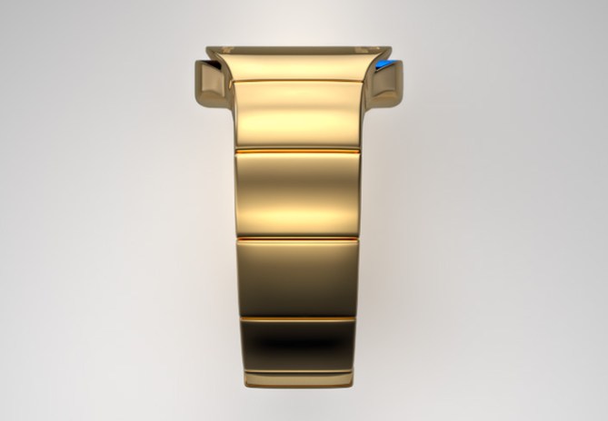
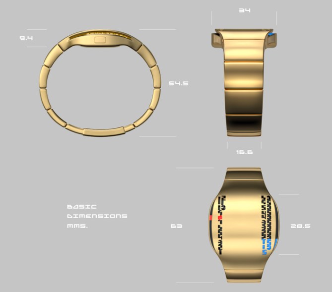
The main body of the watch has two ‘wings’, minutes on the right, and hours on the left. The custom type used for the numerals is laser cut through the metal outer shell. Beneath the outer shell are 2 OLED screens displaying blocks of coloured light that gain meaning when viewed through the pierced surface. This watch is primarily a ‘dress’ piece. Like most watches in the Tokyoflash range, it should appeal to anybody who likes being different and ‘modern’.
The majority of designs that have been submitted so far have been rendered in ‘synthetic’ materials. My choice of gold coloured, satin finished metal is what sets this piece apart.
A beautiful design by Devindh that certainly stands out. How do you feel about the design, the materials and technology chosen? Please offer your thoughts in the comments section below and if you’d like to see this design become reality, vote now.


If 50 Cent and Jabba the Hutt would met up to design a watch this would have been the result. Sorry, to goldy and curvy for my tastes, but the way to tell the time is pretty nice. Maybe some girls will like it.
LikeLike
……Hmmm…..’Jabba the pimp’ what a great idea. I think I have the inspiration for my next idea….:) Thanks for commenting.
LikeLike
Mhhhhh beautiful! I like this as much as your other watches. Curvy? Yes please! Gold? That’s fine! It is not that blingy blingy – it behaves actually. I like the idea of the display covered by a layer with number shaped holes.
One thing would make the watch definitely buyworthy: bending the number columns to let them adapt to the case’s outer curves.
LikeLike
Thanks for sharing your thoughts Sam. You make a good point about the numerals. I have posted a more detailed response in your reply below.
LikeLike
I agree with samukun about the shape of the vertical rows, maybe it is a german thing, I don’t know. If you bend them, then this watch would look even more noble as it already does. The straight and rigid shape of these rows works against the elegance of the watch. I’m fine with the golden material too. It isn’t maybe an everyday watch but one for certian occasions. It would go fine with my suit. Good work devindh!
LikeLike
Thanks:)
LikeLike
This is interesting, very different and quite elegant. Certainly one to wear on a night out. I agree with Samukun, it’s not overly bling. It’s actually a little like a bracelet as most of the display is not used up.
LikeLike
Thank you:)
LikeLike
Colour is not a problem. It’s a personal choice for sure. I love gold but all by friends think it’s for old men or Pimps. Silver or IPB would always be an option in any watch we make so try not to focus on just the colour, as the design is what is really important.
We are looking for some more LCD and Analogue designs NOT LED for a few months. We have so many and more being made. We are looking to choose 5 new designs by the end of Jan so hope to see your ideas coming in. We will be considering past designs and if they can be done in LCD as well. Must be easy to read as well. No harder than 12/11/4 or 12/5/9 preferably easier than that even. Commissions seem very very attractive enough to put a sizable down payment on a house, so it’s not just fun and games, there is real money to be made! It’s like the “American Idol” of watches.
Sincerely,
Tokyoflash Design Studio
LikeLike
If we submitted an earlier design that could be LED, should we re-submit it? You posted an idea of mine that I had intended to be LCD (with two options for displaying the time), but posted it to the blog as an LED option.
http://www.tokyoflash.com/blog/2010/09/futuristic-gps-watch-designed-for-space-travelers/
LikeLike
Meant to say “if we had submitted a design that could be LCD, should we resubmit?”
LikeLike
Hi Vincent, thanks for your comment. We are still considering all concepts that have been submitted up to this point as well as those coming in from now. We will also consider whether past submissions can be done in LCD. If you would like to submit new designs we’d love to see them.
LikeLike
Devindh, I hope you don’t mind, I’d like to show you what I meant in my earlier post: http://www.abload.de/img/devindh-eastern-alternsdnb.jpg 🙂 Totally buybuy!
LikeLike
Hi Sam. Thanks for taking the time to alter my render. Here is a screengrab of one of my original sketches.
[IMG]http://i189.photobucket.com/albums/z105/coloredcircle/101211-0001.png[/IMG]
As you can see I had wanted the design to be a bit more angular so that the numerals followed the contours of the watch more ‘harmoniously’. I can certainly render a variation that is closer to my initial drawing.
LikeLike
Oh yeah I see. I like that one more too. The numbers and the case don’t bite there… yes it is more harmonilicious 😀 When I design, then there are also changes I didn’t plan sometimes, and the development takes a new way. I’m not aware of the little weaknesses wich sneaked in but other persons see them quickly. A new pair of eyes is always good. I sleep one night and review my designs with fresh mind. But in the end it is just my taste. I’m a little flexible though 🙂 Well conclusion: The base idea and the colors and materials are great. That’s why the little flaw was so obvious to me. Oh yes: cool drawings.
LikeLike
Devindh, although some people are asking to see the numbers modified to fit the case, I would actually prefer to see the case modified to fit the numbers. Your rendering of the case is beautiful, but the shape isn’t as interesting to me as the numbers are. I think the numbers are what make this design unique, and I’d rather see a case matched to them. I really like the “Mongolian” concept.
LikeLike
Hi Logan. I had not thought about shaping the case to echo the numbers. I think I will make a few sketches and paintovers to see how it would look. Your observation about the “script” governing the design is probably accurate. I think that when I started considering the real world dimensions of the watch a few design elements got ‘warped’ for the sake of practicality.
LikeLike
Nice work, as always! As some have already commented, gold isn’t really my thing… And there’s the thing about the numbers and the shape not quite working together, but other than that, stylish! =)
LikeLike
Nice typographic idea. I think manufacturing the analogish display system might be a bit challenging.
LikeLike
Hi Fantasmatic: Thanks for commenting. I think that certain parts of the watch might indeed prove challenging to make, but not more so than a number of the ideas that have already been submitted.
LikeLike