
Design submitted by Logan from the USA.
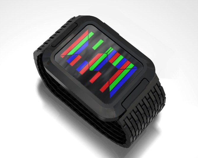
Inspired by subpixels, this watch design divides a segmented digit into red, green, and blue horizontal stripes, and uses the different colors to show hours (red), tens of minutes (green), and single minutes (blue). In this way, the entire time is shown in the space of one digit.
To show hours=10, 11, or 12, the hours (red) shows 0,1, or 2 and blinks slowly. It’s easy to remember which color stands for which part of the time: you read it as RGB.
The display is animated so that the red pieces are shown first, then red+green, then red+green+blue.


Like!!! It is totally confusing! When I read the word subpixel, all was clear. I also worked on such an idea and I totally support this one! Very good idea. And this one could be made easily! Maybe you rethink the 10,11 and 12. Make another symbol instead of blinkg – just my taste. You can make a I I on this display, thats an 11. Make a “b” for the 10, thats like a 1 and an o ( a little zero) combined. Well and the 12… Make an R… a 1 and a 2 molten together. Maybe that’s easier. Anyway, using this one digit for all numbers is great! RGB FTW!
LikeLike
Thanks, Sam! I’m not surprised someone else had a similar idea, because it seems rather natural (especially if you are of an age where you remember CRTs with easily visible subpixels).
LikeLike
Really nice. Would buy if the blinking was gone, and the display was always-on.
LikeLike
Making it always on…I wonder if Tokyoflash could do that by putting a color filter on top of the lens. The filter would have the RGB stripes and the display underneath would just be a normal (negative) LCD. The colors would not be as bright as with LEDs, but they could always be on.
LikeLike
Wow, neat idea! Despite the fact that you’re showing 3 numbers all mashed into one, the display is surprisingly readable, the method of reading it is logical and easy to remember, and it’s also pretty cool to look at. I agree with Sam that you might want to consider alternatives for the 10, 11, and 12, but other than that, I think this is a great production-ready design.
LikeLike
@Sam and @TheSquirrelKing To do away with the blinking, you could replace 10 with 0, 11 with I I as Sam suggested, and then the problem becomes 12. I think the easiest to read might be to make a thin vertical blue line in the middle of the empty holes in the center of the digit. 12 would be 2 plus that middle blue line (split into two pieces to span the upper and lower holes), and the middle blue line would not be used for anything else.
LikeLike
Mhhh the 12 idea is good. It is like a $ and therefore easy to distinguish. Replacing the 10 with 0 is so true! When you don’t have 0:00 (you don’t) then there is no confusion.
Yeah I spent some time with subpixel fun, not only for a watch design. It is a cool way to split up or to unite – depending on the point of view.
LikeLike
Nice design Logan. Keep it simple is key. Graphically this is on the right track. This idea is worth looking into more.
Keep up the great work! We love seeing what you have in store every day.
Cheers.
Tokyoflash Japan Design Studio
LikeLike
Thank you for the encouragement! Congratulations on RPM, I think your refinement of the lens adds a lot to the design and makes it one of your best recent releases.
LikeLike
Great idea but it hurts my eyes a bit.
LikeLike
Reminds me of my old valve tv 😀 Three numbers in one is awesome. I’m not sure if it has to look like a traditional led digit but I like this inventive idea.
LikeLike
haaaa
Logan, that’s a great job. I would give you the same comment as I just gave to Samukun on the previous post:
I don’t really like when there is too many different colors on the watch. I prefer 2 colors (including the color of the case) or 3 colors but with 2 colors very close (like with different luminosity only)
But that’s personal taste!
For the way to read the time, I remember your previous post was a bit more interesting to me!
(sorry, I hope I helping here and I don’t sound to bad!)
LikeLike
Said, it’s definitely helpful when you explain your reasoning, as you have. Thanks. I’ll keep that in mind and try to make some more designs with just a few colors.
LikeLike